Theme Installation
To install this theme you must have a working version of WordPress. Make sure that your installed WordPress version is 5.7 (or higher).
If you need help by installation of WordPress, follow the instructions in WordPress Codex. Also here you can download the latest version of WordPress.
Downloading
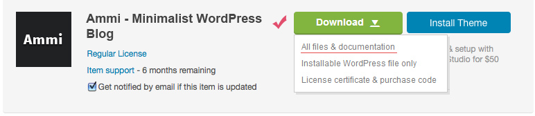
At first, after purchasing this theme, please download the package from ThemeForest (to do this you must be logged in ThemeForest). Move your mouse over your ThemeForest login name in right top corner and then click Download. On the Downloads page you will find all the items that you have purchased. This theme will also be here.
In the next step click the Download > All files & documentation button and save package on your computer.
Please unpack the entire package after downloading.
The Main Files includes the following files and folders:
- Ammi Theme folder - main folder with the following files and folders inside:
- Demo Content folder - contains demo data file:
- ammi-demo-data.xml - xml file with demo data: posts, pages, comments, categories, tags, etc.
- Documentation folder - contains this document:
- assets folder - contains files for documentation;
- documentation.html - documentation file.
- ammi.zip - Ammi theme (ZIP archive for installation);
- Changelog.txt - changelog text file;
- Readme.txt - some information about folders and files in the package.
- Demo Content folder - contains demo data file:
Installation
You can install this theme in two different ways:
- WordPress Theme Manager (installing from the WordPress Dashboard);
- FTP upload.
1. WordPress Theme Manager
1.1 Go to Themes Page
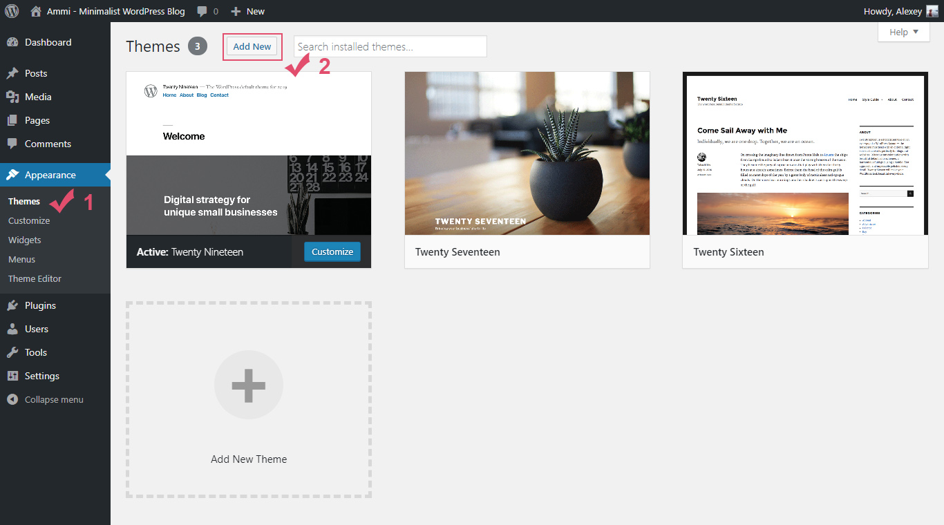
Step 1. Login to your WordPress admin page.
Step 2. Navigate to Appearance > Themes.
Step 3. Click the "Add New" button.
1.3 Upload Theme ZIP File
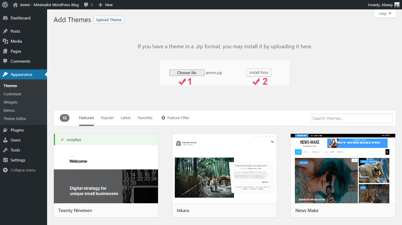
Step 5. Click on the "Choose file" button and select the theme zip file: ammi.zip.
Step 6. Click the "Install Now" button. After that, the process of installing the theme begins.
1.4 Activate Theme
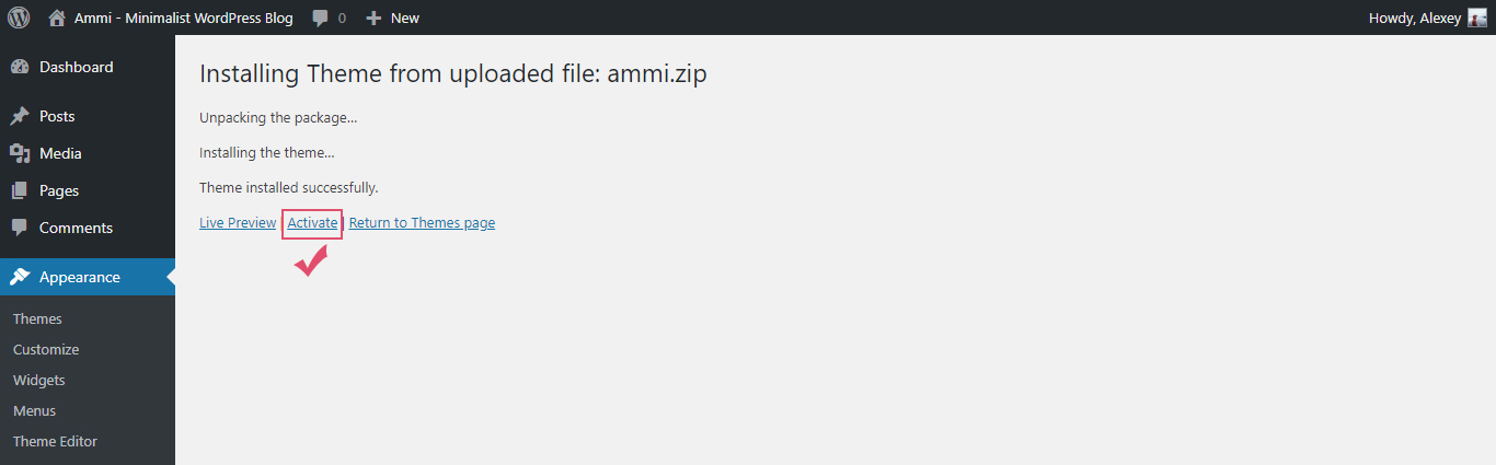
Step 7. After the installation is complete, click the Activate link.
1.5 Required and Recommended Plugins
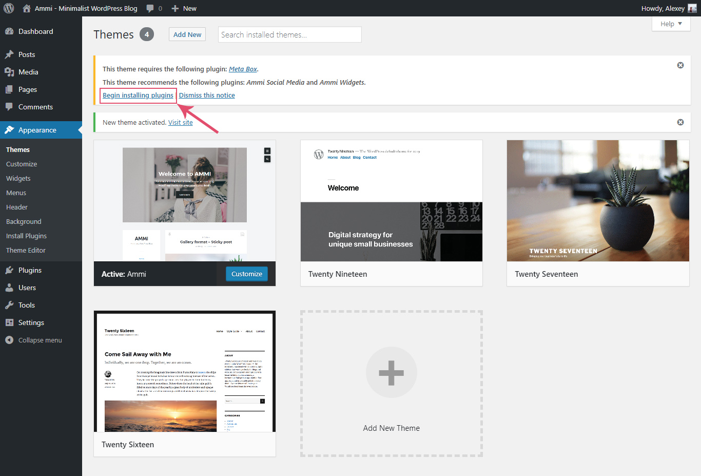
Step 8. The theme is now activated. You should now install and activate the required (Meta Box) and recommended (Ammi Social Media and Ammi Widgets) plugins by clicking on the Begin installing plugins link.
1.6 Plugins Installation
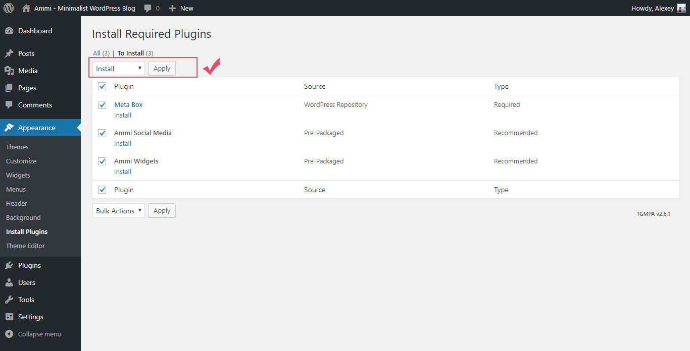
Step 9. Select all plugins and select "Install" from the dropdown menu. Click on the "Apply" button to continue the installation.
1.7 Installation Complete
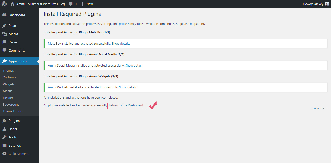
Step 10. After the installation is complete, click the "Return to the Dashboard" link.
1.8 Reading Settings
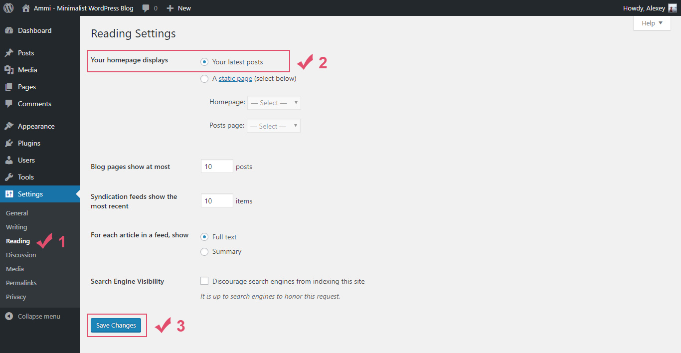
Step 11. Navigate to Settings > Reading > Your homepage displays and select "Your latest posts".
Step 12. Finally, click the "Save Changes" button.
1.9 Classic Editor
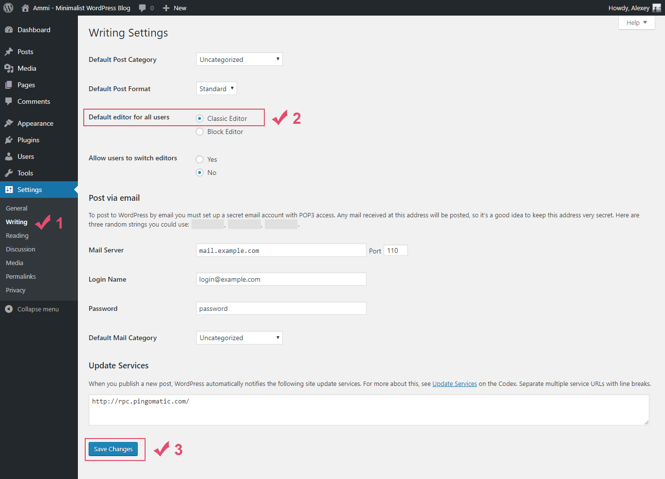
If you are using WordPress 5.x, then in this case with this theme you need to use the Classic Editor. Now this editor is a WordPress plugin, and you can download it here: https://wordpress.org/plugins/classic-editor/
After installing and activating the classic editor, you need to select it as the default editor for all users: Settings > Writing > Default editor for all users > Classic Editor.
Finally, you just need to save the changes: click the "Save Changes" button.
1.10 Classic Widgets
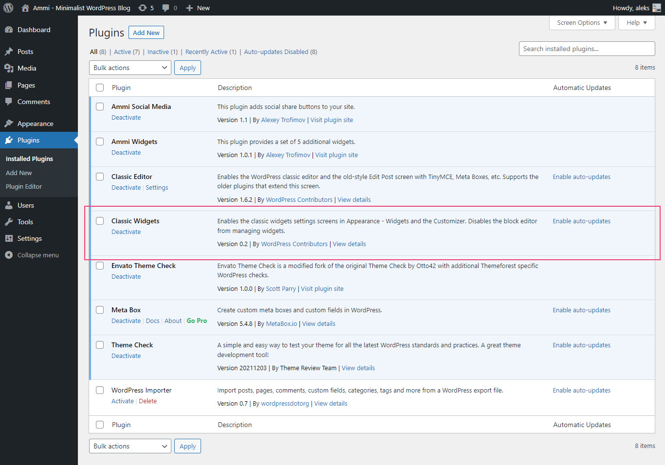
Since WordPress version 5.8, the block editor is also available on the Widgets page and in the Customizer (Appearance > Widgets, Appearance > Customize > Widgets). This theme is not optimized for the block editor, so you need to install the "Classic Widgets" plugin. This plugin will return the classic widgets page to your WordPress. You can install this plugin on the "Add New Plugin" page in your WordPress (Plugins > Add New > Classic Widgets > Install Now and Activate), or you can download this plugin here: https://wordpress.org/plugins/classic-widgets/. This plugin has no settings, and you just need to activate it.
2. Installing by FTP
If you have any problems with installing the theme from the WordPress Dashboard (for example, you see this error: "The uploaded file exceeds the upload_max_filesize directive in php.ini"), then you need to install it via FTP.
To do this, you need to upload non-zipped theme folder called ammi to /wp-content/themes/ folder in your WordPress installation folder on your server.
Next, login to your WordPress admin page and activate the theme (Appearance > Themes).
After the successful activation, see Step 1.5 of this documentation.
How to Update Ammi
In this part of the guide describes how to update Ammi. Just follow these seven steps:
Step 1. At first, you need to download the latest package from ThemeForest.
Step 2. Unpack the entire package after downloading.
Step 3. Next, please unpack the archive with the theme: ammi.zip.
Step 4. After that you need to remove the ammi folder from your server (/wp-content/themes/ammi). For this you can use any FTP client, for example, FileZilla.
Step 5. Now you need to upload non-zipped ammi folder to /wp-content/themes/ folder in your WordPress installation folder on your server.
Step 6. Next, login to your WordPress admin page. If you see a notification that you need to update existing plugins or install new plugins, then you need to do it.
Step 7. And in the last step, please clear your browser's cache and update your site's cache (if you have a plugin for this).
Remember, that all your data in the database are safe because after updating theme files does not change anything in the database. Please also always make a backup of your files before you overwrite them with the new. Also, don't forget about your translation files (.mo and .po) and make copies of those files before updating.
Creating Blog Posts
To create a blog, first make sure that on the front page displays your latest posts. For this navigate to Settings > Reading > Your homepage displays and select "Your latest posts". After that you can create new posts.
Adding new posts works similar to standard WordPress Posts > Add New. All posts will be displayed on the front page.
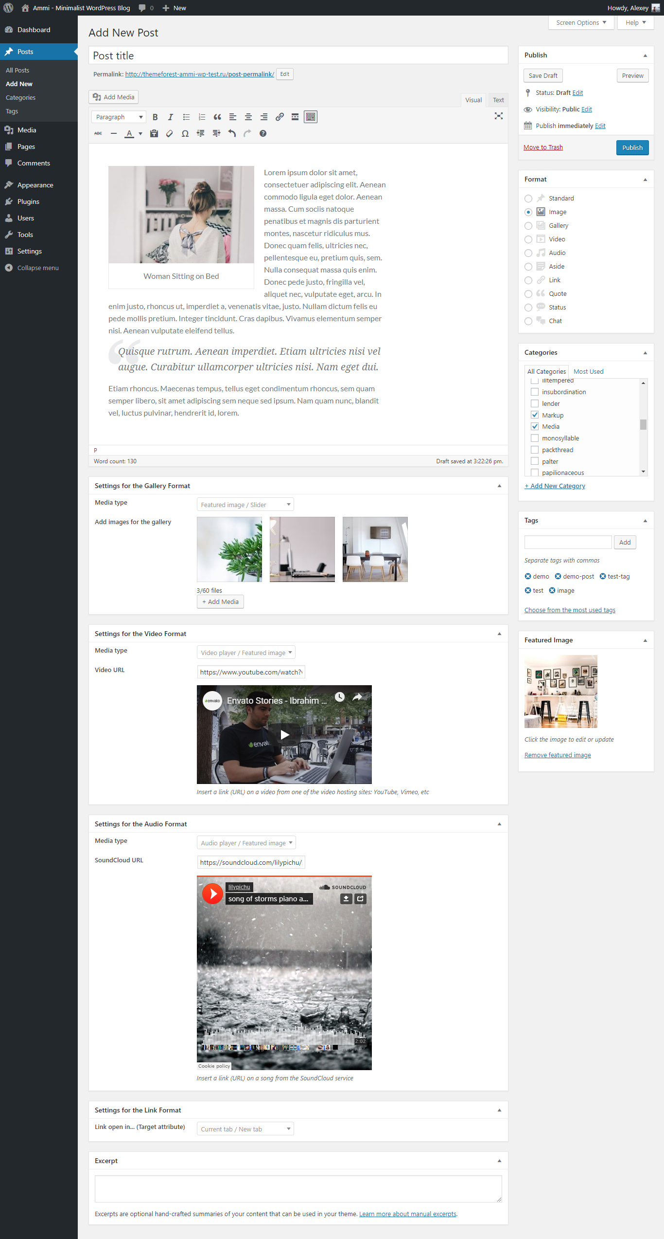
With this theme you can use 10 post formats: standard, image, gallery, video, audio, aside, link, quote, status, and chat. Here's a quick overview of them:
Standard Post Format.
When writing or editing a post, Standard is used to designate that no Post Format is specified. However, for this format you can add an image (Featured Image section). This image will be displayed at the top of your post and under its heading.
Image Post Format.
For this format you can also add an image (Featured Image section), and this image will be displayed at the top of your post and under its heading. Use this format if your post has a featured image.
Gallery Post Format.
The gallery format gives you additional settings for creating images gallery. These settings can be found at the bottom of the page (Gallery Format Settings). To create a gallery, click the "+ Add Media" button and select several existing images or upload new images for this gallery. Recommendation: All images for the gallery must have the same dimensions. You can also choose what to show on the post on the homepage and all archive pages: Slider with images from the gallery or Featured image ("Media type" option).
Video Post Format.
You can also create a video post. When you select the Video format, additional settings appear at the bottom of the page: Video Format Settings. Here you can add a link (URL) to your video. The theme will then check the URL and display the video at the top of your post. If the video does not appear, you have used the wrong URL. Make sure the URL you take is directly from your browser navigation bar when viewing a video on YouTube, Vimeo, etc. You can also choose what to show on the post on the homepage, all archive pages, and single post page: Video player (iframe) or Featured image and popup window with video player ("Media type" option).
Audio Post Format.
For the Audio format additional settings are also available. These settings can be found at the bottom of the page: Audio Format Settings. Here you can add a link (URL) on a song from SoundCloud. The theme will then check the URL and display the audio at the top of your post. Make sure the URL you take is directly from your browser navigation bar when viewing a song on SoundCloud. Here you can also choose what to show on the post on the homepage, all archive pages, and single post page: Audio player (iframe) or Featured image and popup window with audio player ("Media type" option).
Aside Post Format.
This format is suitable for brief snippets of text that aren't quite whole blog posts, such as quick thoughts and anecdotes. You can also add an image for this post (Featured Image).
Link Post Format.
This is a post with a link to another site. The theme will use the first <a href=""></a> tag in the post content as the external link for that post. You can also choose where you want to open this link: in a new tab or not (Link Format Settings > Link open in... (target attribute) > New tab (_blank) or Current tab (_self)).
Quote Post Format.
Quote highlights your blockquote text in a bolder way than standard posts typically do. Use the following code for your quotations:
<blockquote>
    A quotation text
    ...
    ...
    <footer>
        <cite>
            <a href="#link-to-the-author">Author</a>
        </cite>
    </footer>
</blockquote>
You can use this code in your WordPress text editor (Text tab). Note: If you'll see additional indents after creating a quote post, use the code example above, but just make it in one line:
<blockquote>A quotation text...<footer><cite><a href="#link-to-the-author">Author</a></cite></footer></blockquote>
Status Post Format.
Status format is suitable for a quick update about what you are doing right now (similar to a Twitter status update).
Chat Post Format.
Chat to highlight memorable conversations you have with friends. It looks like so:
John: foo
Mary: bar
John: foo 2
...
Below you can see the "Add New Post" page. Remember that all additional settings are displayed only when the appropriate post format is selected (Gallery, Video, Audio, or Link).
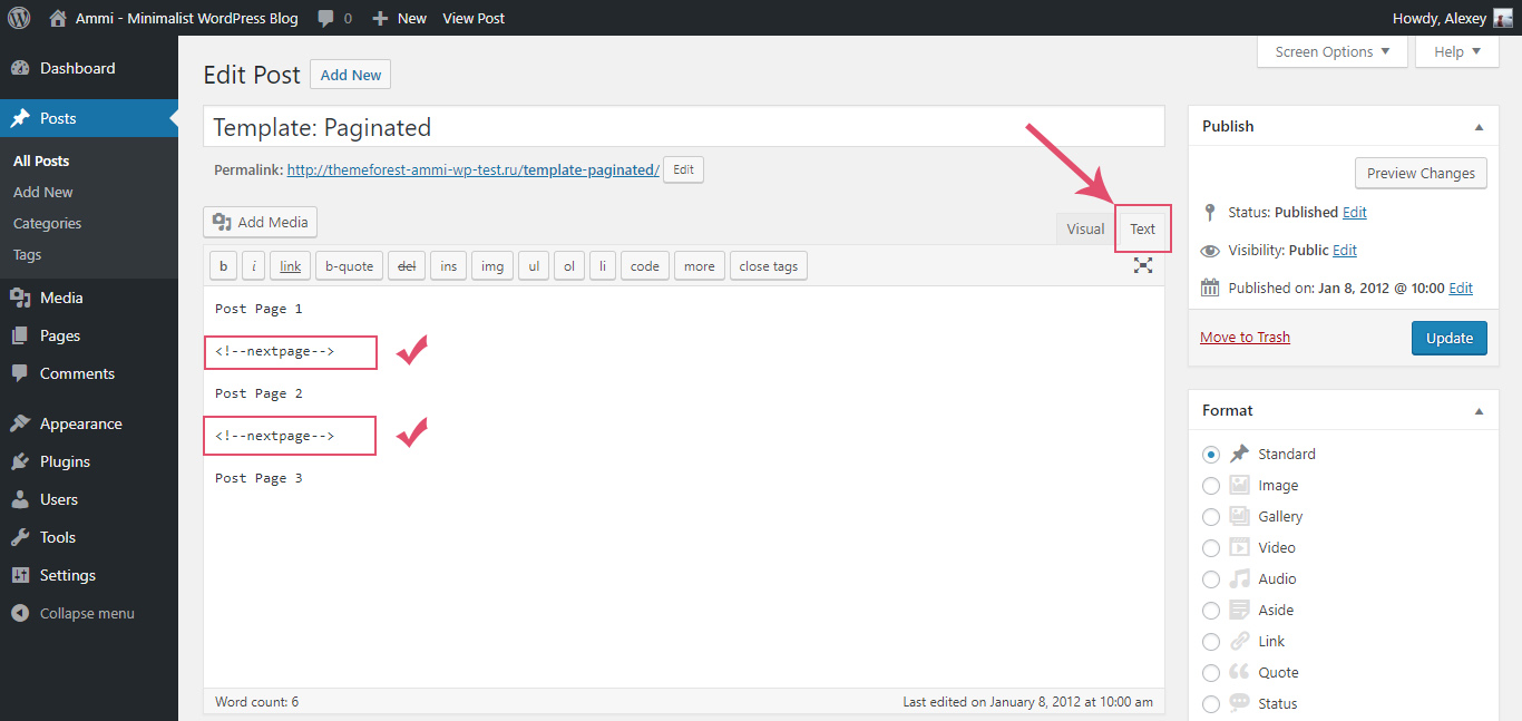
Adding pagination to a single post page.
You can also add pagination to a single post page. For this you need to use the <!--nextpage--> quicktag. Just add it to your text editor where you want to start a new page:
Creating popup images.
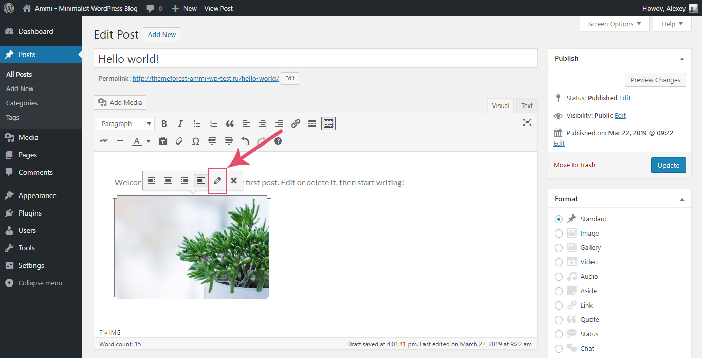
On the live preview demonstration you can see popup images on single pages. You can also easily do the same with your images. Just follow these simple steps:
Step 1. At first, you need to add an image into the Post Editor. Click the "Add Media" button on the top left of your Post Editor and select an image you want to add.
Step 2. Click on the image and click the "Edit" icon:
Step 3. From the Link To dropdown menu select "Media File".
Step 4. Next, click the ADVANCED OPTIONS.
Step 5. Add the following class to the Link CSS Class field: bwp-popup-image
Step 6. Finally, click on the "Update" button.
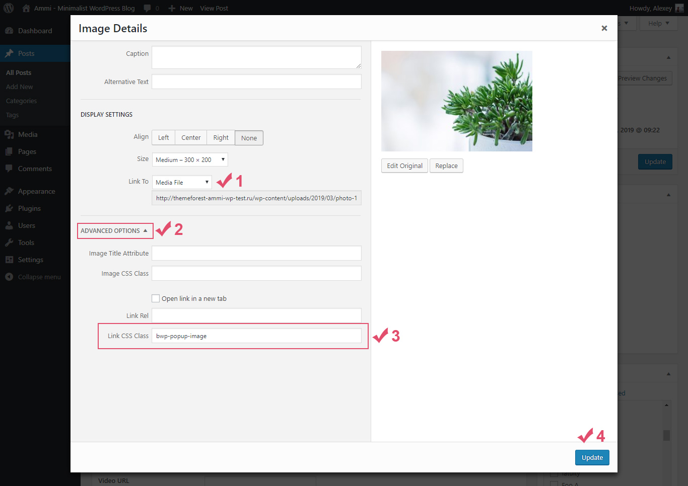
After completing these steps your image also can be opened in a popup window.
Creating Pages
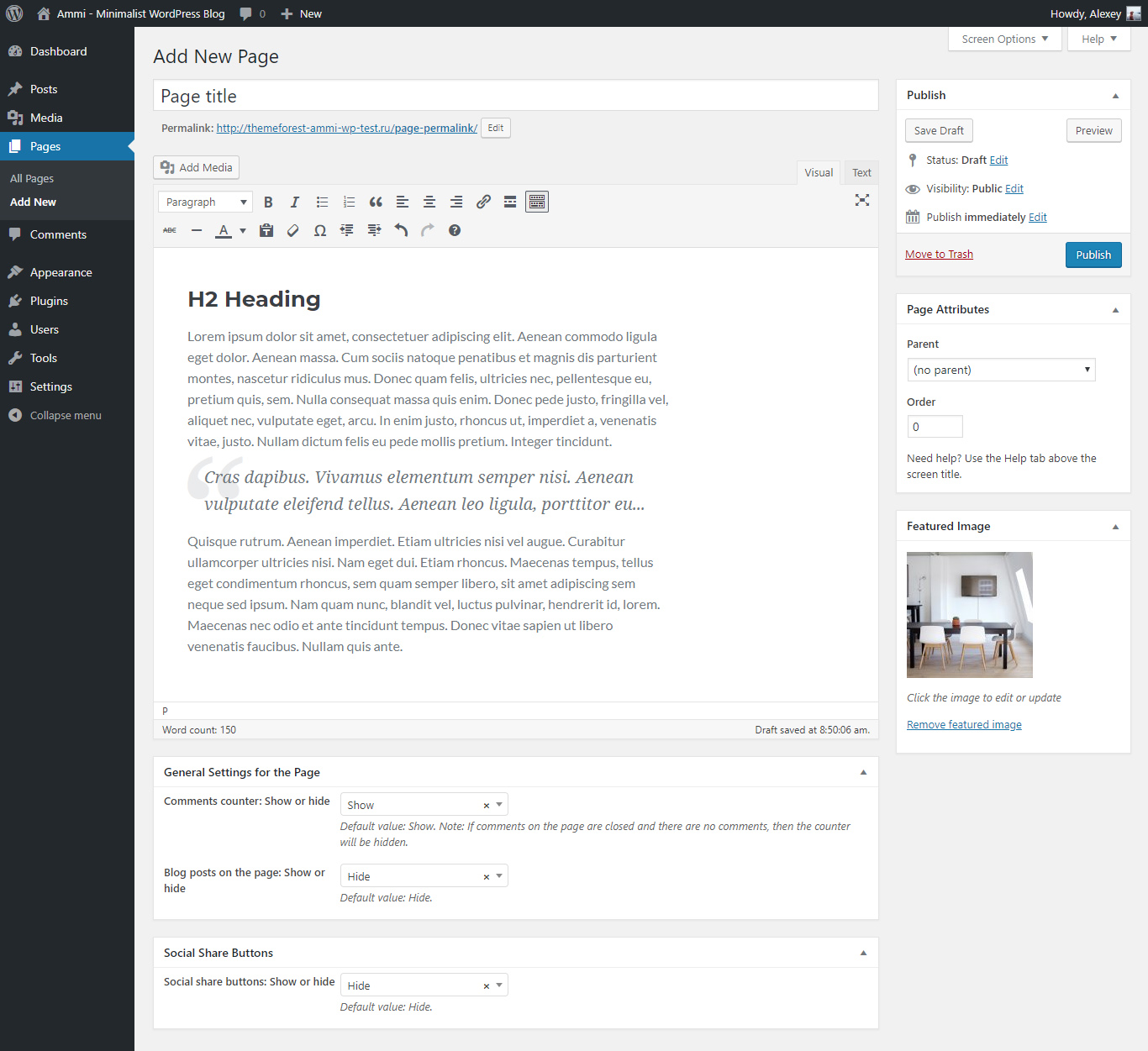
Adding new pages works similar to standard WordPress Pages > Add New.
At the bottom of the page you can see several additional settings: "Comments counter: Show or hide" and "Blog posts on the page: Show or hide". Also, if you have installed and activated the "Ammi Social Media" plugin, you will have one more section of settings called "Social Share Buttons". Here you can control the display of social share buttons on your page.
You can also add an image to your page (Featured Image section).
Creating Menus
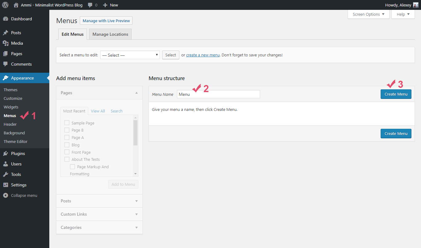
The first step of creating our menu is to open the WordPress Menu Editor. For this go to Appearance > Menus, type Name for your menu and click on the "Create Menu" button.
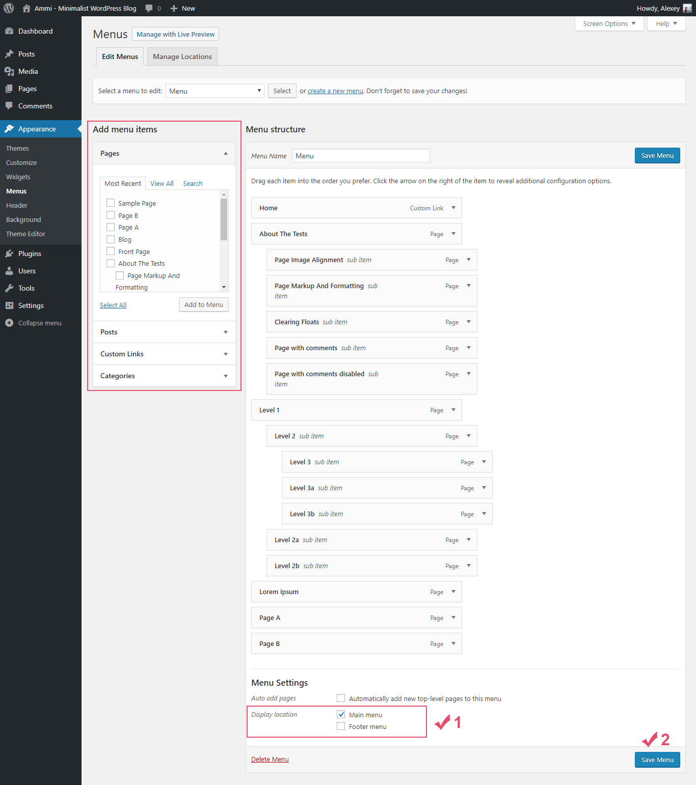
Once you've created the menu, the next step is to select the new menu as the "Main menu" (it is located in the main navigation container) or the "Footer menu" (it is located in the footer) in the "Display location" section.
Now you can add Pages, Posts, Custom Links, and Categories from blocks located on the left.
At the end you need to save your new menu by clicking the "Save Menu" button.
Widgets
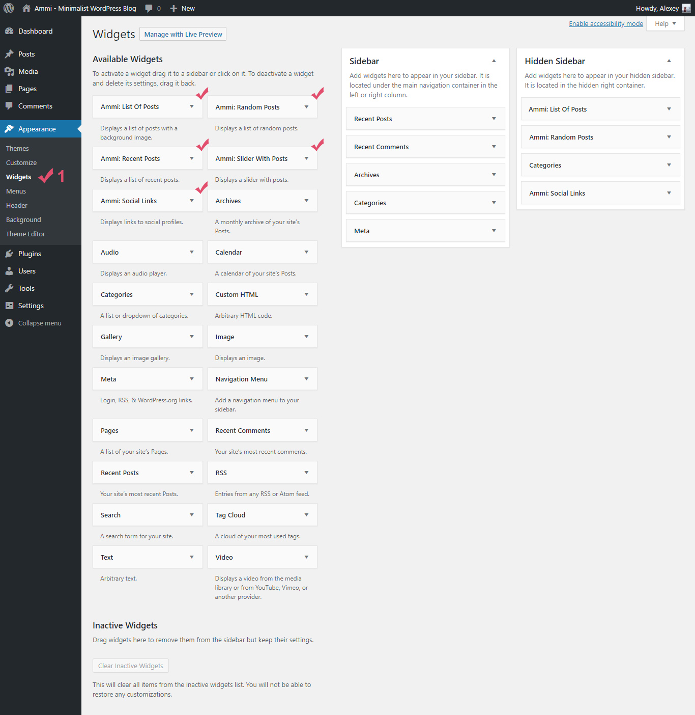
You can manage widgets on the Widgets page (Appearance > Widgets).
Available widget areas:
- Sidebar - It is located under the main navigation container in the left or right column;
- Hidden Sidebar - It is located in the hidden right container.
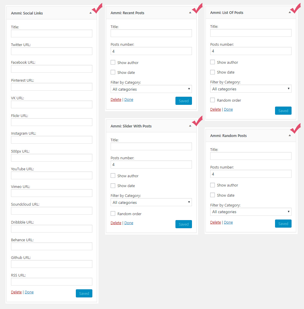
By default, you will have 17 standard widgets (the number of widgets may vary depending on the WordPress version). However, you can get 5 additional widgets. These widgets will be available after installing and activating the "Ammi Widgets" plugin - this is a recommended plugin, and you will be prompted to install it when installing the theme (Theme Installation > Step 1.5: Required and Recommended Plugins). This plugin includes the following widgets:
- Ammi: List Of Posts - Displays a list of posts with a background image;
- Ammi: Random Posts - Displays a list of random posts;
- Ammi: Recent Posts - Displays a list of recent posts;
- Ammi: Slider With Posts - Displays a slider with posts;
- Ammi: Social Links - Displays links to social profiles.
To activate them, all you need to do is drag widgets available on the left side and drop into the right sidebars on the right side.
Theme Customization
Theme options powered by WordPress Customizer. To find them, navigate to Appearance > Customize.
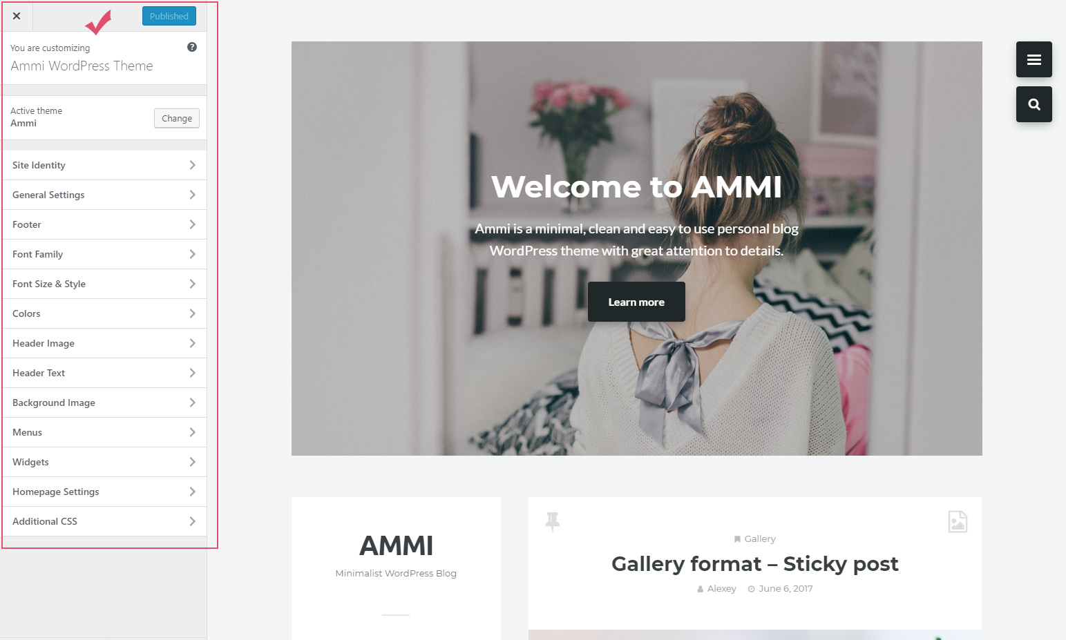
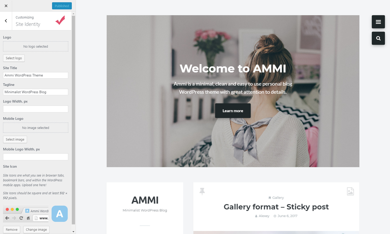
1. Site Identity
- Logo - here you can upload logo. For this option you need to select the Image logo type: Customize > General Settings > Main Navigation Container - Logo > Logo Type: Image. Note: make sure that your installed WordPress version is 4.5 or higher, because logo upload option will only work with WordPress 4.5 (or higher).
- Site Title - title for your site. It is displayed on the tab of your browser window.
- Tagline - tagline for your site. It is also displayed on the tab of your browser window and under the logo in the main navigation container.
- Logo Width, px - custom logo size.
- Mobile Logo - here you can upload logo for mobile devices. For this option you need to select the Image logo type: Customize > General Settings > Mobile Logo > Mobile Logo Type: Image.
- Mobile Logo Width, px - mobile logo size. Note: To make your logo look clear and good on mobile devices, I recommend using a double-resolution logo (2x) and in this field specify the value of the initial width of your logo. For example, your logo has the following dimension: 76 x 33 pixels. In this case, the dimension of the logo for upload will be 152 x 66 pixels and in the "Mobile Logo Width" field you should insert 76.
- Site Icon - upload your favicon image. Site icon should be square and at least 512 x 512 pixels.
2. General Settings
Homepage: Header image and Header text
- Show header image and header text only on the first page - enable this option if you want that this section appears only on the first page.
Hidden Sidebar & Fixed Buttons
- Show hidden sidebar - show/hide sidebar (this is a hidden sidebar on the right side of the page).
- Show search icon and dropdown search form - show/hide search icon and dropdown search form (it is located on the right side of the page).
- Show "Back to top" button - show/hide "Back to top" button.
Main Navigation Container
This container is located in the left or right sidebar. It includes logo, tagline, main menu, social links, and custom text.
Main Navigation Container - Logo
- Logo Type - choose between Text and Image options.
- Text for Logo (Logo Type: Text) - enter text for your logo.
Main Navigation Container - Social Links & RSS
- "Follow us" Text - text above social icons.
- Twitter URL - link to your Twitter profile.
- Facebook URL - link to your Facebook profile.
- Pinterest URL - link to your Pinterest profile.
- VK URL - link to your VKontakte profile.
- Flickr URL - link to your Flickr profile.
- Instagram URL - link to your Instagram profile.
- 500px URL - link to your 500px profile.
- YouTube URL - link to your YouTube profile.
- Vimeo URL - link to your Vimeo profile.
- Soundcloud URL - link to your Soundcloud profile.
- Dribbble URL - link to your Dribbble profile.
- Behance URL - link to your Behance profile.
- GitHub URL - link to your GitHub profile.
- RSS URL - link to RSS feed.
Main Navigation Container - Custom Text
- Custom Text - enter any text here. This text will be displayed at the bottom of the main navigation container. Here you can use the following HTML tags: <a>, <span>, <strong>, <b>, <em>, <i>, <br>. The following attributes are also allowed: <a>: href, title, target, class, rel; <span>: class; <i>: class.
Mobile Logo
- Mobile Logo Type - choose between Text and Image options.
- Text for Mobile Logo (Mobile Logo Type: Text) - enter text for your mobile logo.
Blog
- Blog Layout - choose a blog layout (Blog with Left sidebar or Right sidebar).
- Featured Image: Link Type - choose between "Link to post" and "Link to image" options.
- Use Excerpt or "Read More tag" - select the "Read More Tag" option if you want to use the "Read More" tag from your WordPress editor for creating excerpts for posts. Otherwise, all excerpts for posts will be created automatically.
- Excerpt Length (Number of Words) - length of automatic excerpts from posts (default value: 30).
- Increase all small featured images - enable this option if you want to scale small featured images.
- Enable hover effects when you hover on featured images - enable this option if you want to show effects when you hover on images: animation, transparent dark background, and icon.
- Show post format icon - show/hide post format icon.
- Show categories - show/hide categories.
- Show author - show/hide author.
- Show date - show/hide date.
- Show social share buttons - show/hide social share buttons.
- Show comments counter - show/hide comments counter.
- Show tags (single post page) - show/hide tags on the single post page.
- Show post navigation (single post page) - show/hide post navigation on the single post page.
- Show "About the author" block (single post page) - show/hide "About the author" section on the single post page.
- Show related posts (by tags; single post page) - show/hide related posts section on the single post page.
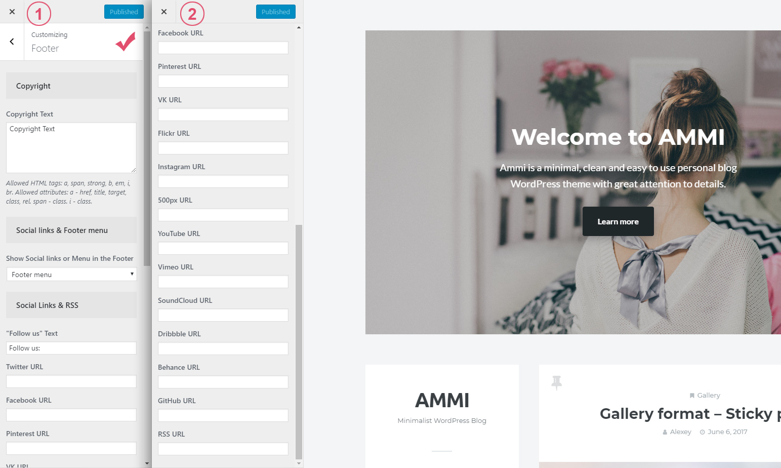
3. Footer
Copyright
- Copyright Text - enter your copyright information (or other text). Allowed HTML tags: <a>, <span>, <strong>, <b>, <em>, <i>, <br>. Allowed attributes: <a>: href, title, target, class, rel; <span>: class; <i>: class.
Social links & Footer menu
- Show Social links or Menu in the Footer - choose what to show in the footer: Social links or Footer menu.
Social Links & RSS
- "Follow us" Text - text before social icons.
- Twitter URL - link to your Twitter profile.
- Facebook URL - link to your Facebook profile.
- Pinterest URL - link to your Pinterest profile.
- VK URL - link to your VKontakte profile.
- Flickr URL - link to your Flickr profile.
- Instagram URL - link to your Instagram profile.
- 500px URL - link to your 500px profile.
- YouTube URL - link to your YouTube profile.
- Vimeo URL - link to your Vimeo profile.
- Soundcloud URL - link to your Soundcloud profile.
- Dribbble URL - link to your Dribbble profile.
- Behance URL - link to your Behance profile.
- GitHub URL - link to your GitHub profile.
- RSS URL - link to RSS feed.
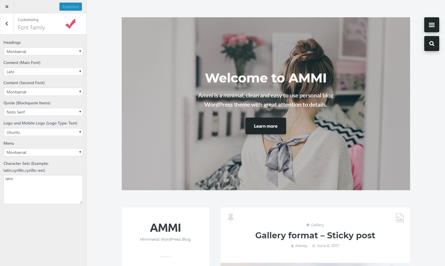
4. Font Family
- Headings - this font will be used for all headings: h1, h2, h3, h4, h5, h6 (default value: Montserrat).
- Content (Main Font) - this font will be used for all theme text. Exceptions: headings, metadata, quotes, logo, menu, tagline, and several text blocks (default value: Lato).
- Content (Second Font) - this font will be used for metadata (date, author, categories, tags, and counters), tagline, and for several text blocks (default value: Montserrat).
- Quote (Blockquote Items) - this font will be used for blockquote item (<blockquote> tag; default value: Noto Serif).
- Logo and Mobile Logo (Logo Type: Text) - this font will be used for your text logo (default value: Ubuntu).
- Menu - this font will be used for your main menu (default value: Montserrat).
- Character Sets - specify which subsets should be used. Multiple subsets must be separated with commas (,) and must be entered without spaces. Example: cyrillic,cyrillic-ext,latin-ext,vietnamese (default value: latin).
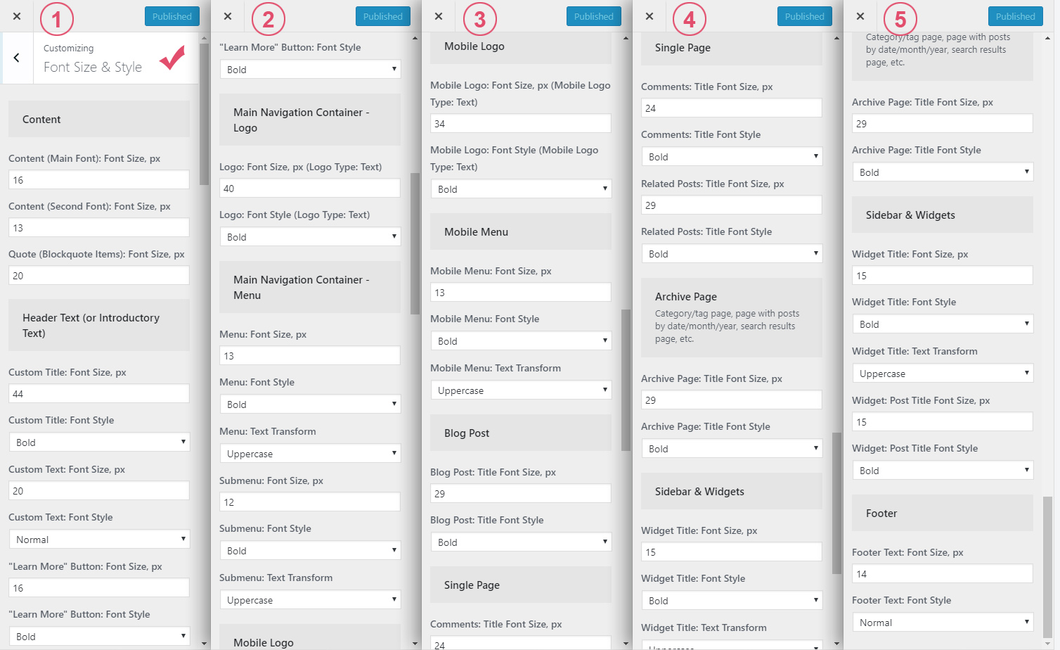
5. Font Size & Style
Content
- Content (Main Font): Font Size, px - default font size (default value: 16).
- Content (Second Font): Font Size, px - font size for metadata, tagline, and for several text blocks (default value: 13).
- Quote (Blockquote Items): Font Size, px - font size for blockquote item (<blockquote> tag; default value: 20).
Header Text (or Introductory Text)
- Custom Title: Font Size, px - font size for custom title (default value: 44).
- Custom Title: Font Style - font style for custom title (default value: Bold).
- Custom Text: Font Size, px - font size for custom text (default value: 20).
- Custom Text: Font Style - font style for custom text (default value: Normal).
- "Learn More" Button: Font Size, px - font size for "Learn More" button (default value: 16).
- "Learn More" Button: Font Style - font style for "Learn More" button (default value: Bold).
Main Navigation Container - Logo
- Logo: Font Size, px (Logo Type: Text) - font size for logo (default value: 40).
- Logo: Font Style (Logo Type: Text) - font style for logo (default value: Bold).
Main Navigation Container - Menu
- Menu: Font Size, px - font size for menu items (default value: 13).
- Menu: Font Style - font style for menu items (default value: Bold).
- Menu: Text Transform - text transform for menu items (default value: Uppercase).
- Submenu: Font Size, px - font size for submenu items (default value: 12).
- Submenu: Font Style - font style for submenu items (default value: Bold).
- Submenu: Text Transform - text transform for submenu items (default value: Uppercase).
Mobile Logo
- Mobile Logo: Font Size, px (Mobile Logo Type: Text) - font size for mobile logo (default value: 34).
- Mobile Logo: Font Style (Mobile Logo Type: Text) - font style for mobile logo (default value: Bold).
Mobile Menu
- Mobile Menu: Font Size, px - font size for menu items (default value: 13).
- Mobile Menu: Font Style - font style for menu items (default value: Bold).
- Mobile Menu: Text Transform - text transform for menu items (default value: Uppercase).
Blog Post
- Blog Post: Title Font Size, px - font size for post title (default value: 29).
- Blog Post: Title Font Style - font style for post title (default value: Bold).
Single Page
- Comments: Title Font Size, px - font size for comments title (default value: 24).
- Comments: Title Font Style - font style for comments title (default value: Bold).
- Related Posts: Title Font Size, px - font size for these two phrases: "You might also like" and "Posts from our blog" (default value: 29).
- Related Posts: Title Font Style - font style for the same phrases (default value: Bold).
Archive Page
- Archive Page: Title Font Size, px - font size for page title (default value: 29).
- Archive Page: Title Font Style - font style for page title (default value: Bold).
Sidebar & Widgets
- Widget Title: Font Size, px - font size for widget title (default value: 15).
- Widget Title: Font Style - font style for widget title (default value: Bold).
- Widget Title: Text Transform - text transform for widget title (default value: Uppercase).
- Widget: Post Title Font Size, px - font size for post title (default value: 15).
- Widget: Post Title Font Style - font style for post title (default value: Bold).
Footer
- Footer Text: Font Size, px - font size for footer text (default value: 14).
- Footer Text: Font Style - font style for footer text (default value: Normal).
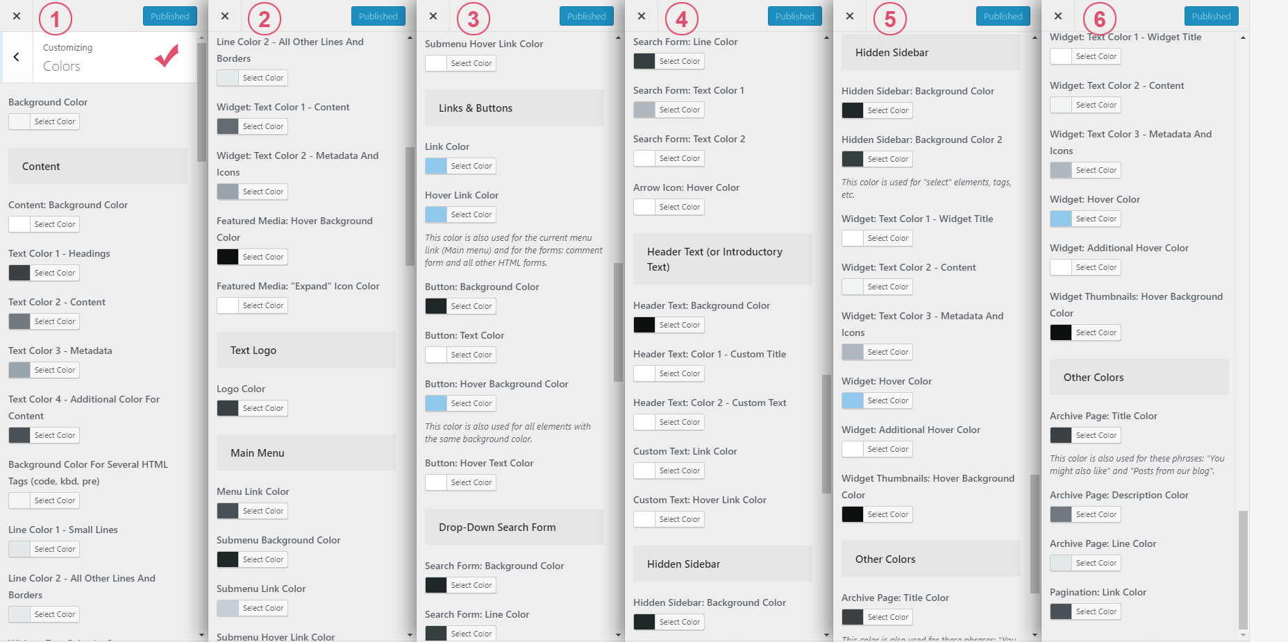
6. Colors
- Background Color - select your background color.
Content
- Content: Background Color - background color for all sections with content: blog posts, widget titles, etc.
- Text Color 1 - Headings - text color for all headings (h1, h2, h3, h4, h5, h6).
- Text Color 2 - Content - text color for content.
- Text Color 3 - Metadata - text color for metadata.
- Text Color 4 - Additional Color For Content - additional color for content (post navigation links, author's nickname, etc.).
- Background Color For Several HTML Tags (code, kbd, pre) - background color for <code>, <kbd>, <pre> tags.
- Line Color 1 - Small Lines - color for all small lines.
- Line Color 2 - All Other Lines And Borders - color for all other lines and borders.
- Widget: Text Color 1 - Content - text color for widget content.
- Widget: Text Color 2 - Metadata And Icons - second color for widget content: metadata and icons.
- Featured Media: Hover Background Color - hover background color for featured media (featured image / gallery images).
- Featured Media: "Expand" Icon Color - color for "Expand" icon.
Text Logo
- Logo Color - text color for logo (only if you are using a simple text logo).
Main Menu
- Menu Link Color - link color for menu items.
- Submenu Background Color - background color for submenu section.
- Submenu Link Color - link color for submenu section.
- Submenu Hover Link Color - link color for submenu section on hover.
Links & Buttons
- Link Color - text color for links. Exceptions: all links that have their own color (for example: post title, read more link, etc.).
- Hover Link Color - hover color for all links. This color is also used for the current menu link (Main menu) and for the forms: comment form and all other HTML forms.
- Button: Background Color - background color for buttons.
- Button: Text Color - text color for buttons.
- Button: Hover Background Color - background color for buttons on hover. This color is also used for all elements with the same background color, for example: current page number, current date in calendar, etc.
- Button: Hover Text Color - text color for buttons on hover.
Drop-Down Search Form
- Search Form: Background Color - background color for search form.
- Search Form: Line Color - color for bottom line.
- Search Form: Text Color 1 - text color for "Enter your search query..." phrase and arrow icon.
- Search Form: Text Color 2 - text color for search query.
- Arrow Icon: Hover Color - hover color for arrow icon.
Header Text (or Introductory Text)
- Header Text: Background Color - background color for introductory text section.
- Header Text: Color 1 - Custom Title - color for custom title.
- Header Text: Color 2 - Custom Text - color for custom text.
- Custom Text: Link Color - link color.
- Custom Text: Hover Link Color - hover link color.
Hidden Sidebar
- Hidden Sidebar: Background Color - background color for hidden sidebar.
- Hidden Sidebar: Background Color 2 - second background color for hidden sidebar. This color is used for "select" elements, tags, search form, etc.
- Widget: Text Color 1 - Widget Title - text color for widget title.
- Widget: Text Color 2 - Content - text color for widget content.
- Widget: Text Color 3 - Metadata And Icons - text color for metadata and icons.
- Widget: Hover Color - hover color for links.
- Widget: Additional Hover Color - additional hover color for text. It is used for tags, buttons, etc.
- Widget Thumbnails: Hover Background Color - hover background color for thumbnails.
Other Colors
- Archive Page: Title Color - text color for page title.
- Archive Page: Description Color - text color for page description: category description, tag description, etc.
- Archive Page: Line Color - color for small line under page title.
- Pagination: Link Color - color for pagination links.
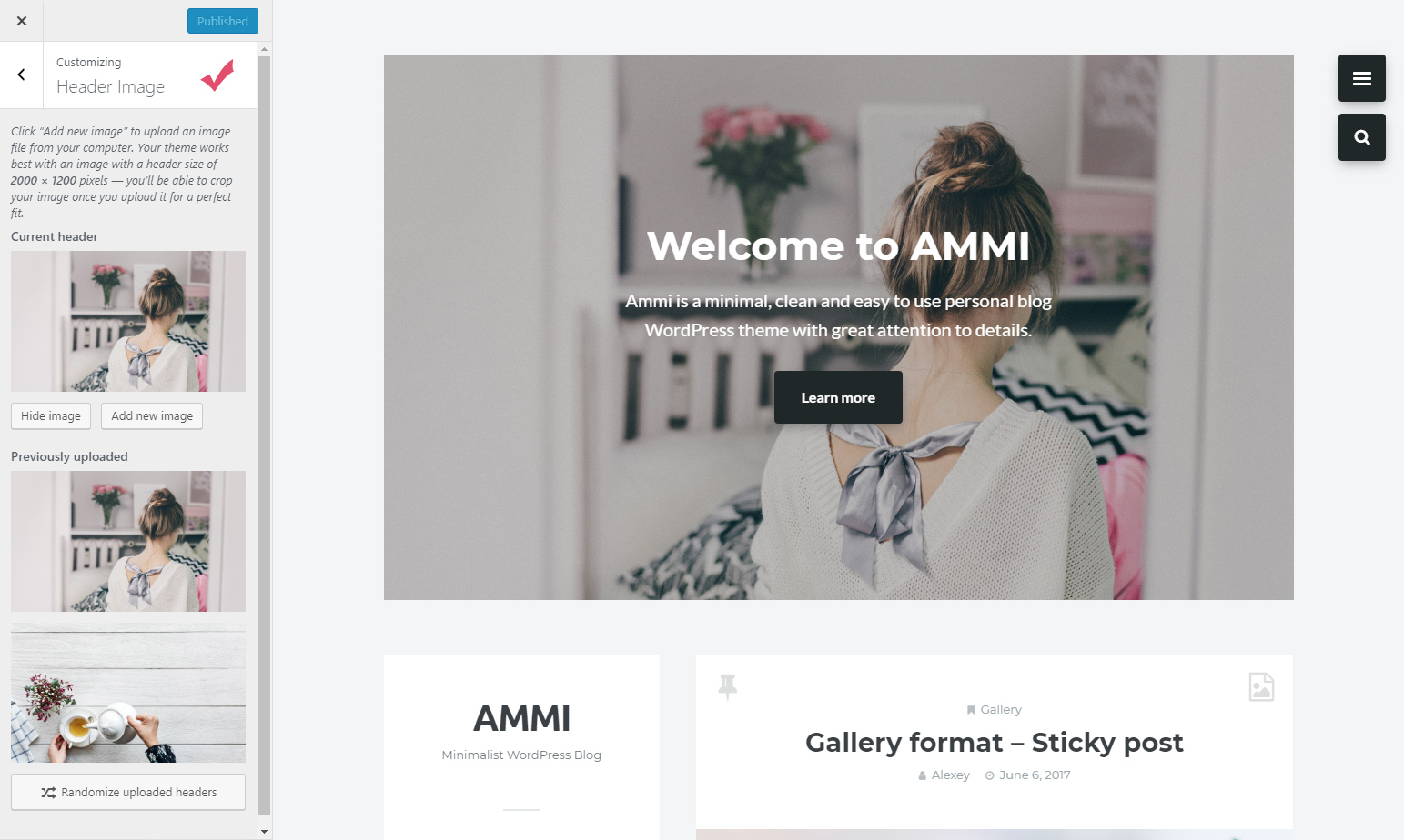
7. Header Image
- Current header - here you can upload an image for the header. You can also add some text for this image in the "Header Text" section: Customize > Header Text. Note: The section with the header image will be displayed only on the homepage.
8. Header Text
- Custom Title - enter a short title for your site. You can use the following HTML tags: <span>, <strong>, <b>, <em>, <i>. The following attributes are also allowed: <span>: class; <i>: class.
- Custom Text - enter a brief description of your site. You can use the following HTML tags: <a>, <span>, <strong>, <b>, <em>, <i>, <br>. The following attributes are also allowed: <a>: href, title, target, class, rel; <span>: class; <i>: class.
- Button: Text - text for button.
- Button: URL - URL for button.
- Button: Target - choose where to open your URL: New tab (_blank) or Current tab (_self).

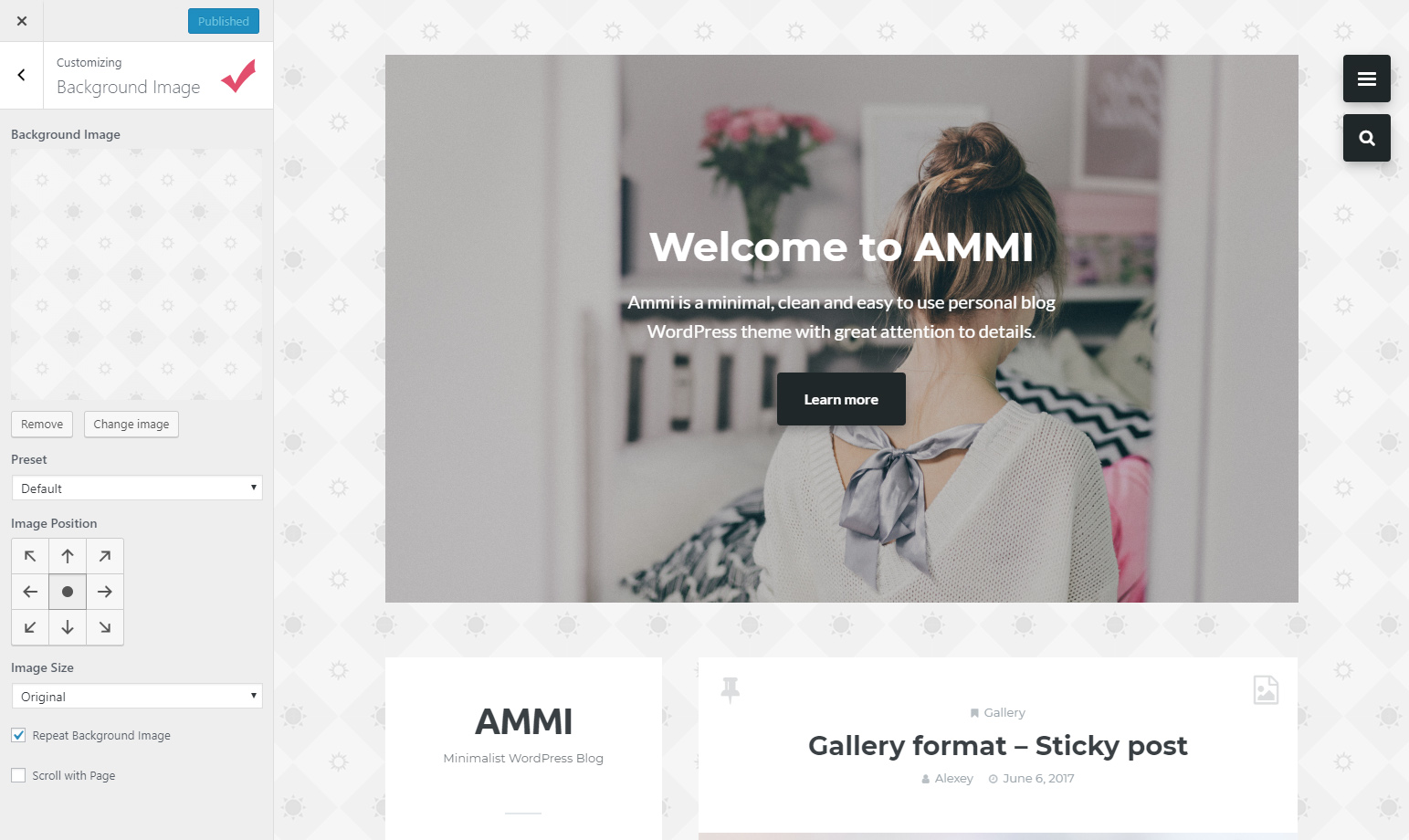
9. Background Image
- Background Image - here you can upload your image for background.
- Preset - select one of the preset image positioning options: default, fill screen, fit to screen, repeat, or custom.
- Image Position - position for background image.
- Image Size - select one of the image size options: original, fit to screen, or fill screen.
- Repeat Background Image - repeat background image or not.
- Scroll with Page - scroll background image with page or not.
10. Additional CSS
- Here you can add your own CSS code. This setting is necessary if you want to change something on your site that is not available in theme options, for example: font size, font style, color, margin, or some other customization.

Translation
To translate this theme, I recommend using the .mo and .po files. These files work in pairs, so for each language you need to have 2 files with the same name but a different extension. For example, if you want to translate the theme into Turkish, you need to create 2 files called tr_TR.mo and tr_TR.po.
As you already understood, first you need to create these 2 files. For this you need to use Poedit software which is very easy to use. You can download it here. After installation Poedit software, you need to run it. In Poedit go to File > New from POT/PO file..., select and open the .pot file from the "languages" folder: "/languages/ammi.pot". After that you just need to select your language, add translation, and save your changes.
Now you have .mo and .po files with your translation, and all you need to do is upload these both files into the "languages" folder on your server: "/wp-content/themes/ammi/languages/". Also do not forget to change the language of your site in the WordPress settings: Settings > General > Site Language.
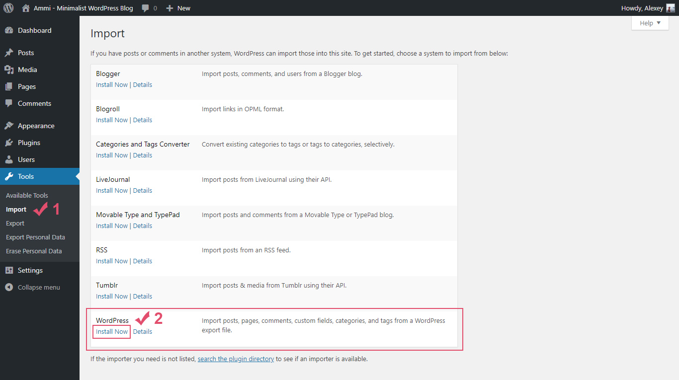
Importing Demo Data
In the main theme files you can find a folder called "Demo Content". This folder contains the ammi-demo-data.xml file with demo data. You can use it to import demo data to your site. To do this, you need to perform a few simple steps:
Step 1. Navigate to Tools > Import.
Step 2. Now you need to install the "WordPress Importer" plugin. To do this, click the "Install Now" link.
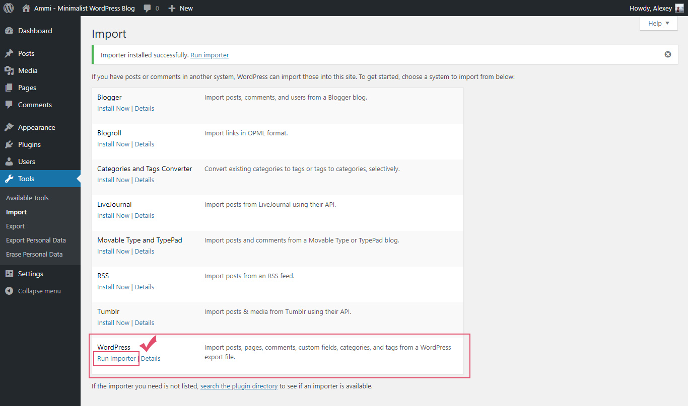
Step 3. After the installation is complete, click the "Run Importer" link.
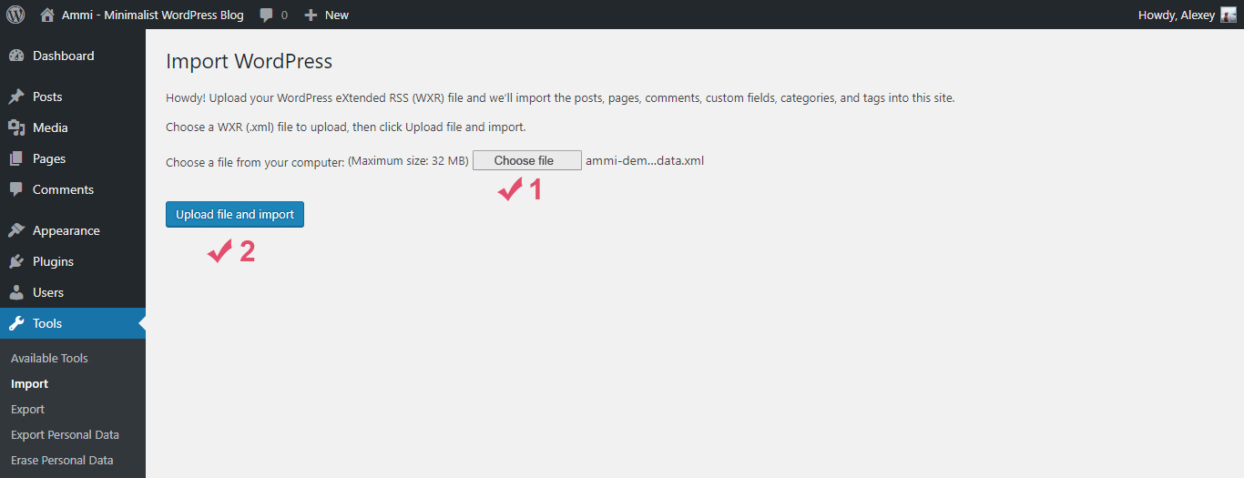
Step 4. Next, click on the "Choose file" button and select the ammi-demo-data.xml file from the "Demo Content" folder (Ammi Theme/Demo Content/ammi-demo-data.xml).
Step 5. Click the "Upload file and import" button.
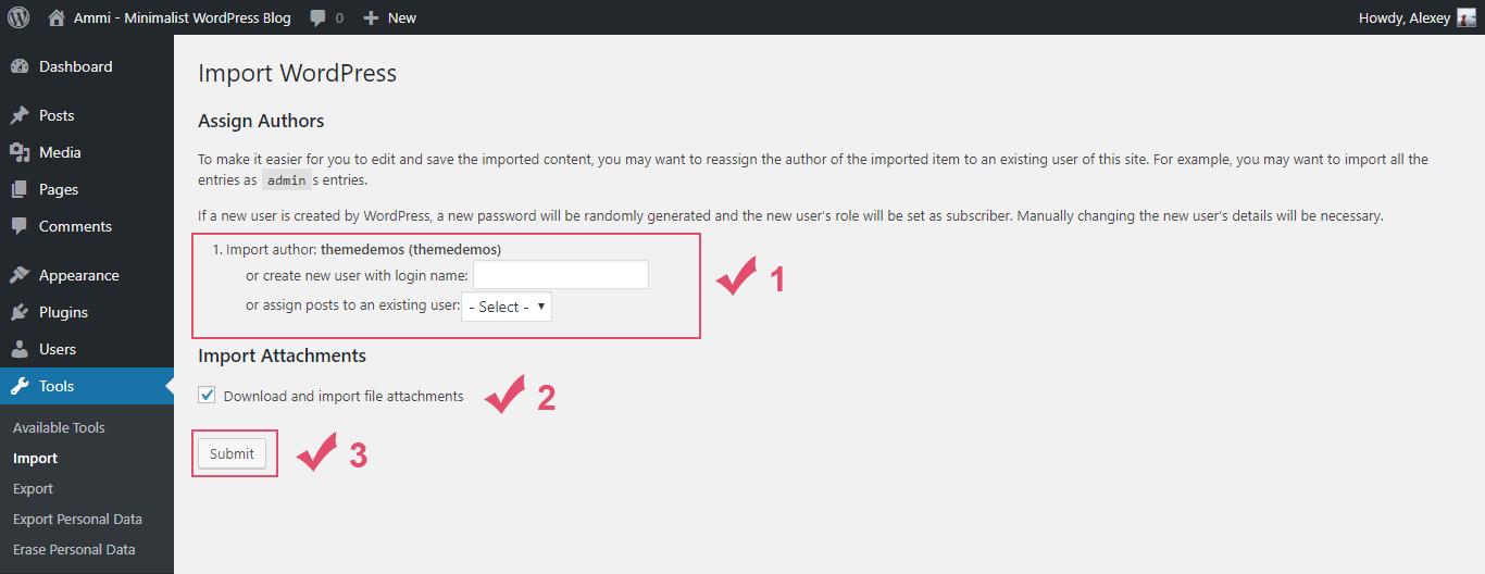
Step 6. After you will then be offered to Assign Authors. You can read the description at the top as this explains everything.
Step 7. Check the box "Download and import file attachments". This will download attachments for images included in the live preview demo.
Step 8. Click the "Submit" button.
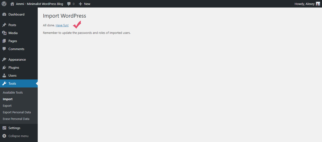
Now you need to wait for the importer to finish. This might take a few minutes depending on your hosting server speed.
Popular Questions
Question 1. Does the theme support RTL?
Unfortunately not. The theme does not support RTL.
Question 2. Is this theme compatible with WooCommerce?
Unfortunately not. This is a simple blog theme.
Question 3. When installing the theme, I see this error message - "The package could not be installed. The theme is missing the style.css stylesheet". How to fix it?
A common issue that can occur with users new to installing WordPress themes is a "Broken theme and/or stylesheets missing" error message being displayed when trying to upload or activate the theme. This error message does not mean that the theme you have purchased is broken, it simply means it has been uploaded incorrectly. Luckily, there is a very easy fix: https://help.market.envato.com/hc/en-us/articles/202821510.
Question 4. My posts do not appear on my homepage. Why so?
You just need to activate the following option in your WordPress settings: Settings > Reading > Your homepage displays > select "Your latest posts". After that, do not forget to save the settings.
Question 5. Some images on my site are displayed incorrectly. What is the problem and how to fix it?
Usually this problem occurs if you install the theme on an already existing site that already has its own library with images. Some theme elements (for example, widgets) use images with specific dimensions. If your site already had images before installing this theme, then you simply do not have copies of all these images with the required dimensions. In this case, your site will have a small problem with the images. You have two ways to fix this problem:
1. Very simple way. You just need to rebuild all thumbnails on your site. To do this, you can use a plugin called AJAX Thumbnail Rebuild: https://wordpress.org/plugins/ajax-thumbnail-rebuild/. Note: I recommend choosing all possible sizes when you will start rebuilding your images. Once the plugin has completed its work, you can deactivate it and remove it.
2. Long way. You need to re-upload each of your images to your site (WordPress Dashboard > Media > Upload New). In this case, WordPress will automatically create the necessary dimensions for this theme. After that you need to manually replace your old images with the new ones in all your posts (Featured Image section).
After all these steps you need to clear your browser's cache and update your site's cache (if you have a plugin for this).
Question 6. How to change the number of displayed posts on the homepage (and on all other archive pages)?
You can easily change the number of displayed posts in your WordPress settings: WordPress Dashboard > Settings > Reading > Blog pages show at most ... posts.
Support and Feedback
All questions you can send via the contact form HERE.
I respond to all emails from Monday to Friday within 24-48 hours in the order in which they were received. My time zone is GMT+3.
Please don't panic if I don't reply for a long time - I really love everyone who uses my WordPress themes, and I will definitely answer all your questions! ;)
What's included in item support:
- Answering questions about how to use the item;
- Answering technical questions about the item (and included third party assets);
- Help with defects in the item or included third party assets;
- Item updates to ensure ongoing compatibility and to resolve security vulnerabilities.
What's not included in item support:
- Item customization;
- Installation of the item;
- Hosting, server environment, or software;
- Support for third party plugins;
- Plugins integration;
- WordPress general support (use WordPress forums for this);
- Support for issues caused by user modifications in the theme's code, styling, and general functionality.
Credits
Thanks so much:
- Bootstrap (v3.4.1) - Bootstrap is the most popular HTML, CSS, and JS framework for developing responsive, mobile first projects on the web.
- jQuery - jQuery is a fast, small, and feature-rich JavaScript library. It makes things like HTML document traversal and manipulation, event handling, animation, and Ajax much simpler with an easy-to-use API that works across a multitude of browsers.
- jQuery Superfish Menu Plugin from Joel Birch - Superfish is a jQuery plugin that adds usability enhancements to existing multi-level drop-down menus.
- OWL Carousel (v1.3.3) - Touch enabled jQuery plugin that lets you create beautiful responsive carousel slider.
- Magnific Popup from Dmitry Semenov - Magnific Popup is a responsive lightbox and dialog script with focus on performance and providing best experience for user with any device.
- html5shiv.js from Alexander Farkas - The HTML5 Shiv enables use of HTML5 sectioning elements in legacy Internet Explorer and provides basic HTML5 styling for Internet Explorer 6-9, Safari 4.x (and iPhone 3.x), and Firefox 3.x.
- Respond.js from Scott Jehl - A fast & lightweight polyfill for min/max-width CSS3 Media Queries (for IE 6-8, and more).
- Font Awesome (v4.7.0) - Get vector icons and social logos on your website with the web's most popular icon set and toolkit.
- WordPress Meta Box Plugin - Meta Box is a powerful, professional, and lightweight toolkit for developers to create unlimited custom meta boxes and WordPress custom fields.
- TGM Plugin Activation - TGM Plugin Activation is a PHP library that allows you to easily require or recommend plugins for your WordPress themes (and plugins).
- Blank WordPress Pot from Fx Bénard - Blank WordPress Pot allows developers to have a great starting point for their translations' pot files and translators an explanation how to use the file.
- Google Fonts - Montserrat, Lato, Ubuntu, and Noto Serif.
Images in the demo:
- Pexels - The best free stock photos & videos shared by talented creators.
- picjumbo - Beautiful FREE stock photos.
- Unsplash - Beautiful, free photos. Gifted by the world's most generous community of photographers.