Theme Installation
To install this theme you must have a working version of WordPress. Make sure that your installed WordPress version is 4.5 or higher.
If you need help by installation of WordPress, follow the instructions in WordPress Codex. Also here you can download the latest version of WordPress.
Downloading
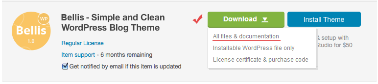
At first, after purchasing this theme please download the package from ThemeForest (to do this you must be logged in ThemeForest). Move your mouse over your ThemeForest login name in right top corner and then click Download. On the Downloads page you will find all the items that you have purchased. This theme will also be here.
In the next step click the Download All files & documentation button and save package on your computer.
Please unpack the entire package after downloading.
The Main Files includes the following files and folders:
- Demo Content folder - contains demo data file
- theme-data.xml
- Documentation folder - contains this document
- bellis.zip - Bellis theme (ZIP archive for installation)
- Changelog.txt - changelog text file
- Readme.txt - some information about folders and files in the package
Installation
You can install this theme in two different ways:
- WordPress Theme Manager (installing from the WordPress Dashboard)
- FTP upload
1. WordPress Theme Manager
1.1 Go to Themes Page
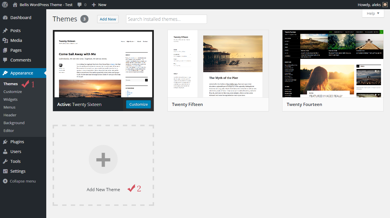
Step 1. Login to your WordPress admin page.
Step 2. Navigate to Appearance Themes.
Step 3. Press Add New button.
1.2 Upload Theme
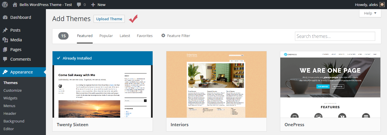
Step 4. Press Upload Theme button.
1.3 Upload Theme ZIP File
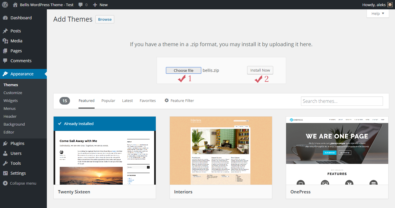
Step 5. Press Choose file button and select the theme zip file (bellis.zip).
Step 6. Then press Install Now button.
The installation process starts...
1.4 Activate Theme
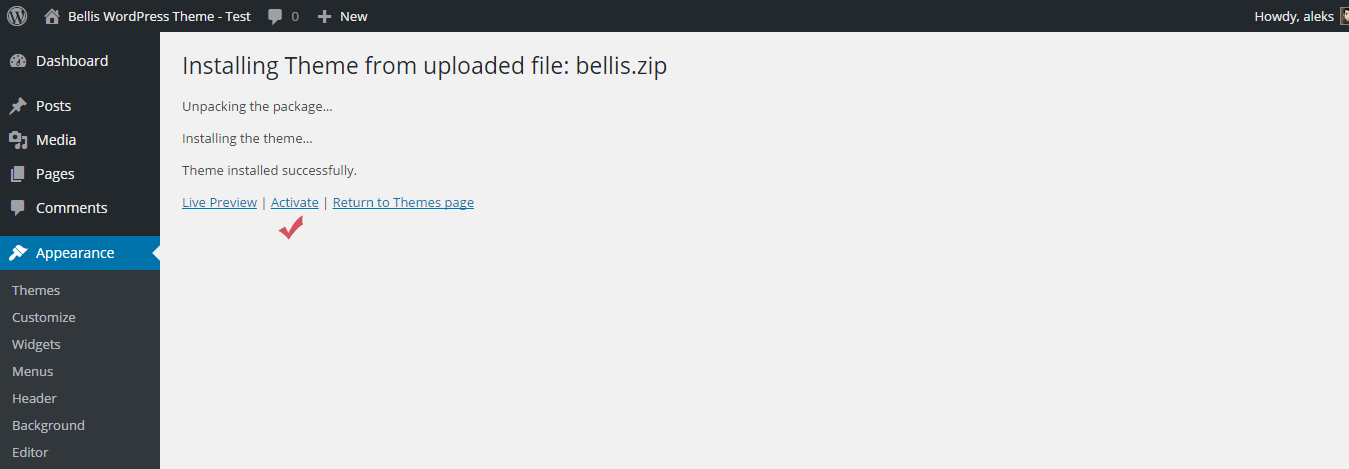
Step 7. After the installation is complete, click Activate the theme.
1.5 Required Plugin

Step 8. The theme is now activated. You should now install and activate the required plugin by clicking on Begin installing plugin on top of the screen.
1.6 Plugin Installation
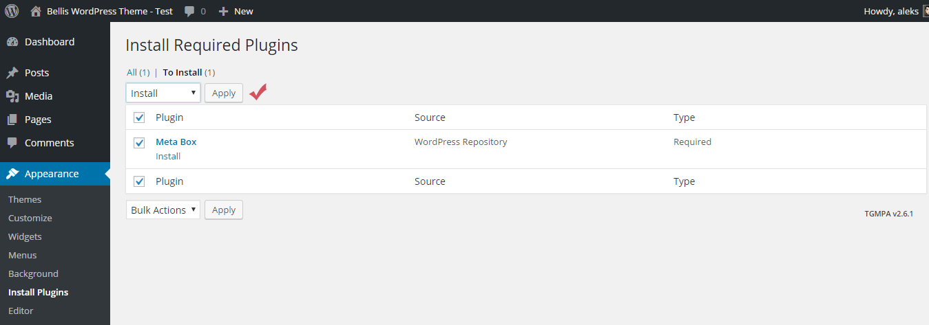
Step 9. Choose the Meta Box plugin and then choose Install from the dropdown menu. Press Apply button to continue the installation.
1.7 Installation Complete
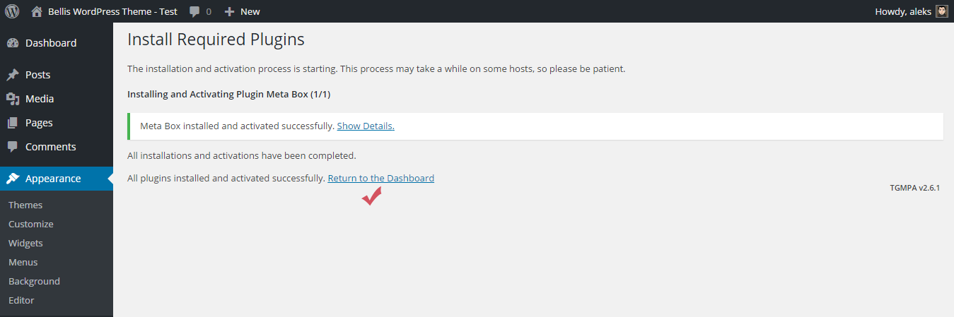
After the installation is complete, click on Return to the Dashboard.
1.8 Reading Settings
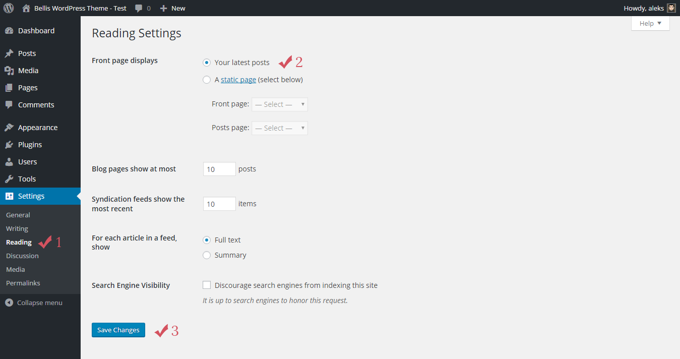
Step 10. Navigate to Settings Reading Front page displays and choose "Your latest posts" option.
Step 11. Press Save Changes button.
2. Installing by FTP
If you have any problems with installing the theme from the WordPress Dashboard (for example, you see this error: "The uploaded file exceeds the upload_max_filesize directive in php.ini"), then you need to install it via FTP.
For this you need to upload non-zipped theme folder called bellis to /wp-content/themes/ folder in your WordPress installation folder on your server.
Next, login to your WordPress admin page and activate the theme (Appearance Themes).
After the successful activation see Step 1.5 of this documentation.
How to Update Bellis
In this part of the guide describes how to update Bellis. Just follow these seven steps:
Step 1. At first, you need to download the latest package from ThemeForest.
Step 2. Unpack the entire package after downloading.
Step 3. Next, please unpack the archive with the theme: bellis.zip.
Step 4. After that you need to remove the bellis folder from your server (/wp-content/themes/bellis). For this you can use any FTP client, for example, FileZilla.
Step 5. Then you need to upload non-zipped bellis folder to /wp-content/themes/ folder in your WordPress installation folder on your server.
Step 6. Next, login to your WordPress admin page and install required plugins (if it is necessary). You will see a notification about this.
Step 7. Clear your browser's cache, and update plugins cache (if you have caching plugins).
Remember, that all your data in the database are safe because after updating theme files does not change anything in the database. Please also always make a backup of your files before you overwrite them with the new.
If you have made changes in the files, then after updating all your changes will be lost.
Creating Blog Posts
To create a blog, first make sure that on the front page displays your latest posts. For this navigate to Settings Reading Front page displays and choose "Your latest posts" option. After that you can create new blog posts.
Adding new posts works similar to standard WordPress Posts Add New. All posts will be displayed on the front page.
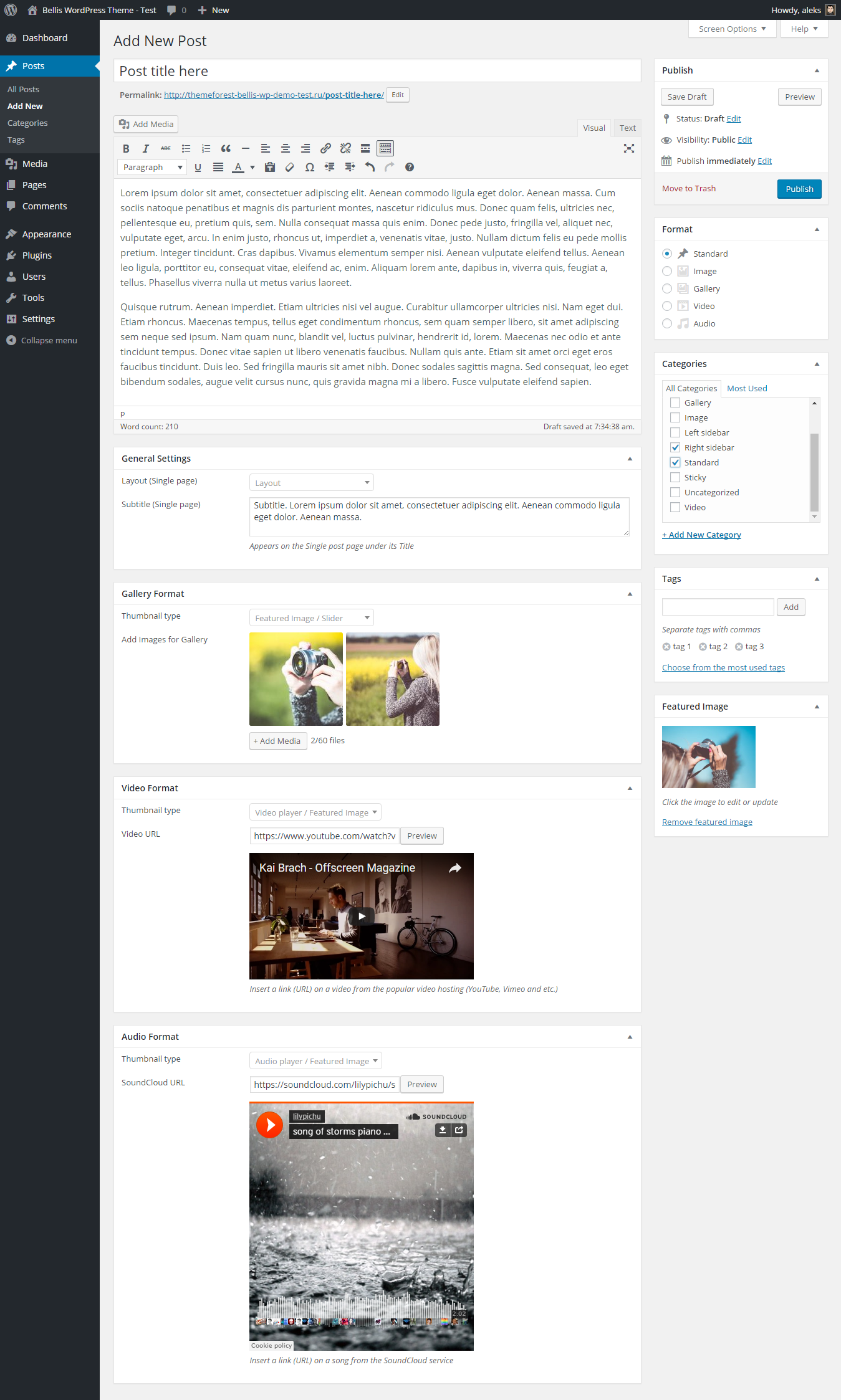
With this theme you can use 5 post formats: standard, image, gallery, video, and audio. Here's a quick overview of them:
Standard Post Format.
When writing or editing a post, Standard is used to designate that no Post Format is specified. However for this format you can add an image (Featured Image section). This image will be displayed at the top of your post. Also in the bottom of the page you will find General Settings, where you can select Layout and add Subtitle for this post. The same can be done for all other post formats.
Image Post Format.
For this format you can also add an image (Featured Image section), and this image will be displayed at the top of your post.
Gallery Post Format.
The gallery format gives you additional settings for creating images gallery. These settings you can find in the bottom of the page (Gallery Format section). To create a gallery, press + Add Media button, and then select or upload images. Recommendation: these images must have the same dimensions.
Video Post Format.
You can also create a video post. When you select the Video format, in the bottom of the page you will see additional settings for this format (Video Format section). Here you can add a link (URL) to your video. The theme will then check the URL and display the video at the top of your post. If no video is displayed then you will have used the wrong URL. Make sure the URL you take is directly from your browser navigation bar when viewing a video on YouTube, Vimeo, etc.
Audio Post Format.
For the Audio format additional settings are also available. These settings you can find in the bottom of the page (Audio Format section). Here you can add a link (URL) on a song from SoundCloud service. The theme will then check the URL and display the audio at the top of your post. Make sure the URL you take is directly from your browser navigation bar when viewing a song on SoundCloud.
You can also select the type of thumbnail for the gallery, video, and audio formats. This setting determines what will be displayed on the blog page: featured image, slider (Gallery format), video player (Video format), audio player (Audio format).
Below you can see the "Add New Post" page.
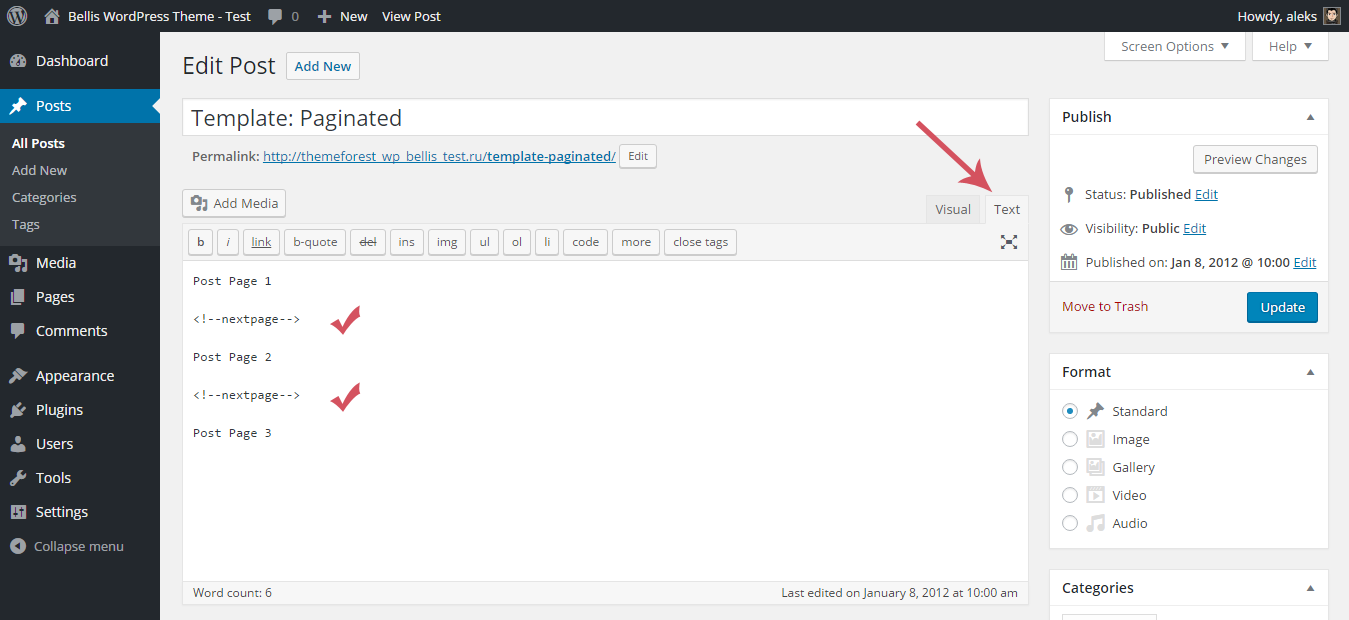
You can also add pagination to a single post page. For this you need to use <!--nextpage--> quicktag. Just add it to your text editor where you want to start a new page. Here you can see how it looks.
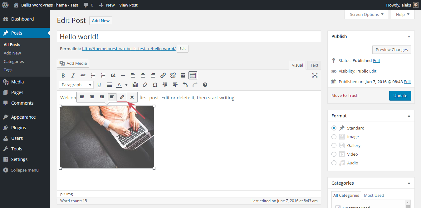
On the live preview demonstration you can see popup images on single posts pages. You can also easily do the same with your images.
Step 1. At first, you need to add an image into the Post Editor. Press Add Media button on the top left of your Post Editor and select an image you want to add.
Step 2. Hover your mouse over the image and click the Edit icon.
Step 3. From the Link To drop-down menu select Media File.
Step 4. Next, click the ADVANCED OPTIONS link.
Step 5. Add the following class to the Link CSS Class field: bwp-popup-image
Step 6. Press Update button.
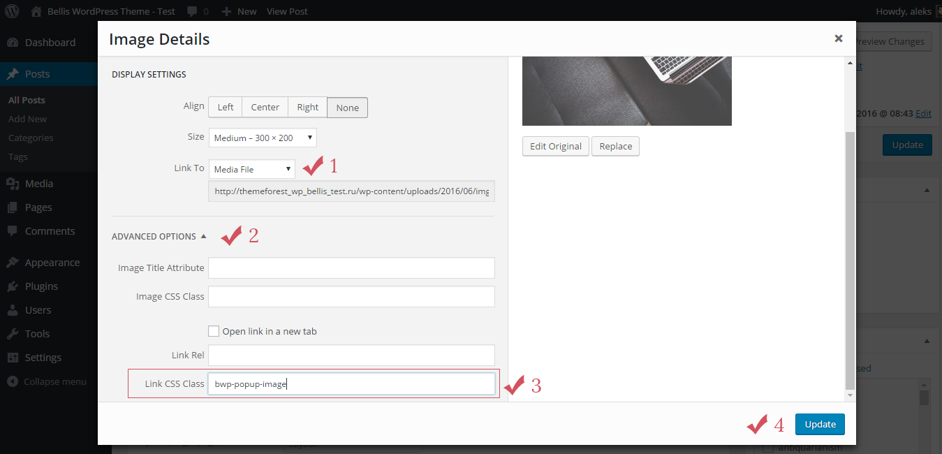
After completing these steps your image also can be opened in a popup window.
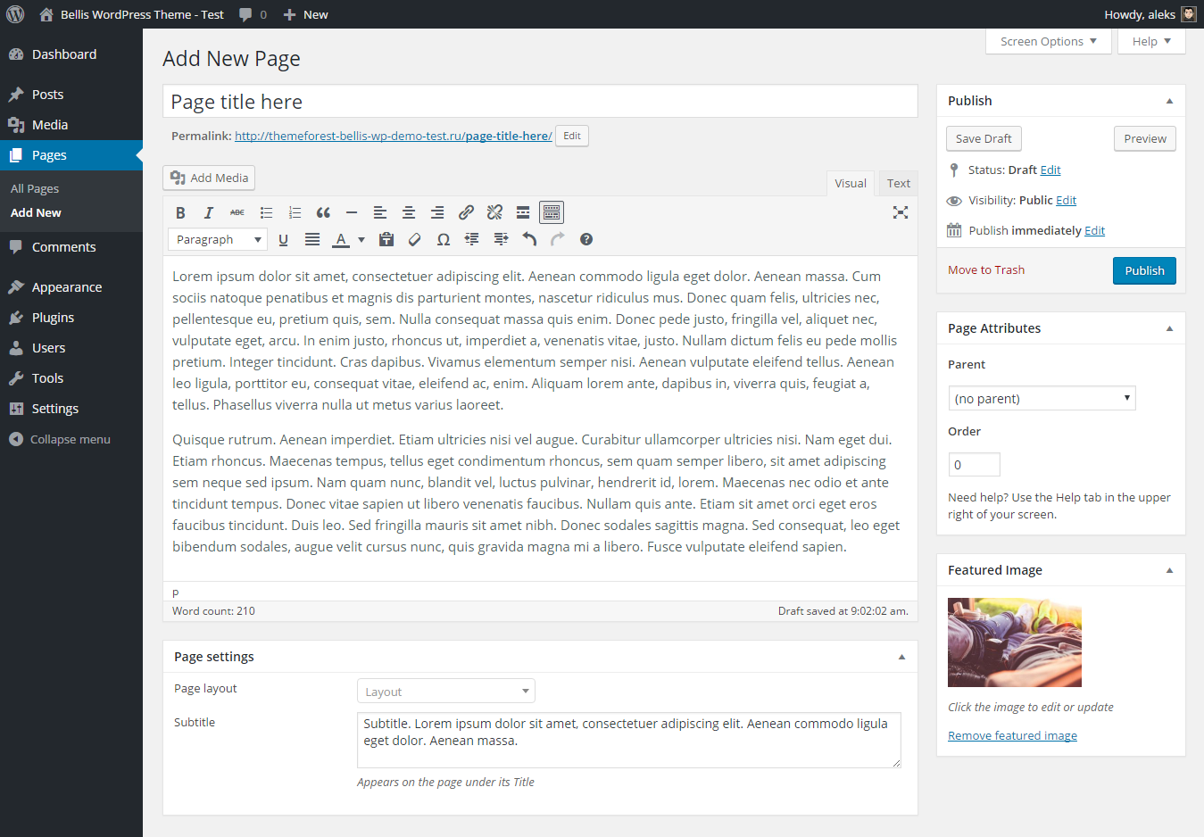
Creating Pages
Adding new pages works similar to standard WordPress Pages Add New. In bottom section you will find Page settings such as Layout and Subtitle. So here you can choose how your page will look: it can be with the sidebar (left or right), or without the sidebar (full width layout).
You can also add an image to your page (Featured Image section).
Creating Menus
The first step of creating our menu is to open the WordPress Menu Editor. For this go to Appearance Menus, type Name for your menu and press Create Menu button.
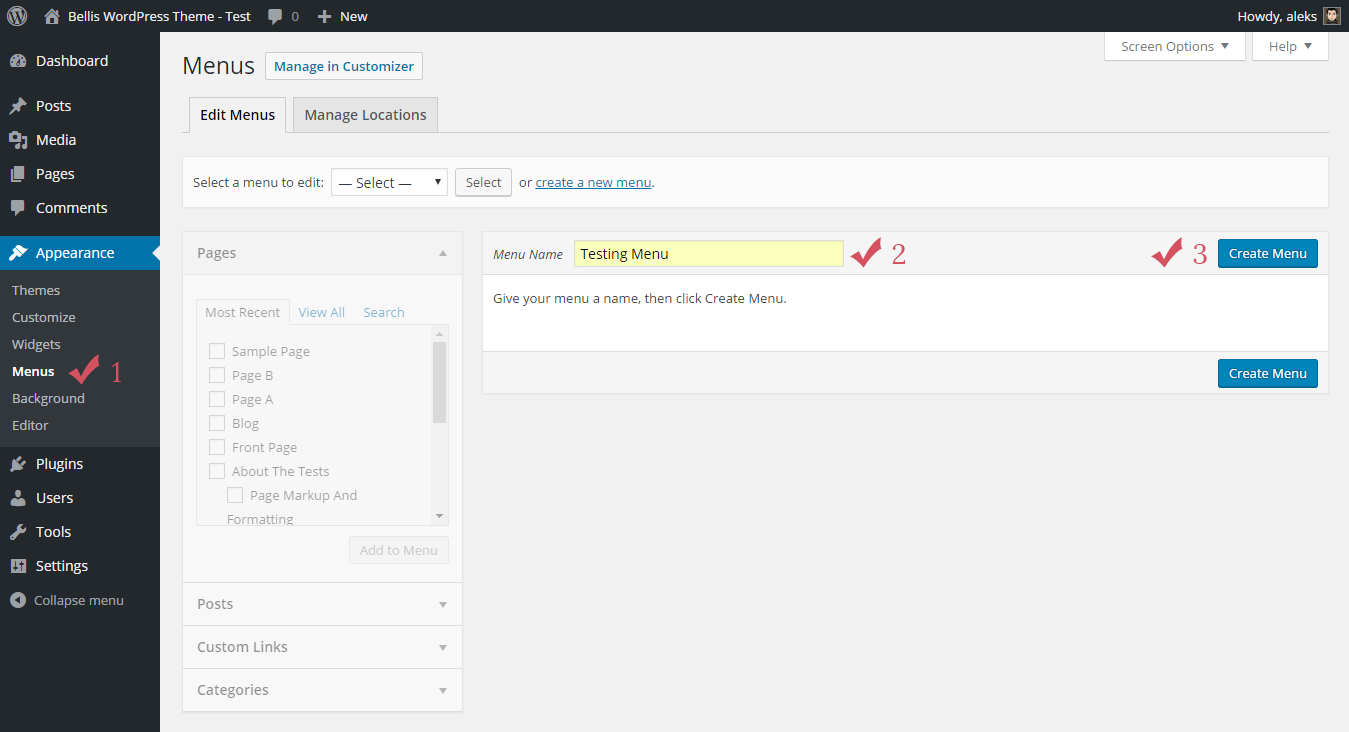
Next, in section Theme locations for position Main menu you need to choose a menu that you've just created.
Now you can add Pages, Posts, Custom Links and Categories from blocks located on the left.
At the end you need to save your new menu by clicking on Save Menu.

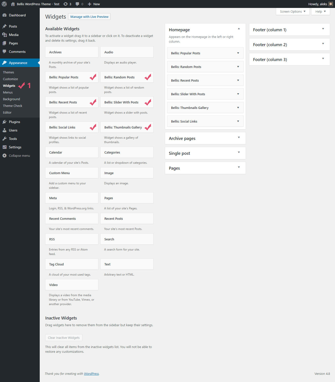
Widgets
You can manage widgets on the Widgets page (Appearance Widgets).
Available widget areas:
- Homepage
- Archive pages
- Single post page
- Pages
- Footer (column 1)
- Footer (column 2)
- Footer (column 3)
This theme includes 6 new widgets but in total you have 21 different widgets to use.
New widgets:
- Popular Posts - Widget shows a list of popular posts
- Random Posts - Widget shows a list of random posts
- Recent Posts - Widget shows a list of recent posts
- Slider With Posts - Widget shows a slider with posts
- Social Links - Widget shows links to social profiles
- Thumbnails Gallery - Widget shows a gallery of thumbnails
To get them, all you need to do is drag widgets available on the left side and drop into the right sidebars on the right side.

Theme Customization
Theme options powered by WordPress' Customizer. To find them, Navigate to Appearance Customize.
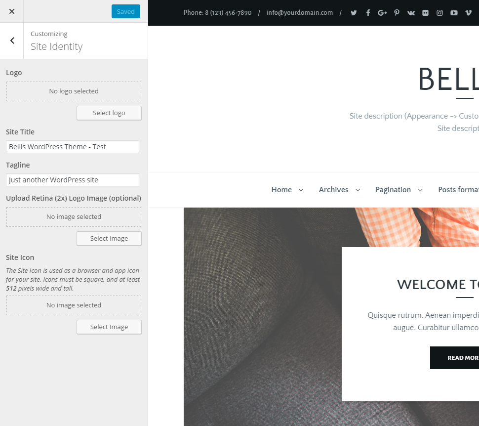
1. Site Identity
- Logo - here you can upload logo. For this option you need to select the Image logo type: Customize Header Logo Area Logo type: Image
- Site Title - title for your site. It is displayed in the window / tab of your browser
- Tagline - tagline for your site. It is also displayed in the window / tab of your browser
- Upload Retina (2x) Logo Image (optional) - here you can upload Retina logo. Note: Retina logo should be always 2x larger than regular logo (this field is optional)
- Site Icon - upload your favicon image. Icon must be square, and at least 512 pixels wide and tall
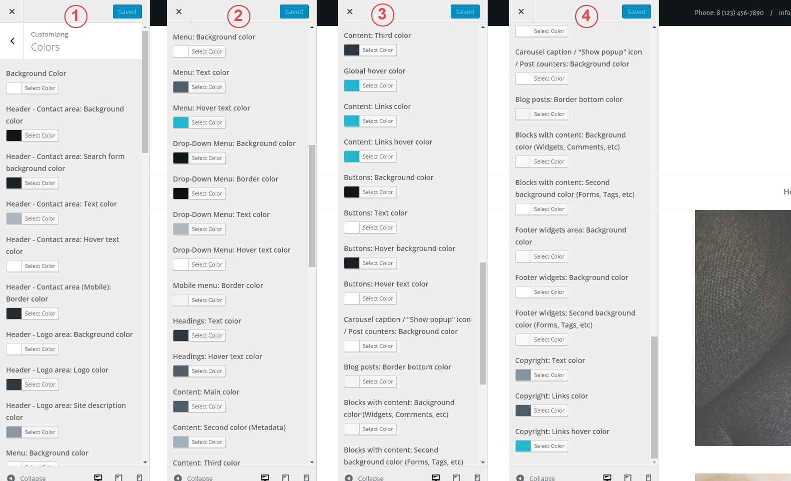
2. Colors
- Background Color - select your background color
- Header - Contact area: Background color - background color for contact section
- Header - Contact area: Search form background color - background color for search form
- Header - Contact area: Text color - text color for contact section
- Header - Contact area: Hover text color - text color for contact section on hover
- Header - Contact area (Mobile): Border color - line color for contact section on mobile devices
- Header - Logo area: Background color - background color for logo section
- Header - Logo area: Logo color - text color for logo (only if you are using a simple text logo)
- Header - Logo area: Site description color - text color for site description
- Menu: Background color - background color for menu section
- Menu: Text color - text color for menu items
- Menu: Hover text color - text color for menu items on hover
- Drop-Down Menu: Background color - background color for submenu
- Drop-Down Menu: Border color - border color for submenu items
- Drop-Down Menu: Text color - text color for submenu
- Drop-Down Menu: Hover text color - text color for submenu on hover
- Mobile menu: Border color - border color for mobile menu
- Headings: Text color - text color for all headings (h1, h2, h3, h4, h5, h6)
- Headings: Hover text color - text color for posts headings on hover
- Content: Main color - text color for content
- Content: Second color (Metadata) - text color for metadata (publication date, post categories, comments counter, etc)
- Content: Third color - the third color for content (author's name, navigation inside a post, labels on comment form)
- Global hover color - global hover color for links
- Content: Links color - text color for links located inside a post
- Content: Links hover color - hover color for links located inside a post
- Buttons: Background color - background color for buttons
- Buttons: Text color - text color for buttons
- Buttons: Hover background color - background color for buttons on hover
- Buttons: Hover text color - text color for buttons on hover
- Carousel caption / "Show popup" icon / Post counters: Background color - background color for carousel caption, "Show popup" icon, post counters
- Blog posts: Border bottom color - bottom line color for posts
- Blocks with content: Background color (Widgets, Comments, etc) - background color for widgets, comments, "About the author" section, etc.
- Blocks with content: Second background color (Forms, Tags, etc) - background color for input fields on comment form, tags, etc.
- Footer widgets area: Background color - background color for footer section
- Footer widgets: Background color - background color for widgets located in the footer
- Footer widgets: Second background color (Forms, Tags, etc) - background color for select fields, search form, tags, etc.
- Copyright: Text color - text color for copyright information
- Copyright: Links color - link color for copyright information
- Copyright: Links hover color - link color for copyright information on hover
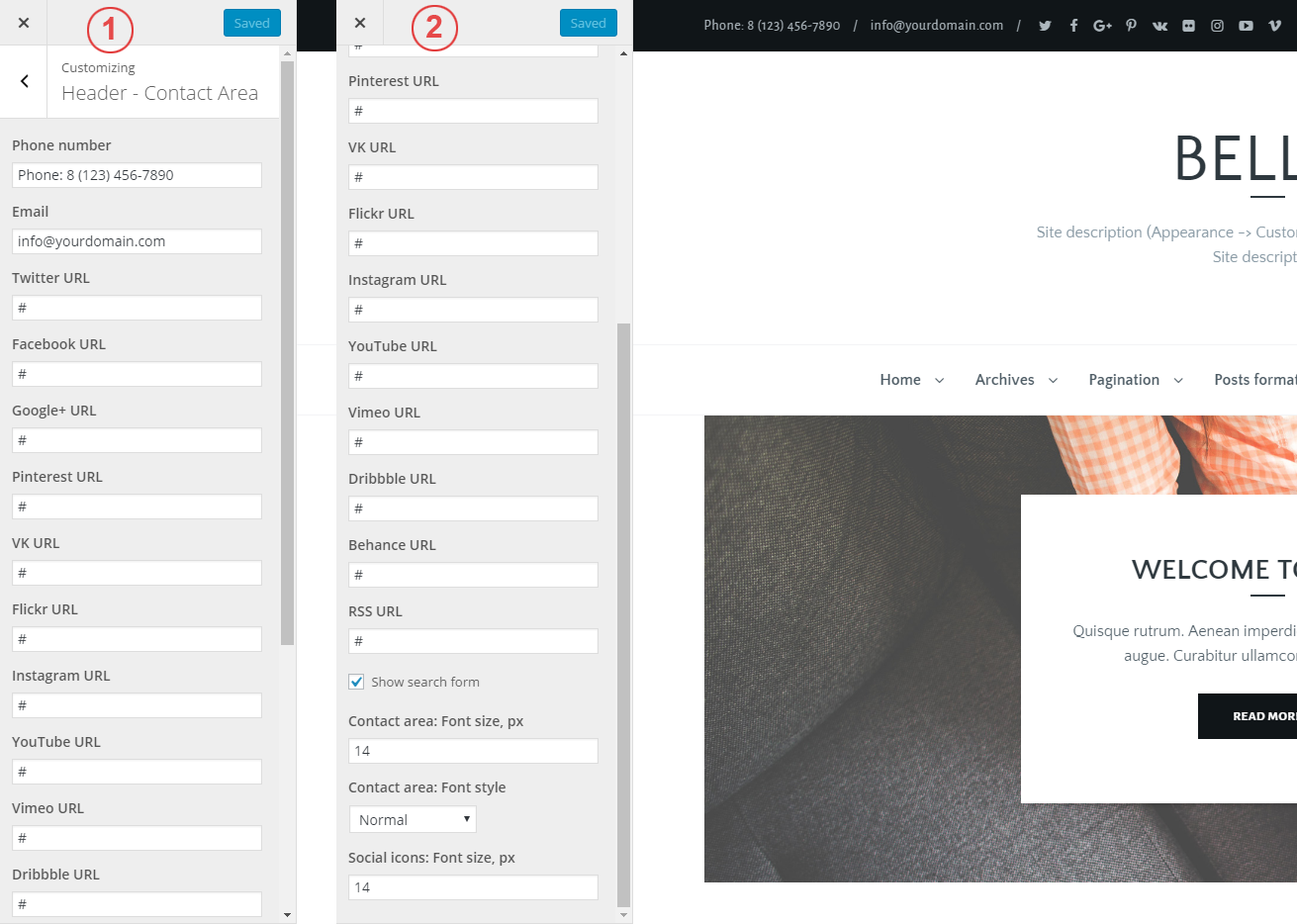
3. Header - Contact Area
- Phone number - enter your phone number or some other text
- Email - enter your Email
- Twitter URL - link to your Twitter profile
- Facebook URL - link to your Facebook profile
- Google+ URL - link to your Google+ profile
- Pinterest URL - link to your Pinterest profile
- VK URL - link to your VKontakte profile
- Flickr URL - link to your Flickr profile
- Instagram URL - link to your Instagram profile
- YouTube URL - link to your YouTube profile
- Vimeo URL - link to your Vimeo profile
- Dribbble URL - link to your Dribbble profile
- Behance URL - link to your Behance profile
- RSS URL - link to RSS feed
- Show search form - show/hide search form
- Contact area: Font size, px - font size for contact section (default value: 14)
- Contact area: Font style - font style for contact section (default value: Normal)
- Social icons: Font size, px - font size for social icons (default value: 14)
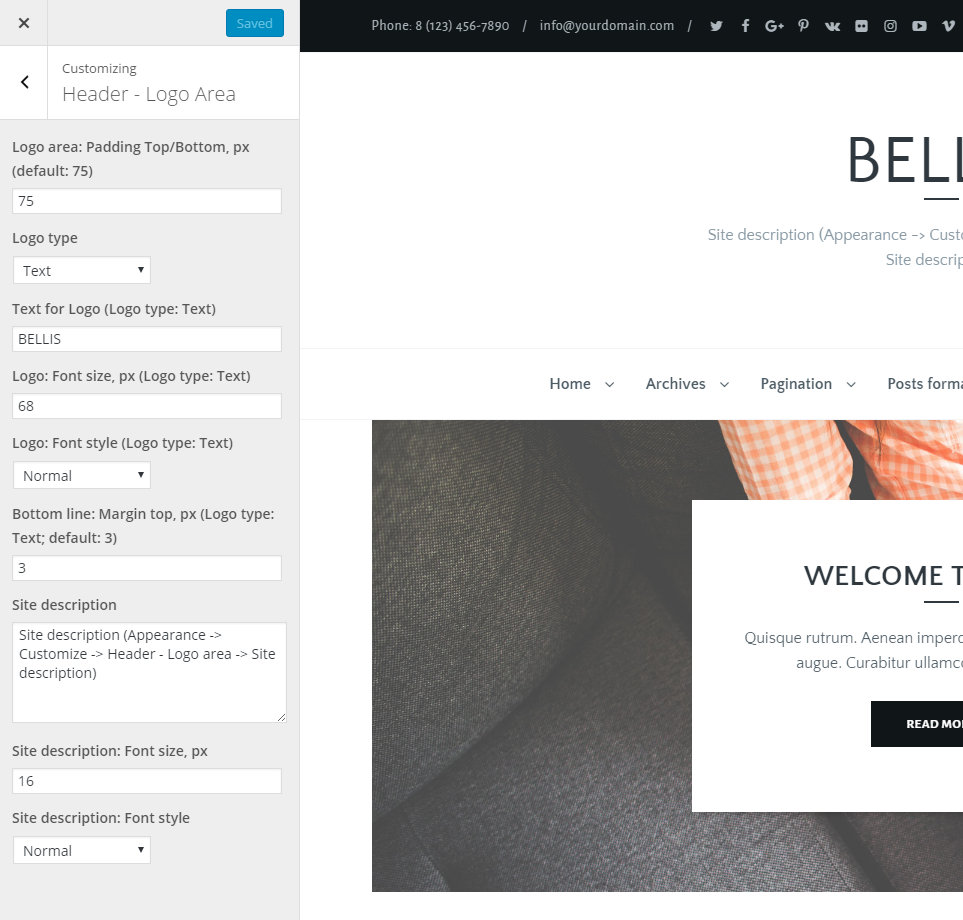
4. Header - Logo Area
- Logo area: Padding Top/Bottom, px - enter indent value for logo section (default value: 75)
- Logo type - choose between Text and Image options
- Text for Logo (Logo type: Text) - enter text for your logo
- Logo: Font size, px (Logo type: Text) - font size for logo (default value: 68)
- Logo: Font style (Logo type: Text) - font style for logo (default value: Normal)
- Bottom line: Margin top, px (Logo type: Text) - enter top margin for bottom line (default value:3)
- Site description - enter short description for your site
- Site description: Font size, px - font size for site description (default value: 16)
- Site description: Font style - font style for site description (default value: Normal)
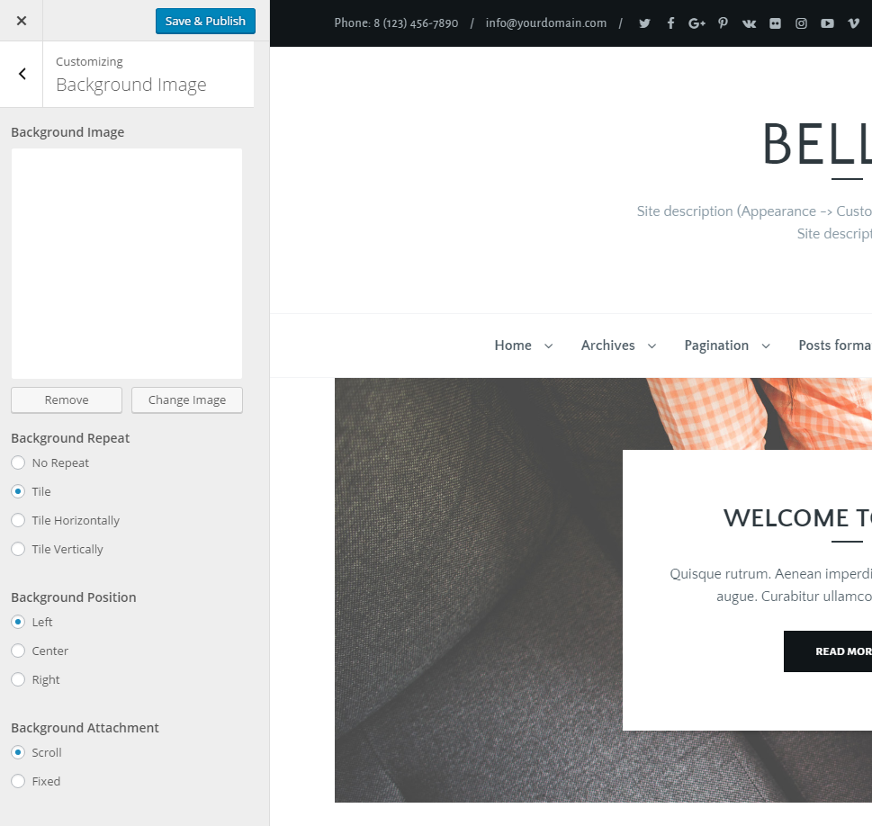
5. Background Image
- Background Image - upload image for background
- Background Repeat - choose background repeat
- Background Position - choose background position
- Background Attachment - choose background attachment
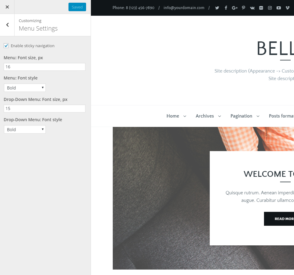
6. Menu Settings
- Enable sticky navigation - enable/disable sticky navigation
- Menu: Font size, px - font size for menu items (default value: 16)
- Menu: Font style - font style for menu items (default value: Bold)
- Drop-Down Menu: Font size, px - font size for submenu items (default value: 15)
- Drop-Down Menu: Font style - font style for submenu items (default value: Bold)
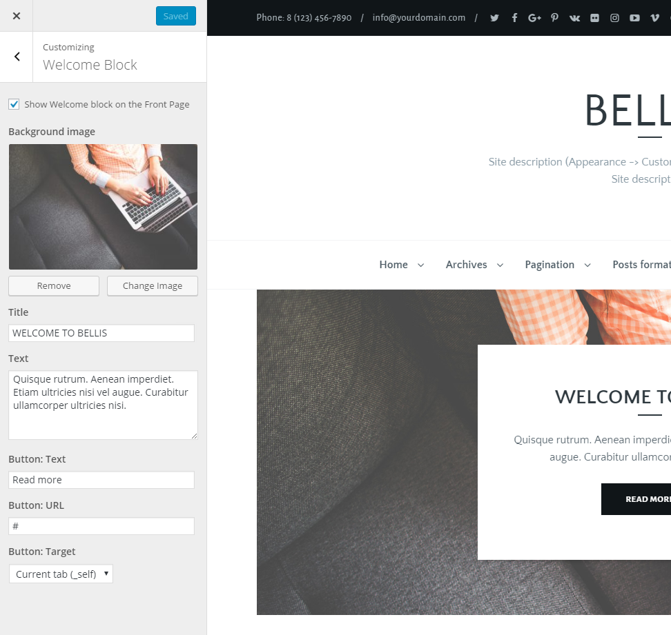
7. Welcome Block
- Show Welcome block on the Front Page - show/hide "Welcome" section on your front page
- Background image - background image for "Welcome" section
- Title - enter your title for "Welcome" section
- Text - enter your text for "Welcome" section
- Button: Text - enter text for button
- Button: URL - enter URL for button
- Button: Target - choose where to open your URL
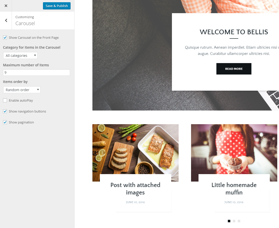
8. Carousel
- Show Carousel on the Front Page - show/hide carousel section on your front page
- Category for Items in the Carousel - select a category from which one you want to show posts. Note: carousel shows posts, which have image (featured image or gallery)
- Maximum number of Items - enter maximum items number (default value: 9)
- Items order by - choose between Random order, Date and Most commented
- Enable autoPlay - enable/disable autoPlay option
- Show navigation buttons - show/hide navigation buttons
- Show pagination - show/hide pagination
9. Blog
- Show filter by categories - show/hide filter by categories
- Blog layout - choose a blog layout (3 Columns, 2 Columns with left or right sidebar, 2 Columns, 1 Column with left or right sidebar, 1 Column)
- Pagination type - choose between Standard pagination, Next/Previous page links, Infinite scroll or Load More button
- Links open in... (Target attribute) - select New tab to open links on blog posts in a new window
- Use Excerpt or "Read More tag" - select Read More tag if you want to use WordPress read more tag for creating excerpt for post. Otherwise Excerpt will be created automatically
- Excerpt length (number of words) - length for auto excerpt (default value: 19)
- Post title: Font size, px - font size for post title (default value: 29)
- Post title: Font style - font style for post title (default value: Bold)
- Post title - Bottom line: Margin top, px - enter top margin for bottom line (default value: 7)
- Excerpt: Font size, px - font size for excerpt (default value: 16)
- Post details: Font size, px - font size for metadata: post categories, date, comments counter (default value: 13)
- Post details: Font style - font style for metadata (default value: Normal)
- Featured images: Add "data-no-retina" attribute to all images - Enable this option if you want to fix retina.js 404 errors (more about the issue you can find here)
- Show categories - show/hide post categories
- Show date - show/hide date
- Show comments counter - show/hide comments counter
- Show views counter - show/hide views counter
- Show likes counter - show/hide likes counter

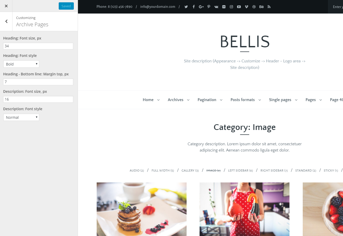
10. Archive Pages
- Heading: Font size, px - font size for archive page heading (default value: 34)
- Heading: Font style - font style for archive page heading (default value: Bold)
- Heading - Bottom line: Margin top, px - enter top margin for bottom line (default value: 7)
- Description: Font size, px - font size for archive description (default value: 16)
- Description: Font style - font style for archive description (default value: Normal)
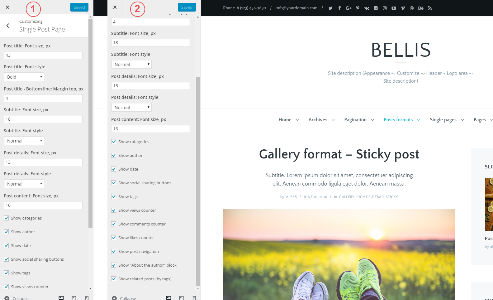
11. Single Post Page
- Post title: Font size, px - font size for post title (default value: 43)
- Post title: Font style - font style for post title (default value: Bold)
- Post title - Bottom line: Margin top, px - enter top margin for bottom line (default value: 4)
- Subtitle: Font size, px - font size for subtitle (default value: 18)
- Subtitle: Font style - font style for subtitle (default value: Normal)
- Post details: Font size, px - font size for metadata: author, date, post categories (default value:13)
- Post details: Font style - font style for metadata (default value: Normal)
- Post content: Font size, px - font size for content (default value: 16)
- Show categories - show/hide categories
- Show author - show/hide author
- Show date - show/hide date
- Show social sharing buttons - show/hide social sharing buttons
- Show tags - show/hide tags
- Show views counter - show/hide views counter
- Show comments counter - show/hide comments counter
- Show likes counter - show/hide likes counter
- Show post navigation - show/hide post navigation
- Show "About the author" block - show/hide "About the author" section
- Show related posts (by tags) - show/hide related posts section. Note: this function shows posts, which have image (featured image or gallery). For example, if you have 5 posts that are related by one tag, and only 3 of them have images, in this case you will see 2 posts related to the current post.
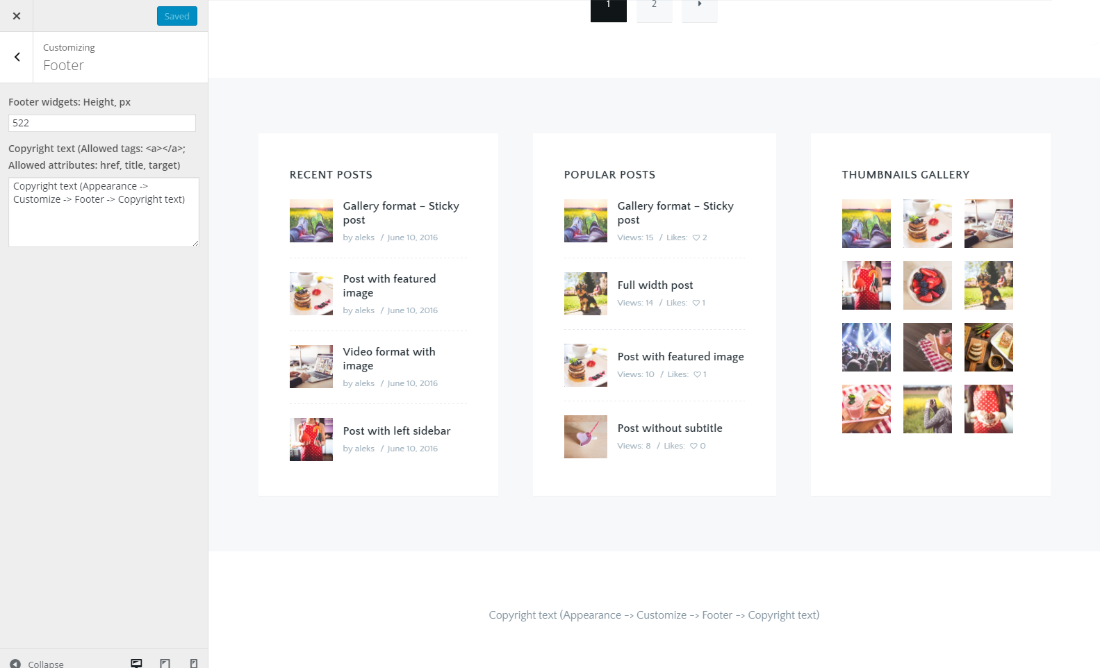
12. Footer
- Footer widgets: Height, px - enter widgets height (optional). Note: I recommend to use this option only if you have 3 widgets in the footer and you want that all these widgets had the same height
- Copyright text - enter your copyright information (or other text). Allowed tags: <a></a>; Allowed attributes: href, title, target
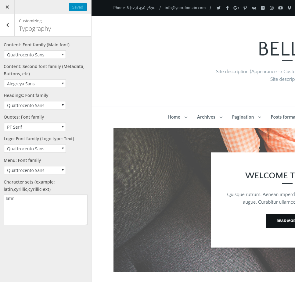
13. Typography
- Content: Font family (Main font) - this font will be used for all theme texts except listed below (default value: Quattrocento Sans)
- Content: Second font family (Metadata, Buttons, etc) - this font will be used for metadata, buttons and contact section (default value: Alegreya Sans)
- Headings: Font family - this font will be used for all headings: h1, h2, h3, h4, h5, h6 (default value: Quattrocento Sans)
- Quotes: Font family - this font will be used for blockquote item (<blockquote> tag; default value: PT Serif)
- Logo: Font family (Logo type: Text) - this font will be used for your text logo (default value: Quattrocento Sans)
- Menu: Font family - this font will be used for header menu (default value: Quattrocento Sans)
- Character sets - specify which subsets should be used. Multiple subsets should be separated with commas (,) and should be entered without spaces. Example: latin,cyrillic-ext,greek-ext,greek,vietnamese,cyrillic,latin-ext (default value: latin)
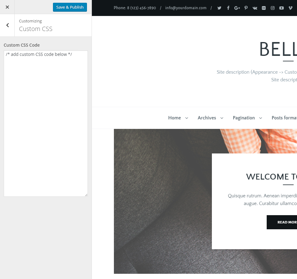
14. Custom CSS / Additional CSS
- Custom CSS Code - here you can add your own CSS code. This setting is necessary if you want to change something on your site that is not available in theme options, for example: font size, font style, color, margin, or some other customization. Note: In WordPress 4.7.x you need to use the Additional CSS section instead of the Custom CSS section.
Translation
To translate this theme, I recommend using the .mo and .po files. These files work in pairs, so for each language you need to have 2 files with the same name but a different extension. For example, if you want to translate the theme into Turkish language, your files would be tr_TR.mo and tr_TR.po.
At first, you need to create these files. For this you need to use Poedit software which is very easy to use. You can download it here. After installation Poedit software, you need to run it. Then, in Poedit go to File New from POT/PO file..., select and open the pot file from the "languages" folder (/languages/bellis.pot). After that you just need to select your language, add translation, and save your changes.
Now you have .mo and .po files with your translation, and all you need to do is upload these both files into the "languages" folder on your server (/wp-content/themes/bellis/languages/).
Importing Demo Data
In the theme main files, that you have downloaded from ThemeForest, you can find a folder labeled "Demo Content" which contains an export file. This file you can use to import the demo data to your site. To do this, you need to perform a few simple steps.
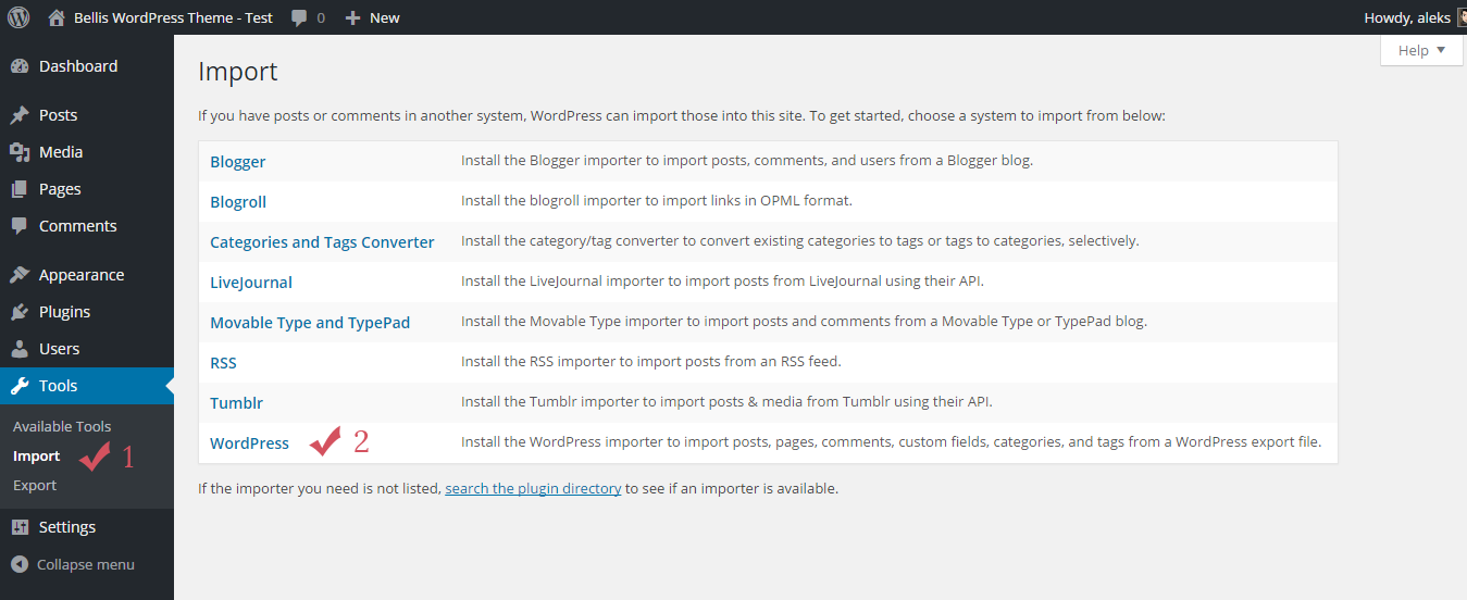
Step 1. Navigate to Tools Import.
Step 2. Click on the WordPress link.
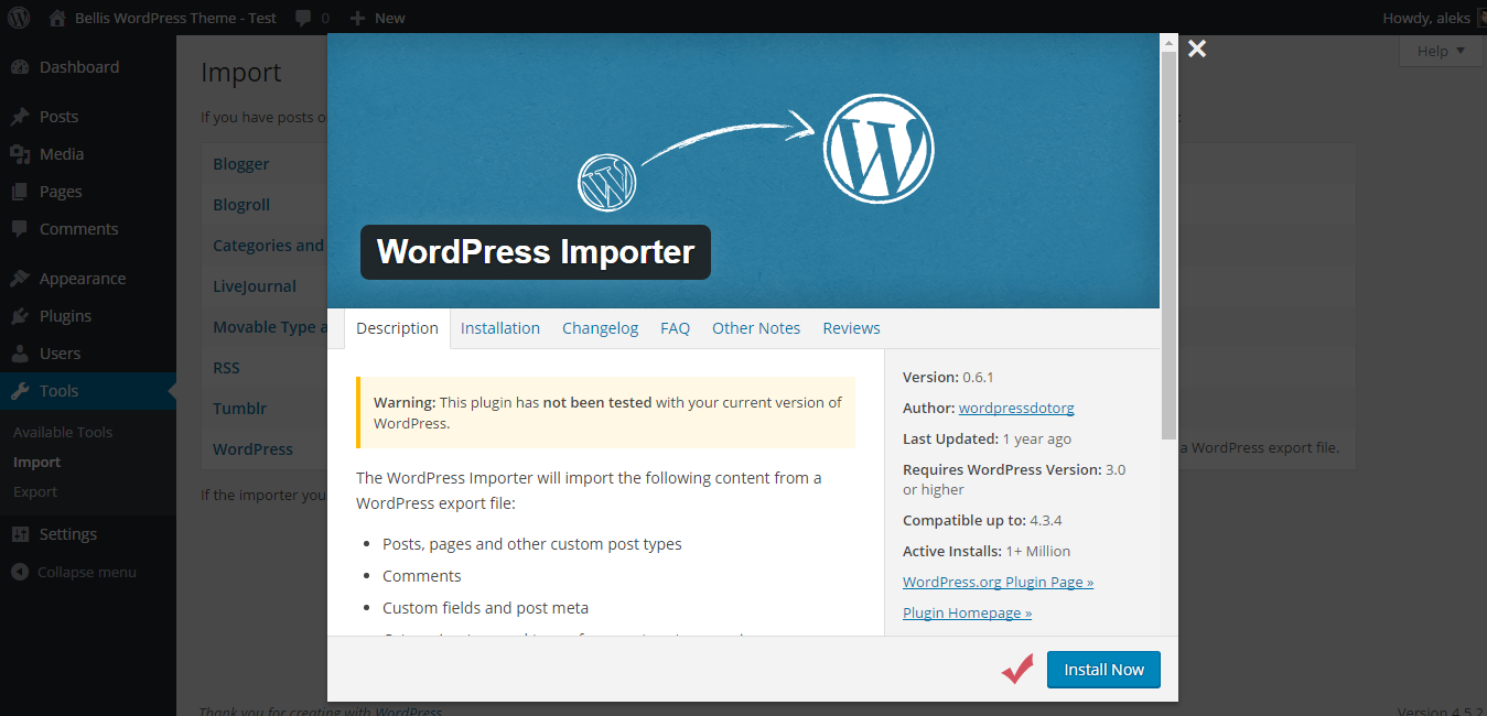
Step 3. Now you need to install the WordPress Importer plugin. In the window that opens, press Install Now button.
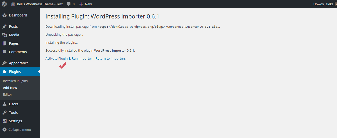
Step 4. After the installation is complete, click on the Activate Plugin & Run Importer link.
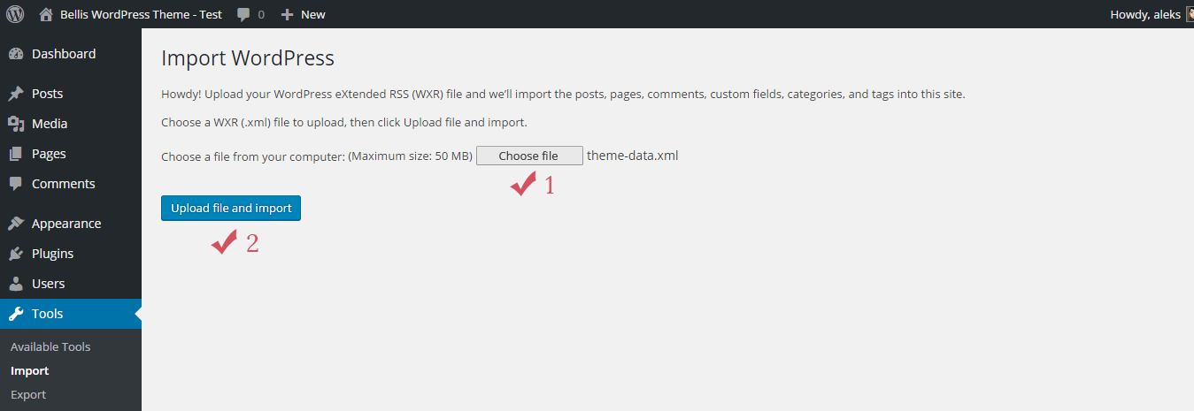
Step 5. Next, press Choose file button and select the "theme-data.xml" file from the "Demo Content" folder (/Demo Content/theme-data.xml).
Step 6. Press Upload file and import button.
Step 7. After you will then be offered to Assign Authors. You can read the description at the top as this explains everything.
Step 8. Check the box "Download and import file attachments". This will download attachments for images included in the live preview demo.
Step 9. Press Submit button.

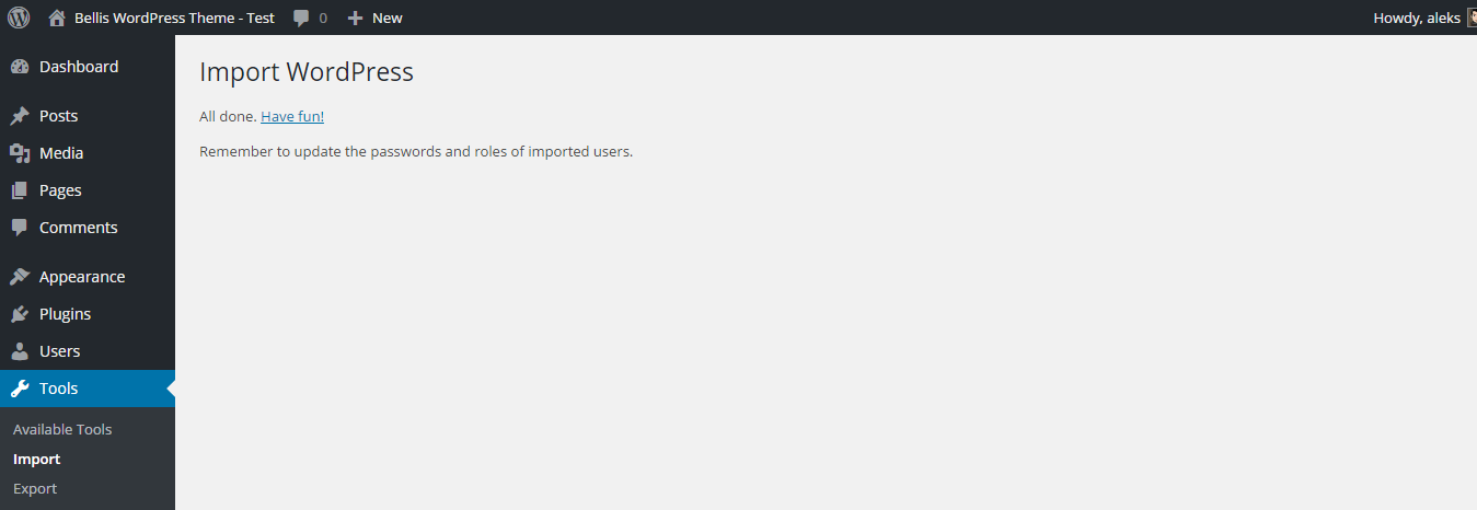
Now you need to wait for the importer to finish. This might take a few minutes depending on your hosting server speed.
Support and Feedback
All questions you can send via the contact form HERE.
I answer all questions every day from Monday to Friday from 8:00 to 18:00 (GMT+3) within 24-48h in the order they were received.
Please do not panic if I do not answer too long – I love my buyers and I’ll answer for all questions ;)
Support for my items includes:
- Answering questions about how to use the item
- Answering technical questions about the item (and included third party assets)
- Help with defects in the item or included third party assets
- Item updates to ensure ongoing compatibility and to resolve security vulnerabilities
Item support does not include:
- Item customization
- Installation of the item
- Hosting, server environment, or software
- Support for third party plug-ins
- Plugins integration
- WordPress General Support (use the WordPress forums for general WordPress support)
- Support for issues caused by user modifications in the theme’s code, styling and general functionality
Credits
Thanks so much:
- Bootstrap - Bootstrap is the most popular HTML, CSS, and JS framework for developing responsive, mobile first projects on the web.
- Retina.js - Retina.js is an open source script that makes it easy to serve high-resolution images to devices with retina displays.
- jQuery Superfish Menu Plugin by Joel Birch - Superfish is a jQuery plugin that adds usability enhancements to multi-level drop-down menus. Fully supports touch devices and keyboard interaction.
- OWL Carousel - Touch enabled jQuery plugin that lets you create beautiful responsive carousel slider.
- Masonry - Cascading grid layout library.
- imagesLoaded - Detect when images have been loaded.
- Magnific Popup - Magnific Popup is a responsive lightbox & dialog script with focus on performance and providing best experience for user with any device.
- Infinite-scroll - Infinite Scroll jQuery Plugin.
- html5shiv.js - This script is the defacto way to enable use of HTML5 sectioning elements in legacy Internet Explorer.
- Respond.js - A fast & lightweight polyfill for min/max-width CSS3 Media Queries (for IE 6-8, and more).
- Font Awesome - The iconic font and CSS toolkit.
- Meta Box Plugin - Meta Boxes and Custom Fields Plugin For WordPress.
- TGM Plugin Activation - TGM Plugin Activation is a PHP library that allows you to easily require or recommend plugins for your WordPress themes (and plugins).
- Post Like System by JonMasterson - Post Like System for WordPress.
- Blank WordPress Pot. Blank WordPress Pot allows developers to have a great starting point for their translations' pot files and translators an explanation how to use the file.
- Google Fonts - Quattrocento Sans, Alegreya Sans, PT Serif.