Theme Installation
To install this theme you must have a working version of WordPress. Make sure that your installed WordPress version is 6.0 (or higher).
If you need help installing WordPress, follow these detailed instructions. Also here you can download the latest version of WordPress.
Downloading
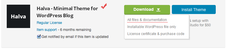
At first, after purchasing this theme, please download the package from ThemeForest (to do this you must be logged in ThemeForest). Move your mouse over your ThemeForest login name in right top corner and then click Download. On the Downloads page you will find all the items that you have purchased. This theme will also be here.
In the next step click the "Download > All files & documentation" button and save package on your computer.
Important! Please unpack the archive after downloading.
After unpacking the full archive, you will receive the following folders and files:
- Folder: "Halva Theme with Documentation" - main folder with the following files and folders inside:
- Folder: "Demo Content" - contains demo data file:
- halva-demo-data.xml - xml file with demo data: posts, pages, comments, categories, tags, etc.
- Folder: "Documentation" - contains this document:
- Folder: "assets" - contains files for documentation (styles, scripts, images, and so on);
- documentation.html - documentation file.
- halva.zip - Halva theme (ZIP archive for installation);
- Changelog.txt - changelog text file;
- Readme.txt - some information about folders and files in the package.
- Folder: "Demo Content" - contains demo data file:
Installation
You can install this theme in two different ways:
- WordPress Theme Manager (installing from the WordPress Dashboard);
- FTP upload.
1. WordPress Theme Manager
1.1 Go to Themes Page
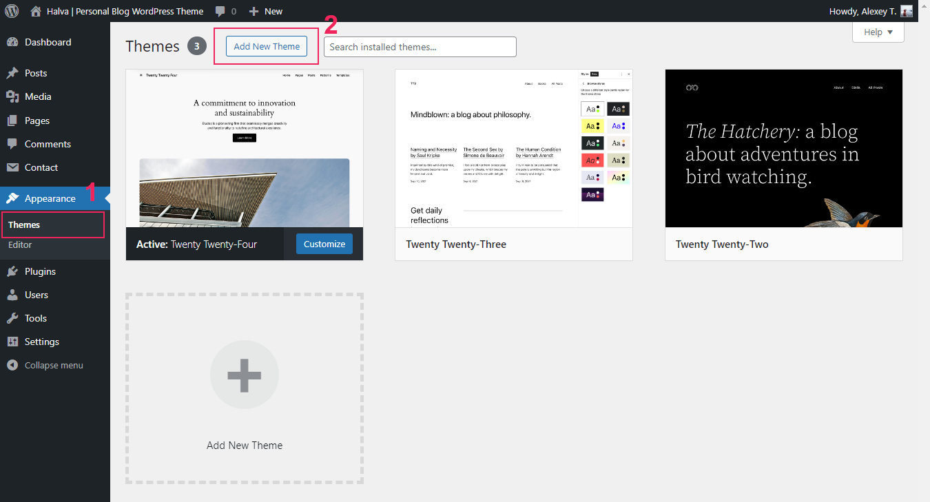
Step 1. Login to your WordPress admin page.
Step 2. Navigate to Appearance > Themes.
Step 3. Click the "Add New Theme" button.
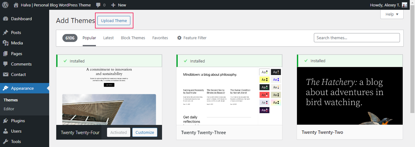
1.3 Upload Theme ZIP File
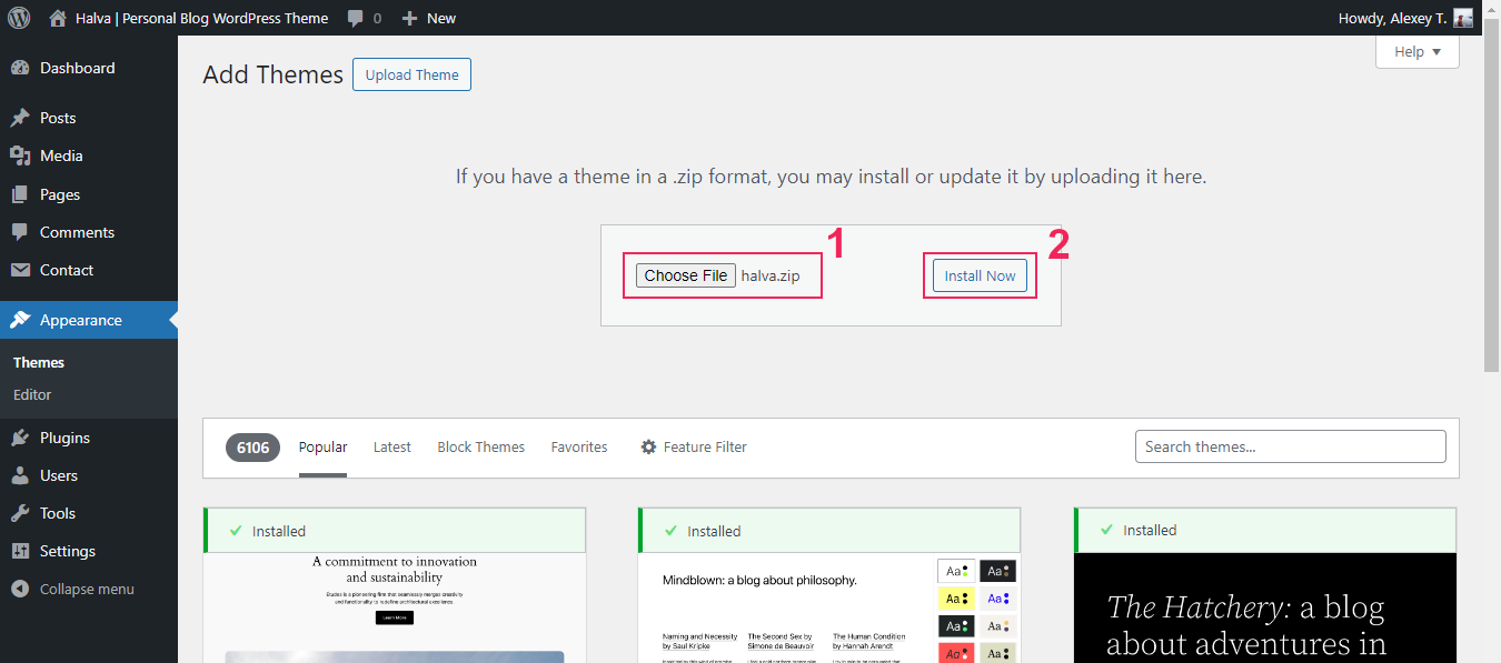
Step 5. Click on the "Choose file" button and select the theme zip file: /Halva Theme with Documentation/halva.zip.
Step 6. Click the "Install Now" button. After that, the process of installing the theme begins.
1.4 Activate Theme
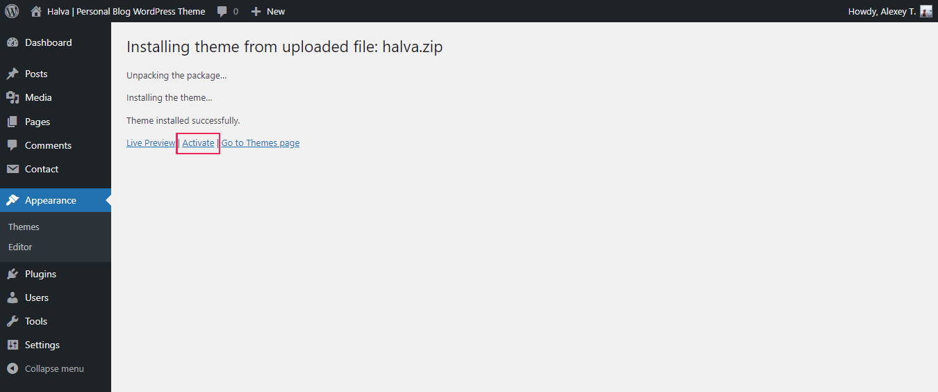
Step 7. After the installation is complete, click the Activate link.
1.5 Required and Recommended Plugins
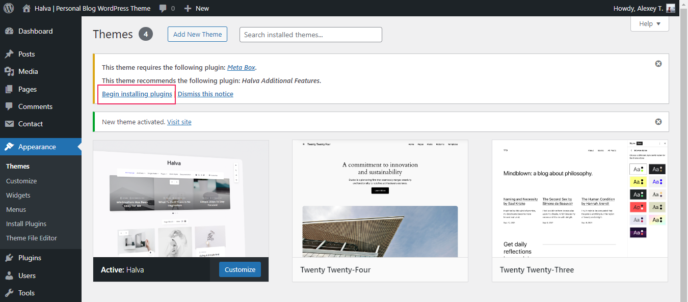
Step 8. The theme is now activated. You should now install and activate the required (Meta Box) and recommended (Halva Additional Features) plugins by clicking on the Begin installing plugins link.
1.6 Plugins Installation
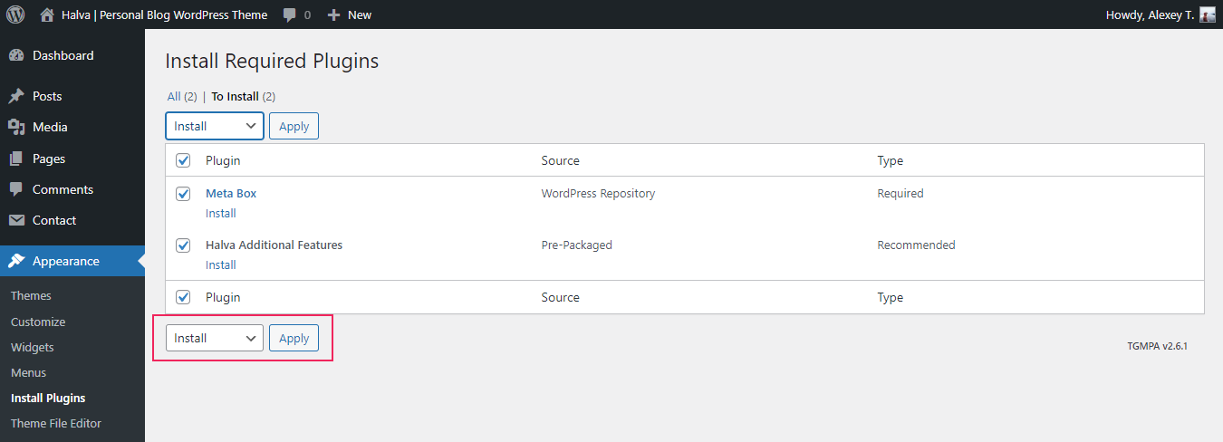
Step 9. Select all plugins and select "Install" from the dropdown menu. Click on the "Apply" button to continue the installation.
1.7 Installation Complete
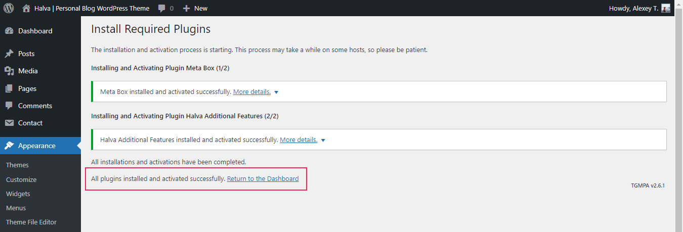
Step 10. After the installation is complete, click the "Return to the Dashboard" link.
1.8 Reading Settings
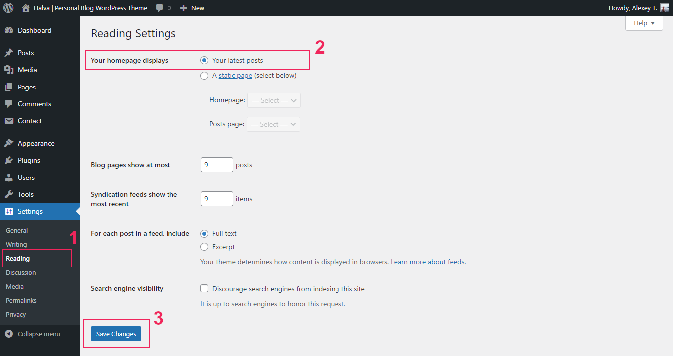
Step 11. Navigate to Settings > Reading > Your homepage displays and select "Your latest posts".
Step 12. Finally, click the "Save Changes" button.
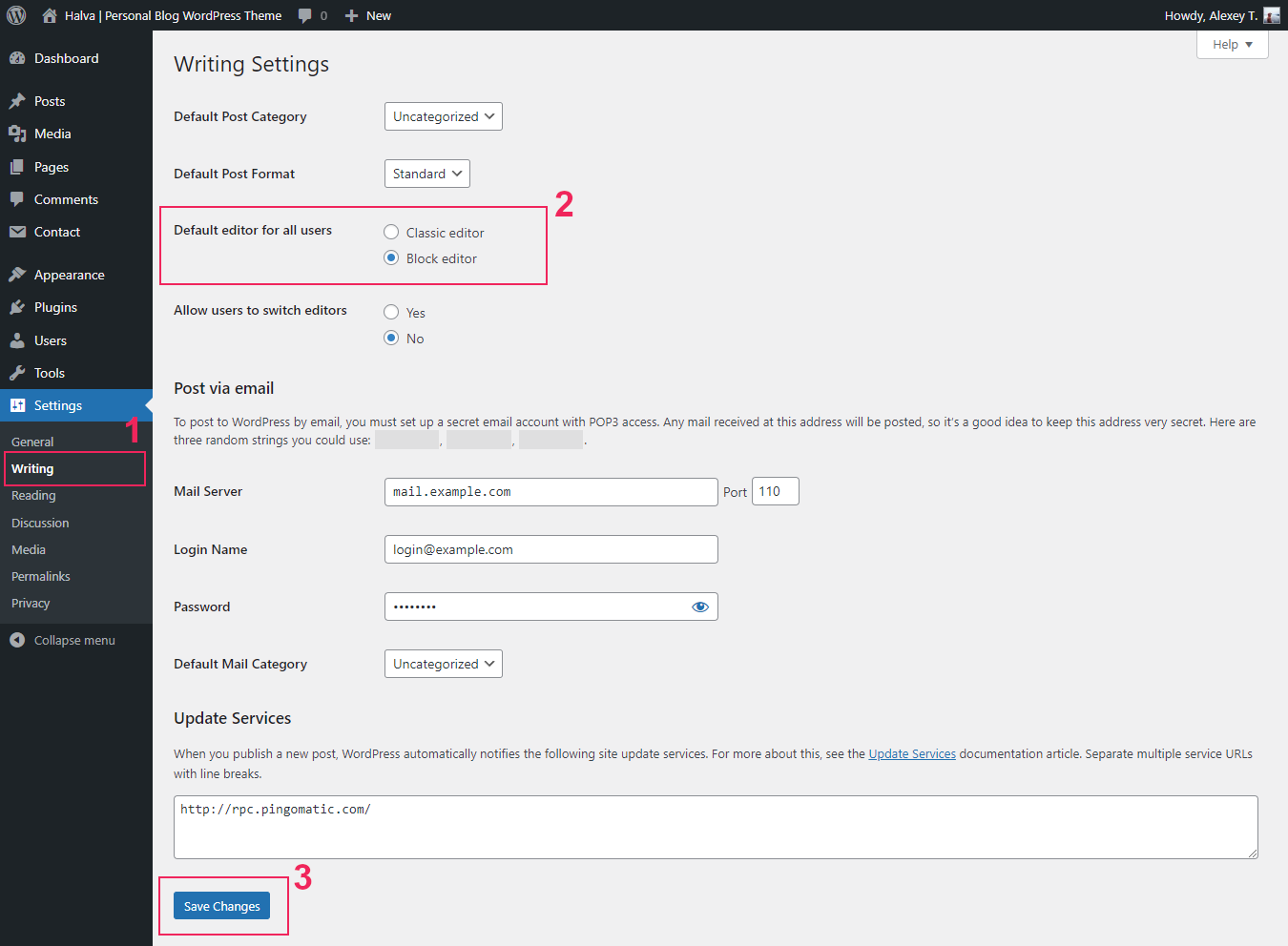
1.9 Editor Type
If you do not want to use the Block Editor with this theme, and want to switch to the Classic Editor, then for this you need to follow a few simple steps. First you need to install the classic editor through the "Plugins" page: Plugins > Add New > Classic Editor > Install Now and Activate. You can also download this plugin here: https://wordpress.org/plugins/classic-editor/.
After installing and activating the classic editor, you can choose the default editor for your WordPress in the settings: Settings > Writing > Default editor for all users > Classic Editor or Block Editor.
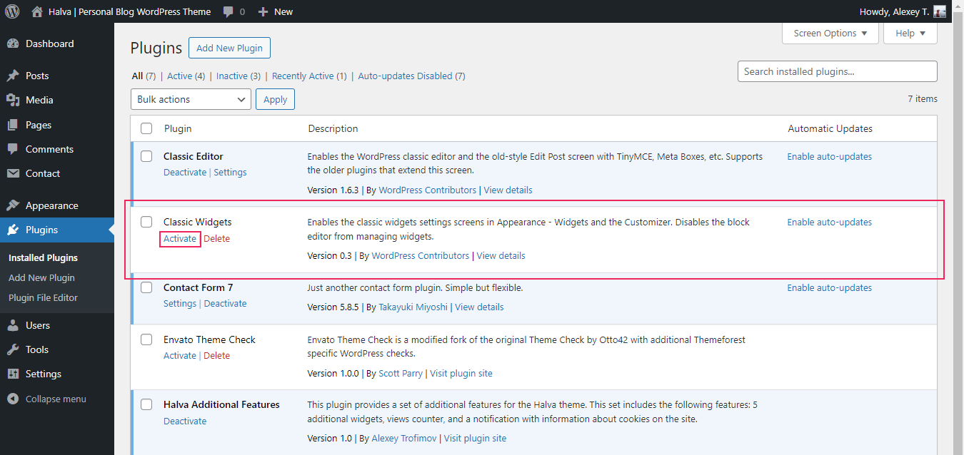
1.10 Classic Widgets
Since WordPress version 5.8, the block editor is also available on the Widgets page and in the Customizer (Appearance > Widgets, Appearance > Customize > Widgets). If you don't want to use the block editor when editing widgets, then you can easily return classic widgets to your WordPress. To do this, you just need to install and activate the "Classic Widgets" plugin. You can do this on the "Add New Plugin" page in your WordPress (Plugins > Add New > Classic Widgets > Install Now and Activate), or you can download this plugin HERE and then install it. This plugin has no settings, and you just need to activate it.
2. Installing by FTP
If you have any problems with installing the theme from the WordPress Dashboard (for example, you see this error: "The uploaded file exceeds the upload_max_filesize directive in php.ini"), then you need to install it via FTP.
To do this, you need to upload non-zipped theme folder called halva to /wp-content/themes/ folder in your WordPress installation folder on your server.
Next, login to your WordPress admin page and activate the theme (Appearance > Themes).
After the successful activation, see Step 1.5 of this documentation.
How to Update Halva
In this part of the guide describes how to update Halva. Just follow these seven steps:
Step 1. At first, you need to download the latest package from ThemeForest.
Step 2. Unpack the entire package after downloading.
Step 3. Next, please unpack the archive with the theme: /Halva Theme with Documentation/halva.zip.
Step 4. After that you need to remove the halva folder from your server (/wp-content/themes/halva). For this you can use any FTP client, for example, FileZilla.
Step 5. Now you need to upload non-zipped halva folder to /wp-content/themes/ folder in your WordPress installation folder on your server.
Step 6. Next, login to your WordPress admin page. If you see a notification that you need to update existing plugins or install new plugins, then you need to do it.
Step 7. And in the last step, please clear your browser's cache and update the site's cache (if you have a plugin for this).
Remember, that all your data in the database are safe because after updating theme files does not change anything in the database. Please also always make a backup of your files before you overwrite them with the new. Also, don't forget about your translation files (.mo and .po) and make copies of those files before updating.
Creating Blog Posts
To create a blog, first make sure that on the front page displays your latest posts. For this navigate to Settings > Reading > Your homepage displays and select "Your latest posts". After that you can create new posts.
You can add a new post in the WordPress admin panel: WordPress Dashboard > Posts > Add New Post. All posts will be displayed on the front page.
With this theme you can use 10 post formats: standard, image, gallery, video, audio, aside, link, quote, status, and chat. The post format can be selected on the right side of the post editing page in the Format section. Below is a brief description of each format:
1. Standard Post Format.
When writing or editing a post, Standard is used to designate that no Post Format is specified. However, for this format you can add an image (Featured Image section). This image will be displayed at the top of your post.
2. Image Post Format.
For this format you can also add an image (Featured Image section), and this image will be displayed at the top of your post. Use this format if your post has a featured image.
3. Gallery Post Format. See an example on the demo site
The gallery format gives you additional settings for creating an image gallery. These settings are available at the bottom of the post editing page: "Gallery Format Settings". To create a gallery, click the "+ Add Media" button and select several existing images or upload new images for this gallery. Important: All images for the gallery must have the same dimensions. You can also choose what to show in the post on the homepage and on all archive pages: "Slider with images from the gallery" or "Featured image" ("Gallery Format Settings > Media type").
4. Video Post Format. See an example on the demo site
You can also create a video post. When you select the Video format, additional settings appear at the bottom of the page: "Video Format Settings". Here you can add a link (URL) to your video. The theme will then check the URL and display the video at the top of your post. If the video does not appear, you have used the wrong URL. Make sure the URL you take is directly from your browser navigation bar when viewing a video on YouTube, Vimeo, etc. You can also choose what to show in the post on the homepage and on all archive pages: "Video player (iframe)" or "Featured image" ("Video Format Settings > Media type").
5. Audio Post Format. See an example on the demo site
For the Audio format additional settings are also available. These settings can be found at the bottom of the post editing page: "Audio Format Settings". Here you can add a link (URL) on a song from SoundCloud. The theme will then check the URL and display the audio at the top of your post. Make sure the URL you take is directly from your browser navigation bar when viewing a song on SoundCloud. Here you can also choose what to show in the post on the homepage and on all archive pages: "Audio player (iframe)" or "Featured image" ("Audio Format Settings > Media type").
6. Aside Post Format.
This format is suitable for brief snippets of text that aren't quite whole blog posts, such as quick thoughts and anecdotes. You can also add an image for this post (Featured Image).
7. Link Post Format. See an example on the demo site
This is a post with a link to another site. The theme will use the first <a href=""></a> tag in the post content as the external link for that post. An additional setting is also available for this format, which allows you to choose where to open your link: in the current browser tab or in a new browser tab. You can find this setting at the bottom of the post editing page: "Link Format Settings > Open link in... (target attribute)".
8. Quote Post Format. See an example on the demo site
Quote highlights your blockquote text in a bolder way than standard posts typically do. Creating a quote post differs depending on the editor you use:
- Block Editor. Use the "Quote" block at the beginning of your post to create a quote. If you want to add more content to your quote post, then after the "Quote" block you need to use the "More" block, and only after that block continue adding content.
- Classic Editor. You just need to create a simple quote from your text at the beginning of your post in the classic editor. If you need to add additional content after your quote, then use the "More" tag where you want to create an excerpt for this post. You can also add your quote using the following HTML code:
<blockquote>
    A quotation text
    ...
    ...
    <footer>
        <cite>
            <a href="#">Author</a>
        </cite>
    </footer>
</blockquote>
You can use this code in your text editor: Classic editor > Text tab. Note: If you'll see additional indents after creating a quote post, use the code example above, but just make it in one line:
<blockquote>A quotation text ... <footer><cite><a href="#">Author</a></cite></footer></blockquote>
9. Status Post Format. See an example on the demo site
Status format is suitable for a quick update about what you are doing right now (similar to a Twitter status update). You can also use this format to highlight important short texts. This is an example from the demo site: Status format.
10. Chat Post Format.
The "Chat" post format highlights each conversation line. This format is intended exclusively for posts with correspondence. It looks like so:
Abbott: Strange as it may seem, they give ball players nowadays very peculiar names.

Costello: Funny names?

Abbott: Nicknames, nicknames. Now, on the St. Louis team we have Who's on first, What's on second, I Don't Know is on third.

Costello: That's what I want to find out. I want you to tell me the names of the fellows on the St. Louis team.

...
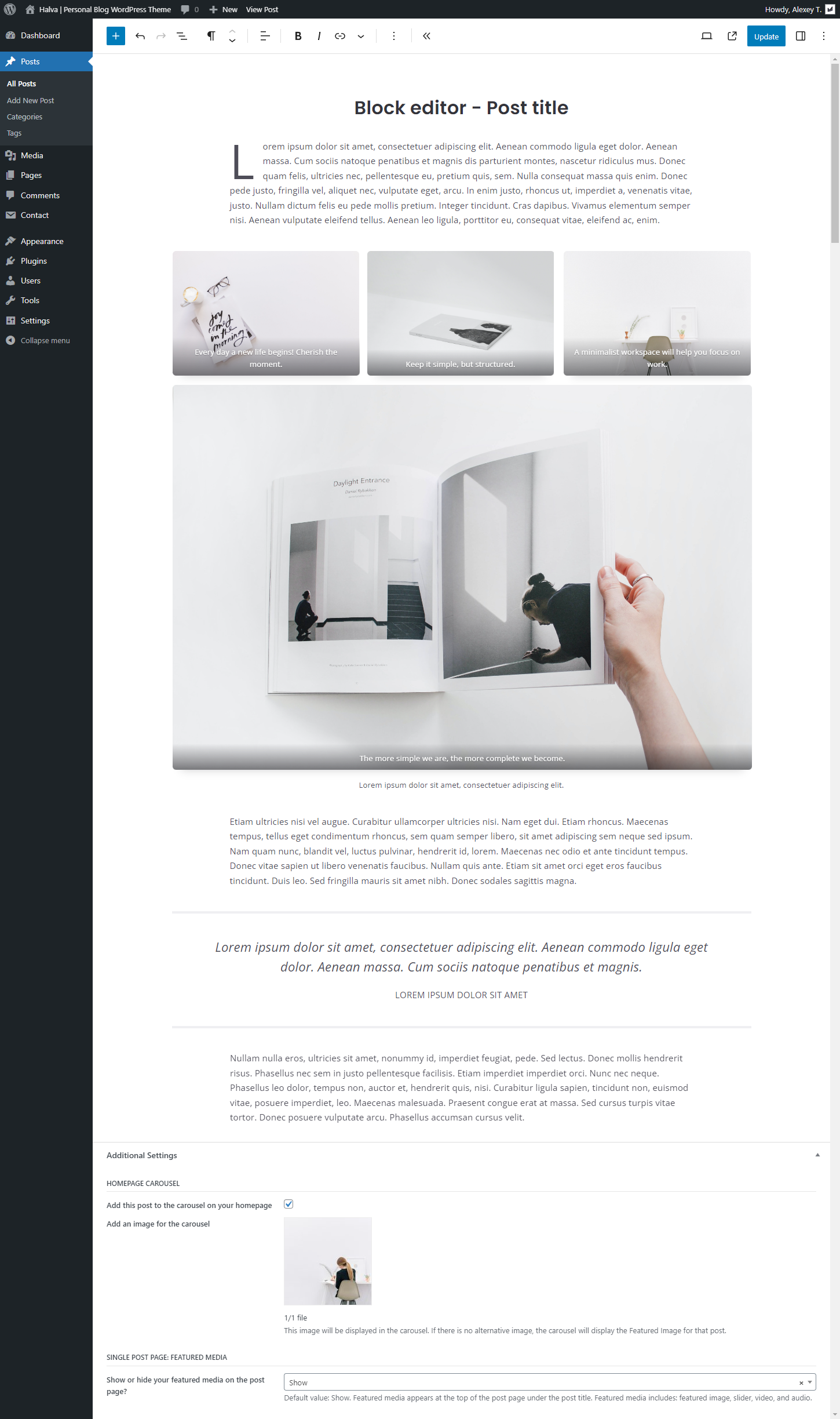
Additional settings for each post.
Each post also has a number of additional settings that allow you to add your post to the carousel on the homepage, as well as control the display of the featured image. These settings are located at the bottom of the post editing page: "Additional Settings".
Homepage carousel.
Each of your posts can be manually added to the carousel that appears at the top of your homepage. To do this, you just need to activate the following setting for the post you need: "Additional Settings > Homepage Carousel > Add this post to the carousel on your homepage".
By default, the homepage carousel displays posts by category. To display featured posts, you need to change the following setting for the carousel: "Appearance > Customize > Homepage Carousel > Carousel Options > What Type Of Posts Should Be Shown In The Carousel? > Featured posts."
Important: If your carousel is not showing featured posts, please check the following setting: "Appearance > Customize > Homepage Carousel > Carousel Options > What Type Of Posts Should Be Shown In The Carousel? > Featured posts". If the carousel does not appear on your homepage, please enable it in the settings: "Appearance > Customize > Homepage Carousel > Display Settings > Show homepage carousel". If the carousel still does not appear on your homepage after that, make sure that your latest posts are displayed on your homepage, since this carousel is only available on the homepage with your latest posts (WordPress Dashboard > Settings > Reading > Your homepage displays > Your latest posts).
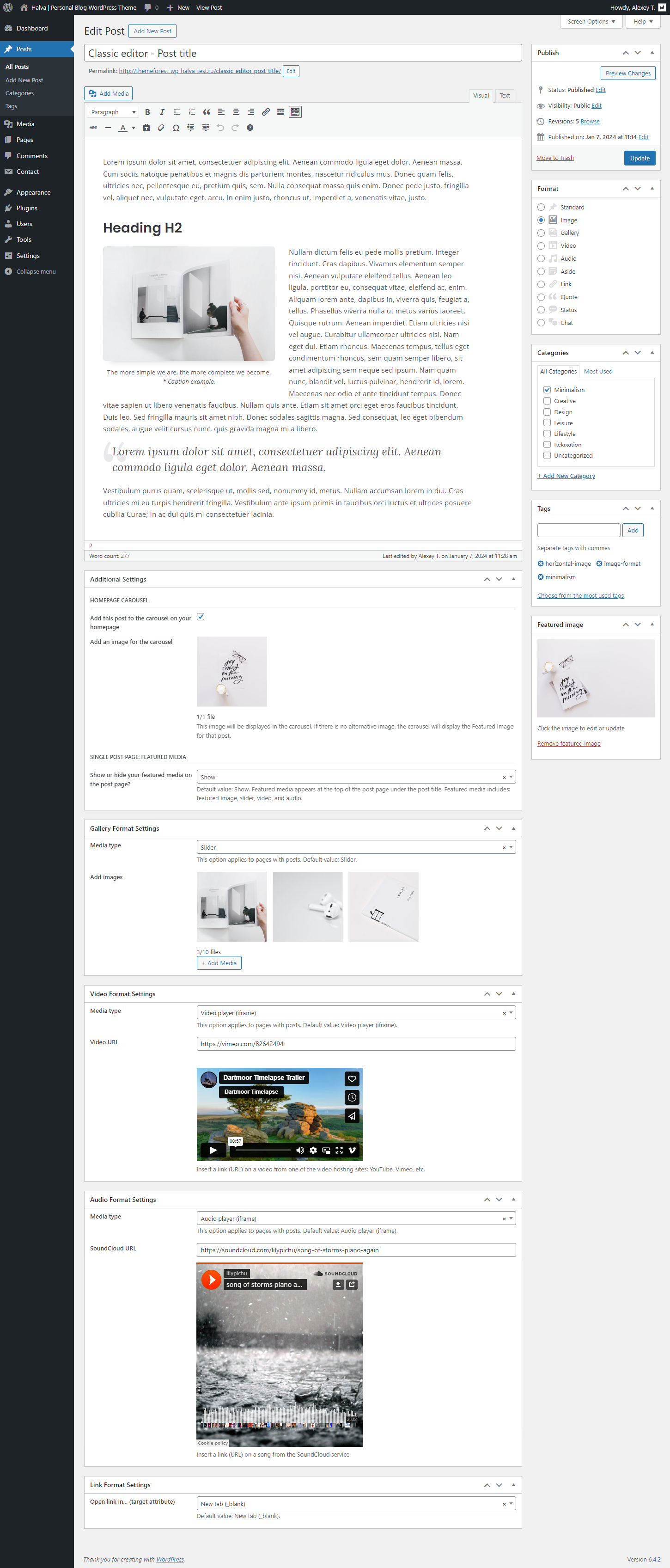
Below you can see screenshots of the "Add New Post (Edit Post)" page in both editors: Block editor (block_editor_edit_post.png) and Classic editor (classic_editor_edit_post.png). Remember that some additional settings are displayed only when the appropriate post format has been selected (Gallery, Video, Audio, or Link).
Block editor: Creating popup images
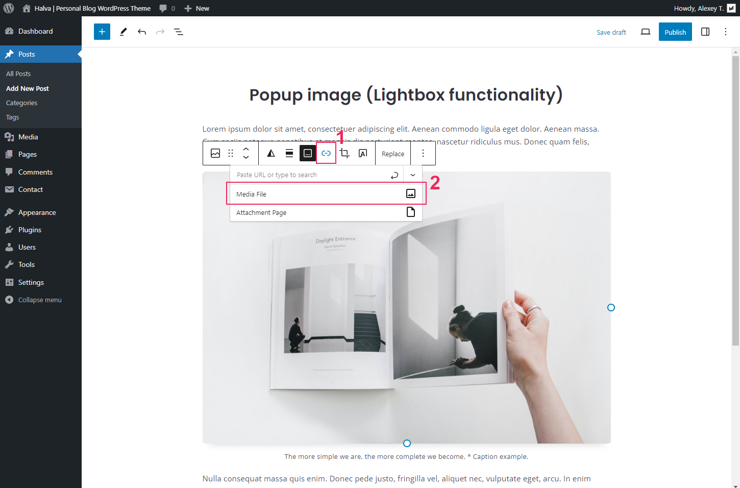
To add a popup image in the block editor, you need to follow a few simple steps:
Step 1. First you need to add an image. To do this, use the Image block.
Step 2. After you've added an image, click on that image. In the upper bar with settings for the image block, you need to add a link to the media file:
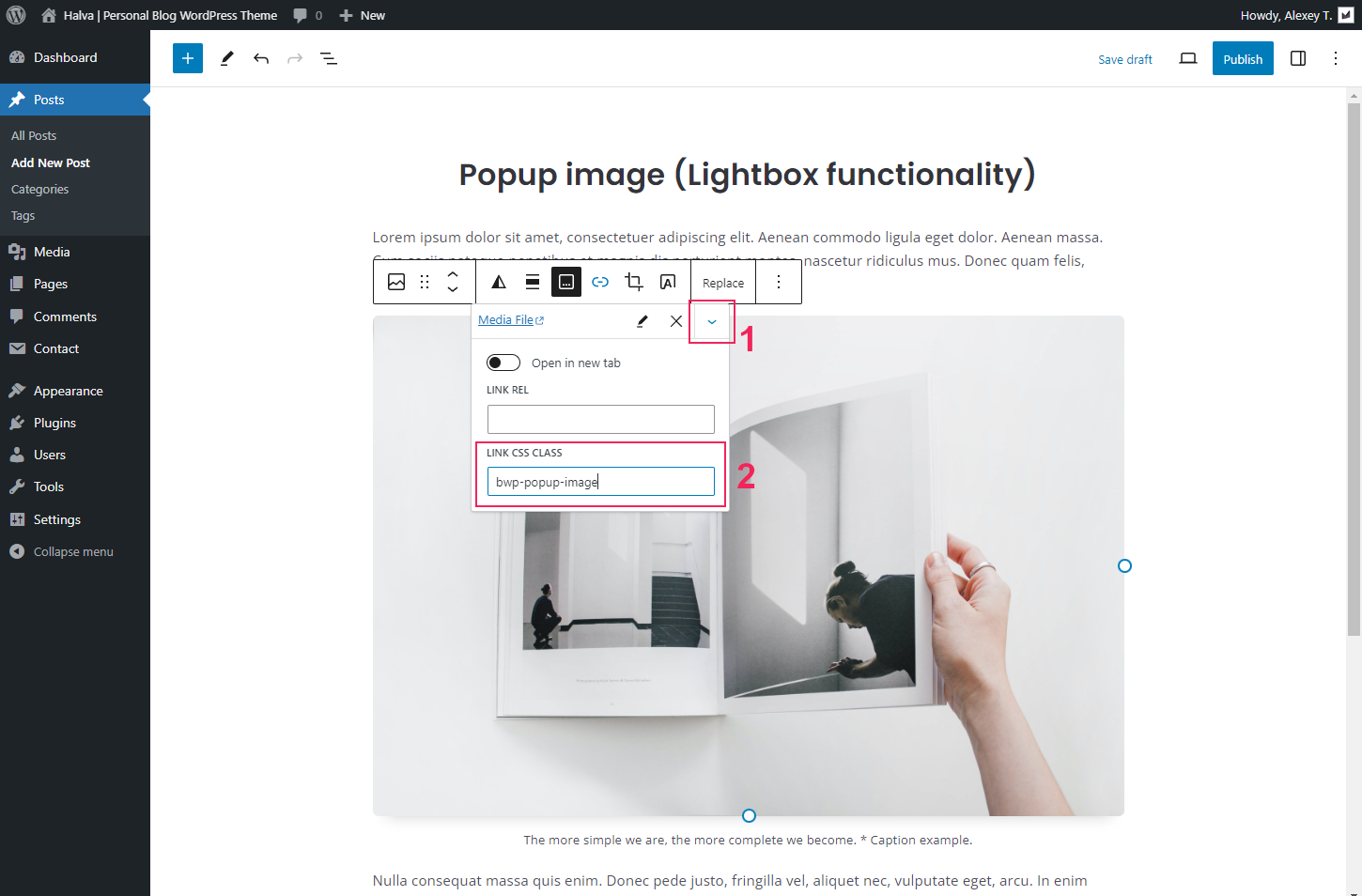
Step 3. After you have added a link to a media file to your image, you need to open the advanced settings for that link. To do this, click on the arrow icon and in the opened container in the "Link CSS Class" field add the following CSS class: bwp-popup-image
That's all! After that, just update your post: click on the "Update" (or "Publish") button.
Block editor: Creating popup gallery
You can also add popup images to your gallery in the block editor. To do this, follow these steps:
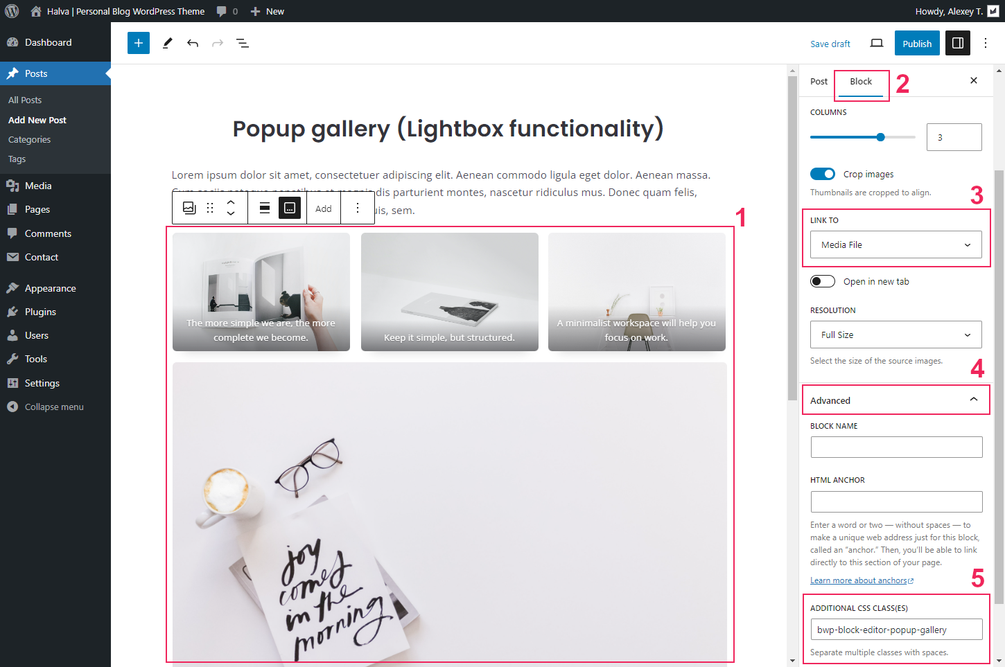
Step 1. Create a gallery using the Gallery block.
Step 2. In the settings for this gallery block, add links to media files: Gallery settings > Link to > Media file.
Step 3. Open advanced settings and add additional CSS class for your gallery: Advanced > Additional CSS class(es) > bwp-block-editor-popup-gallery
That's all! After that, update your post: click on the "Update" (or "Publish") button.
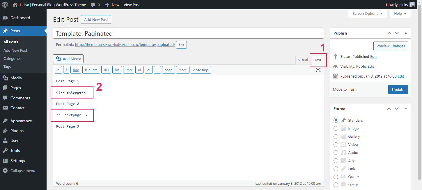
Classic editor: Adding pagination to a single post page
If you are using the Classic Editor, and you want to paginate your post, then for this you need to use the <!--nextpage--> quicktag. Just add it to your text editor where you want to start a new page:
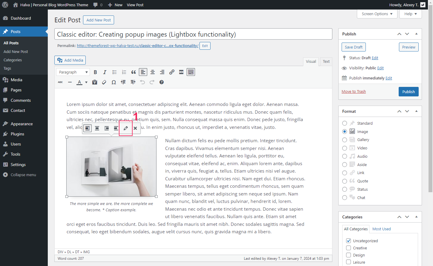
Classic editor: Creating popup images
To add a popup image in the Classic Editor, follow these steps:
Step 1. At first, you need to add an image into the Post Editor. Click the "Add Media" button on the top left of your Post Editor and select an image you want to add.
Step 2. Click on the image and click the "Edit" icon:
Step 3. From the Link To dropdown menu select "Media File".
Step 4. Next, click the ADVANCED OPTIONS.
Step 5. Add the following class to the Link CSS Class field: bwp-popup-image
Step 6. Finally, click on the "Update" button.
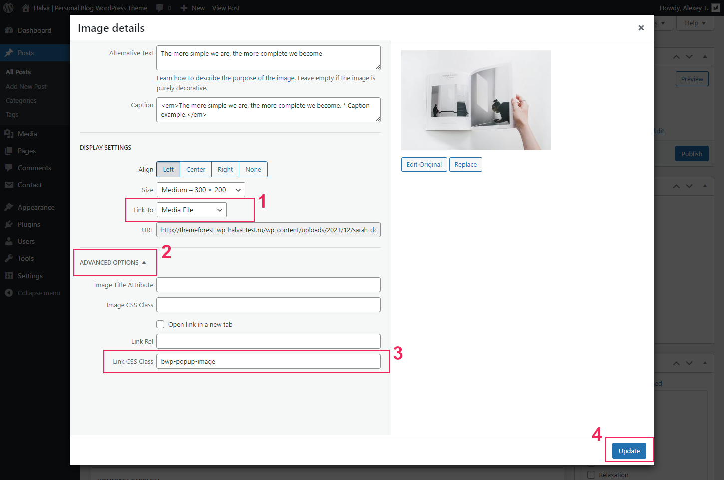
After completing these steps, your image can be enlarged by clicking on it.
Creating Pages
You can add a new page in the WordPress admin panel: WordPress Dashboard > Pages > Add New Page.
All settings for standard pages are in the customizer: Appearance > Customize > Single Pages > Single Page (see the documentation section: "Theme Customization"). Also, you can add a featured image to each page, which will be displayed at the top of the page (Right column with page settings > Featured image).
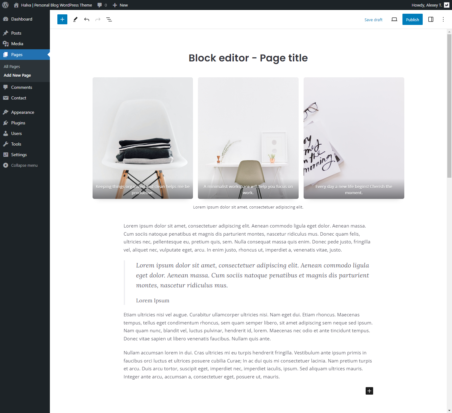
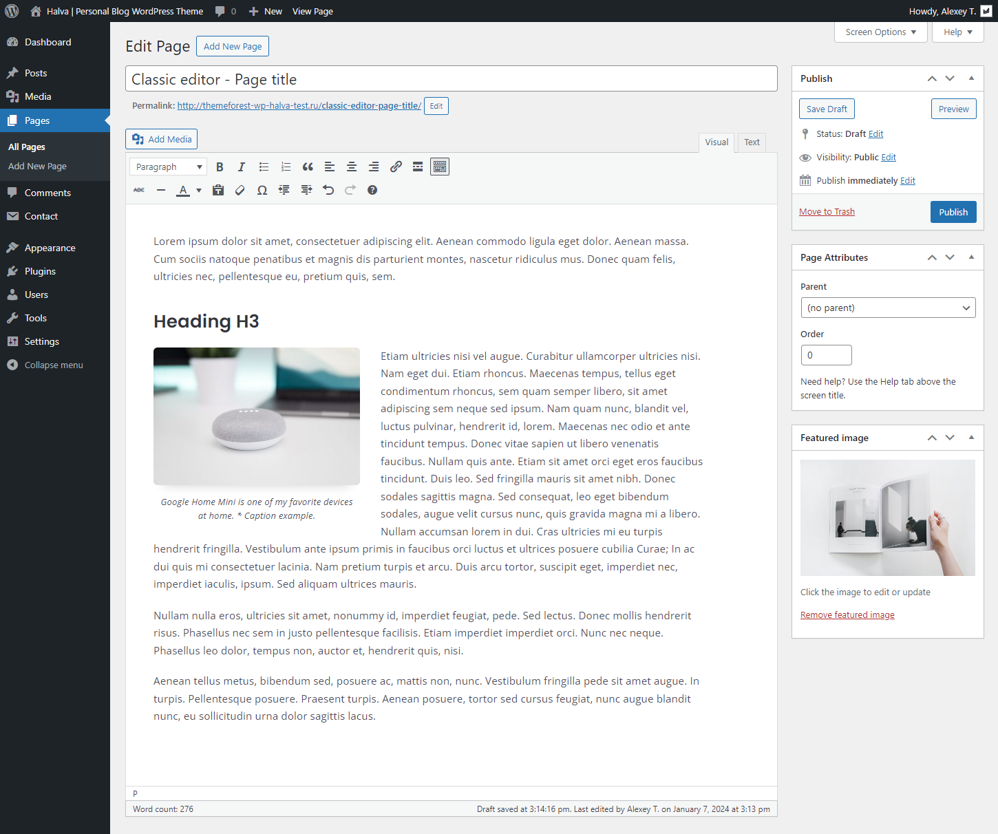
Depending on the editor you choose (block editor or classic editor), creating and editing a standard page will look like the screenshots below:
Creating Menus
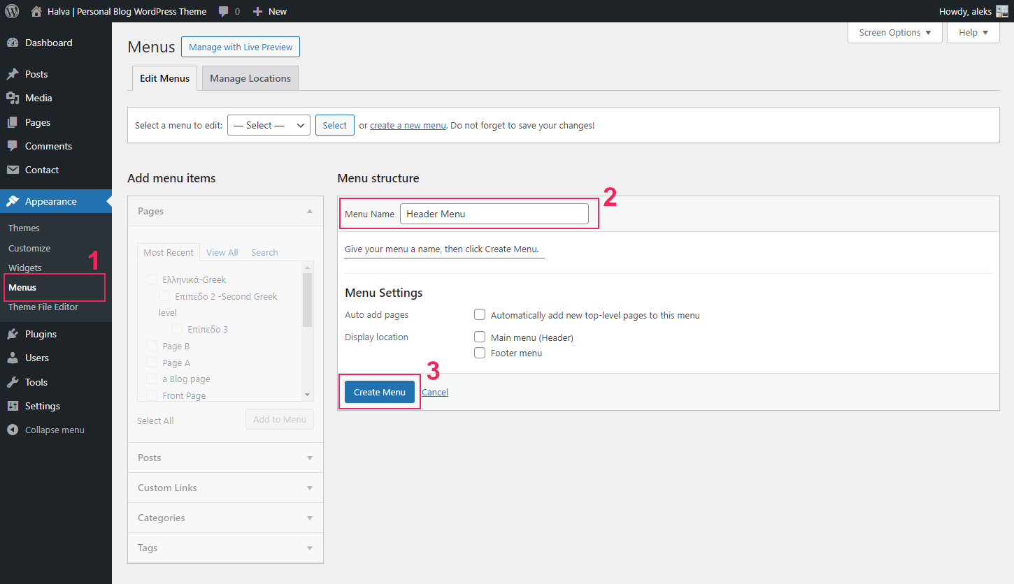
The first step of creating our menu is to open the WordPress Menu Editor. For this go to Appearance > Menus, type Name for your menu and click on the "Create Menu" button.
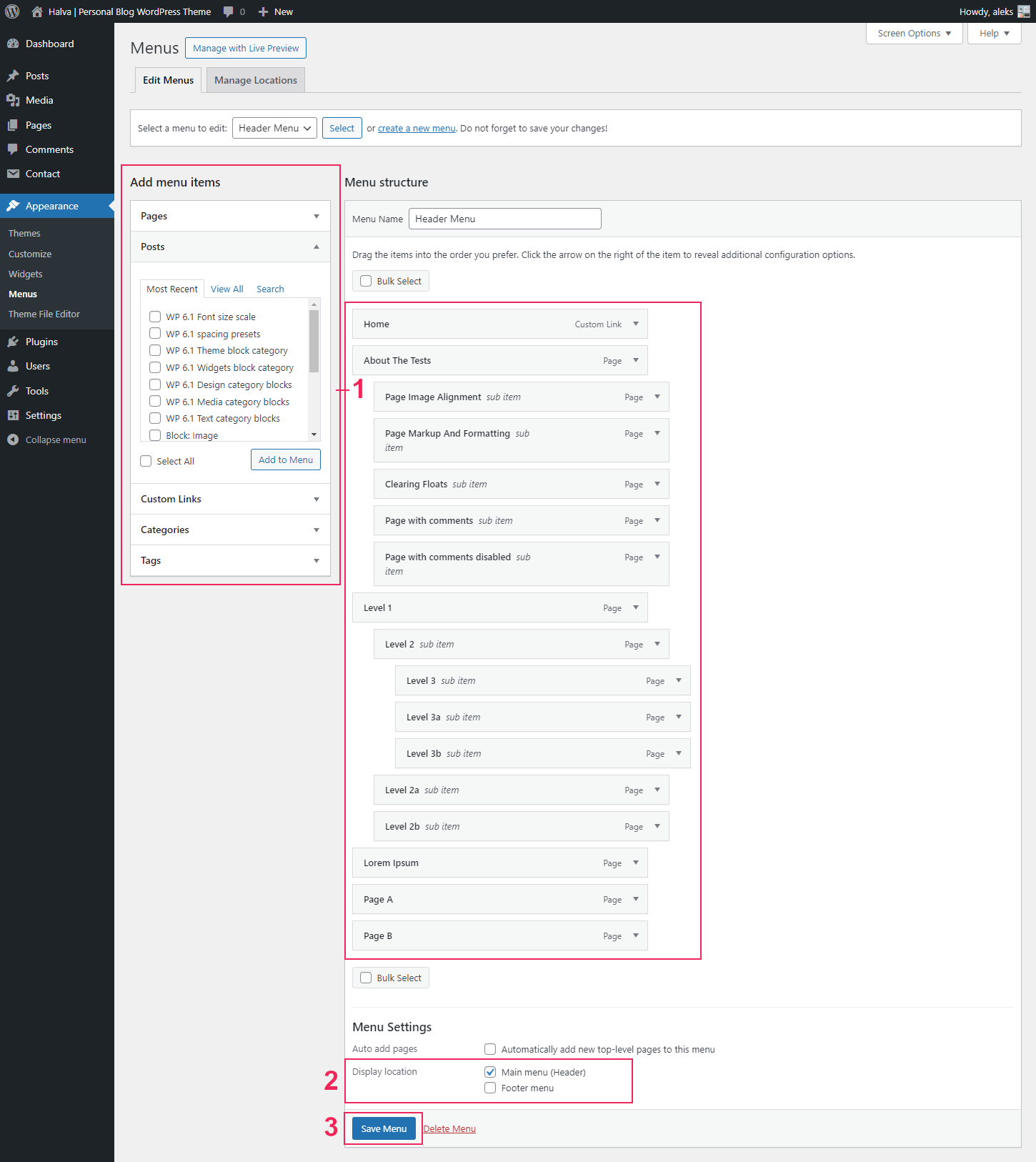
Once you've created the menu, the next step is to select the new menu as the "Main menu" (it is located in the header) or the "Footer menu" (it is located in the footer) in the "Display location" section.
Now you can add Pages, Posts, Custom Links, Tags, and Categories from blocks located on the left.
At the end you need to save your new menu by clicking the "Save Menu" button.
Subscribe Settings
If you have a Mailchimp account (or an account on another website for subscription), you can display a link to your subscription form in your site's navigation.
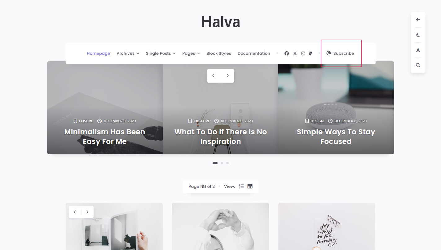
To display this link, go to the theme settings and fill out the required information for your "Subscribe" link:
- WordPress Dashboard > Appearance > Customize > Site Navigation > Subscribe Link:
- Subscribe URL - Add a public URL to your subscription form page;
- Subscribe: Link Text - Enter your text for the "Subscribe" link.
If you don't want this link to appear in your navigation, simply leave one of these two fields blank.
To get a link to your Mailchimp subscription form, you need to do the following:
- Log in to your Mailchimp account: https://mailchimp.com/
- Go to the "Contacts" section and select "Signup forms".
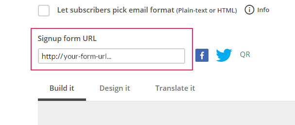
- On the page that appears, you need to create a form. To do this, go to the "Form builder" section.
- On the Form Builder page you can create and edit your subscription form. Here at the top of the page you can find the "Signup form URL" field, which contains the URL address of your form. You can paste this URL into the following field in the theme settings: WordPress Dashboard > Appearance > Customize > Site Navigation > Subscribe Link > Subscribe URL.
If you have any difficulties, there are a lot of videos on YouTube about creating subscription forms in Mailchimp, so you can always find your answer there.
Note: If you are using any other subscription website, you can also paste the URL of your form from that website.
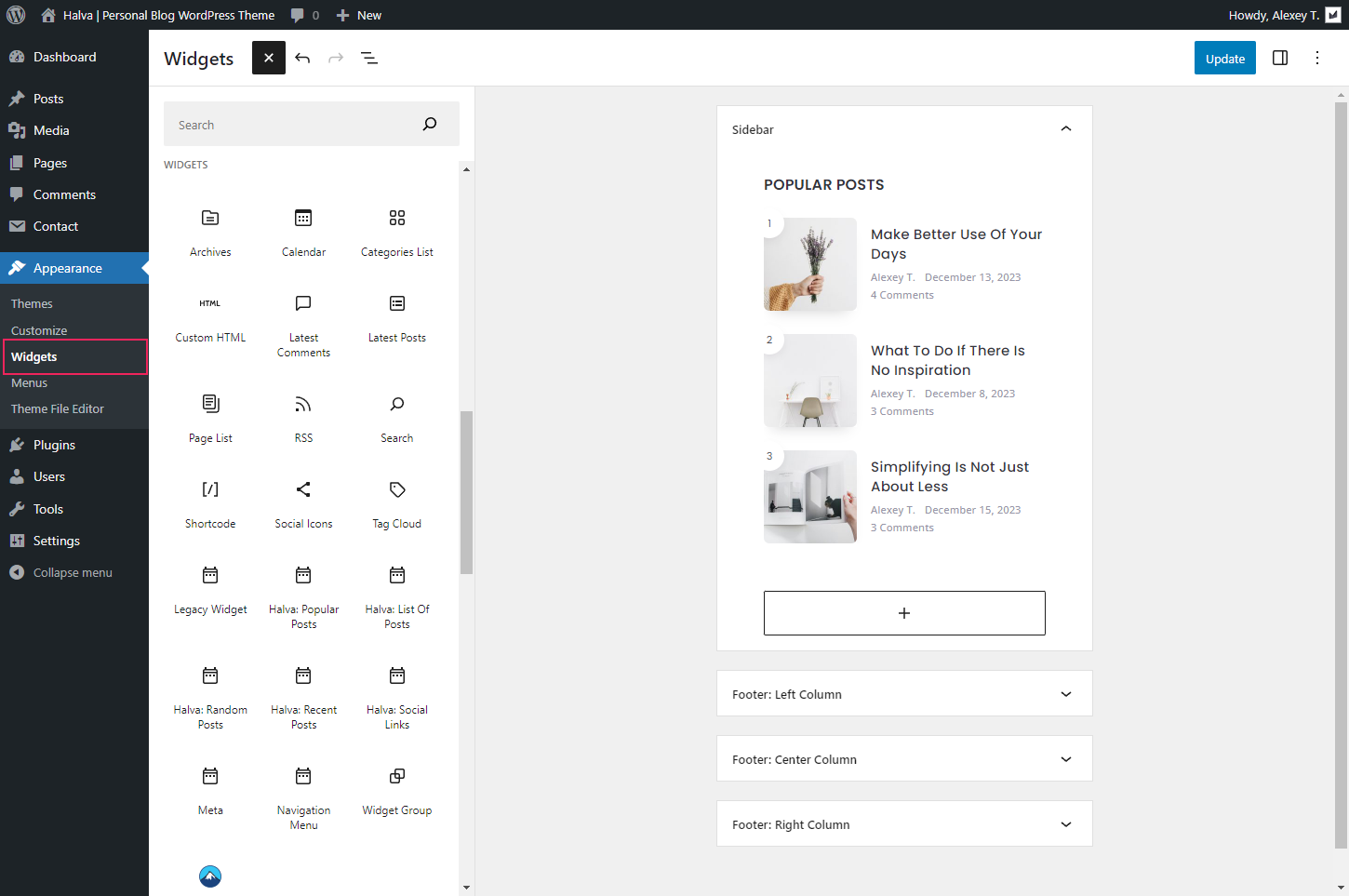
Widgets
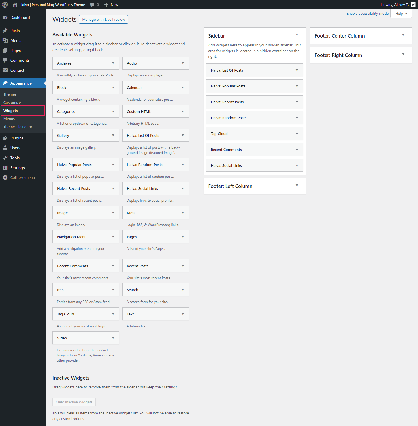
You can manage widgets on the Widgets page (Appearance > Widgets). Depending on the version of WordPress you are using, this page may differ:
- WordPress 5.7.x: This is a classic page with widgets and sidebars;
- WordPress 5.8+: This is a page for editing widgets using the block editor (Block Widgets Editor).
Areas for widgets.
This theme has 4 areas for widgets:
- Sidebar - This is a hidden sidebar located on the right side of the page. If one or more widgets are located inside the sidebar, then this sidebar with these widgets will be displayed on all pages of your site. Also, you can disable this sidebar in the theme settings: "Appearance > Customize > Sticky Buttons > Button: Show hidden sidebar (arrow icon)" (if the sidebar button is hidden, then the sidebar itself will also be disabled). If there are no widgets in this sidebar, then the sidebar with the button to open the sidebar will not be displayed.
- Footer: Left Column - This area is located in the footer in the left column.
- Footer: Center Column - This area is located in the footer in the center column.
- Footer: Right Column - This area is located in the footer in the right column.
Available widgets.
Depending on the version of your WordPress, you will have a different number of widgets. For WordPress 5.7.x there are 17 standard widgets and 5 additional widgets that come with this theme. For WordPress 5.8 and higher, these will be all blocks from the block editor, all classic widgets (or legacy widgets) and 5 additional widgets that are available with this theme.
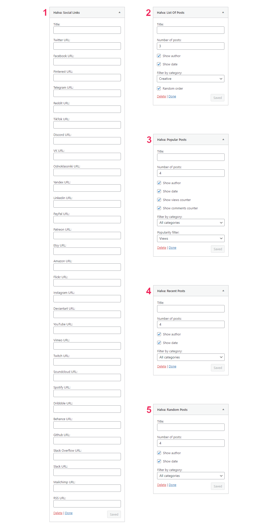
If you want to get 5 additional widgets, then for this you need to install and activate the "Halva Additional Features" plugin (Information about this plugin). This plugin provides the following set of additional widgets:
- Halva: List Of Posts - Displays a list of posts with a background image (featured image);
- Halva: Popular Posts - Displays a list of popular posts;
- Halva: Random Posts - Displays a list of random posts;
- Halva: Recent Posts - Displays a list of recent posts;
- Halva: Social Links - Displays links to social profiles.
To activate the widgets you need, simply drag them from the list of widgets (or blocks) on the left to one of the available widget areas on the right.
Below you can see two screenshots of the Widgets page: the Block Editor page and the Classic Widgets page. The third screenshot shows the settings for 5 additional widgets.
Creating Contact Forms
To create and use a contact form on your site, I recommend using the most popular plugin called "Contact Form 7". Contact Form 7 can manage multiple contact forms, plus you can customize the form and the mail contents flexibly with simple markup. The form supports Ajax-powered submitting, CAPTCHA, Akismet spam filtering and so on. You can download it here.
Once you have downloaded, installed, and activated this plugin, a new section called "Contact" will appear in the WordPress navigation menu. There you can create a new contact form or edit existing contact forms:
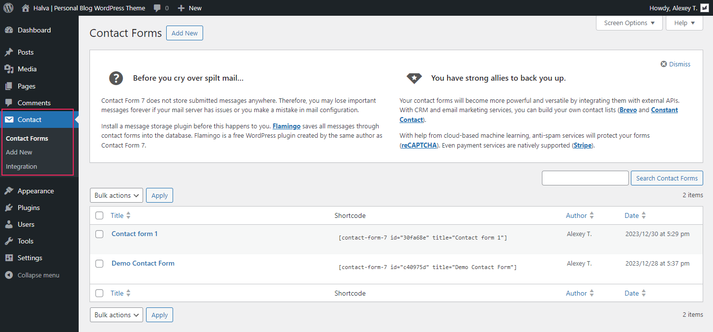
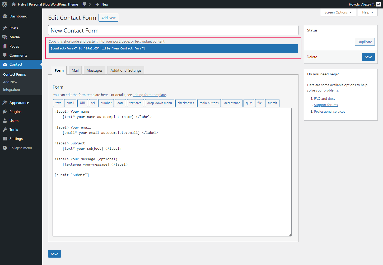
To create a new contact form, click on the "Add New" button. When creating the form, you can use the official documentation: Docs and FAQ.
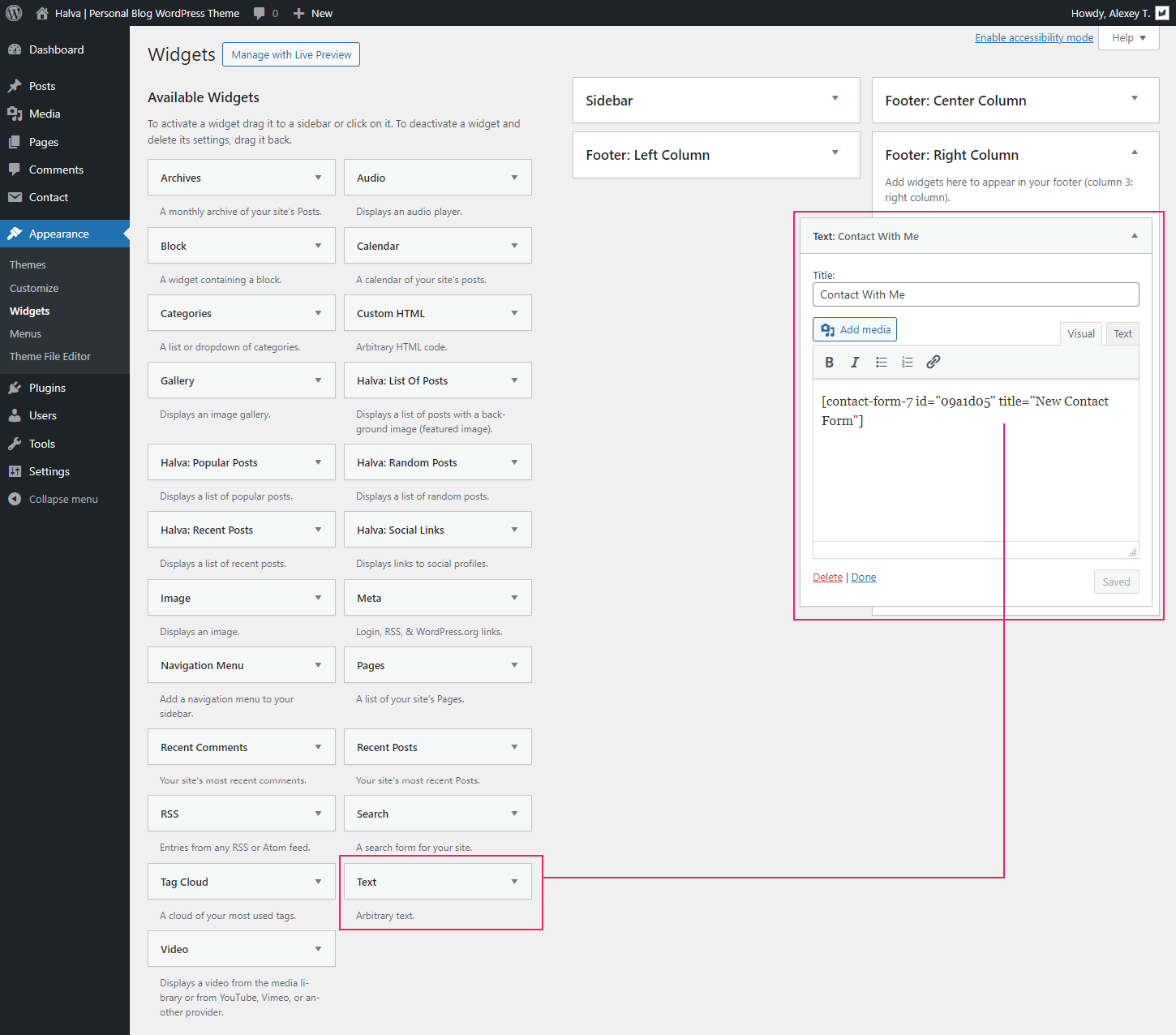
After creating your contact form, you need to copy the shortcode of the contact form and paste it into your post, page, or text widget content:
Theme Customization
Theme options powered by WordPress Customizer. To find them, navigate to Appearance > Customize.
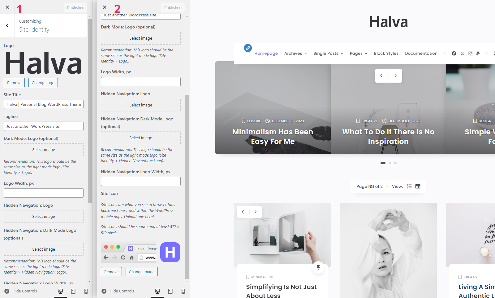
1. Site Identity
- Logo - Here you can upload your main logo. The uploaded logo will appear on your site only if you have selected the Image logo type: Customize > Logo Settings > Main Logo > Logo Type > Image.
- Site Title - Title for your site. It is displayed on the tab of your browser window. This title is also used in the hidden H1 heading in the site header on the following pages: homepage with your latest posts, all archive pages, and search results page.
- Tagline - Tagline for your site. It is displayed on the tab of your browser window.
- Dark Mode: Logo - Here you can upload your main logo for the dark version of your site. Note: Logos for light and dark modes should be the same size and different colors.
- Logo Width, px - The width of your main logo in pixels. Note: To make your logo look clear and good on mobile devices, I recommend using a double-resolution logo (2x) and in this field specify the value of the initial width of your logo. For example, your logo has the following dimension: 128 x 38 pixels. In this case, the dimension of the logo for upload will be 256 x 76 pixels and in the "Logo Width" field you should insert 128.
- Hidden Navigation: Logo - Here you can upload your additional logo, which will be displayed in the hidden navigation of your site. The uploaded logo will appear on your site only if you have selected the Image logo type: Customize > Logo Settings > Hidden Navigation: Logo > Hidden Navigation: Logo Type > Image.
- Hidden Navigation: Dark Mode Logo - Here you can upload your additional logo for the dark version of your site. Note: Logos for light and dark modes should be the same size and different colors.
- Hidden Navigation: Logo Width, px - The width of your additional logo in pixels.
- Site Icon - Site Icons are what you see in browser tabs, bookmark bars, and within the WordPress mobile apps. Upload one here. Site Icons should be square and at least 512 × 512 pixels.
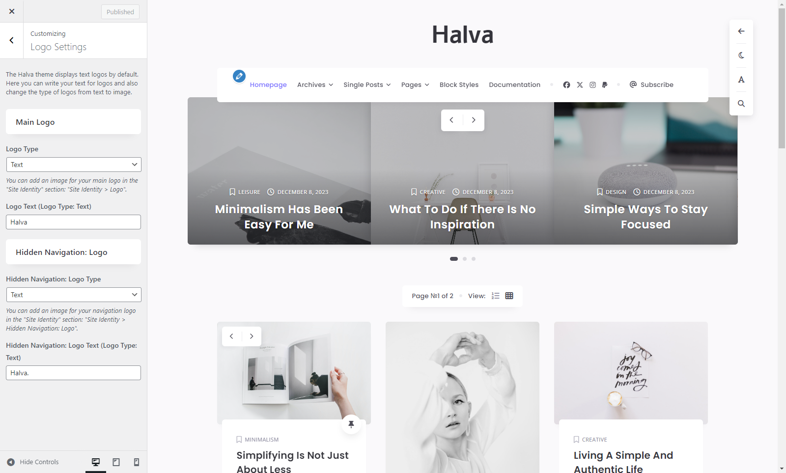
2. Logo Settings
Main Logo
- Logo Type - Choose between two different logo types: Text and Image. Note: You can add an image for your main logo in the "Site Identity" section: Customize > Site Identity > Logo.
- Logo Text (Logo Type: Text) - Enter text for your main logo.
Hidden Navigation: Logo
- Hidden Navigation: Logo Type - Choose between two different logo types: Text and Image. Note: You can add an image for your navigation logo in the "Site Identity" section: Customize > Site Identity > Hidden Navigation: Logo.
- Hidden Navigation: Logo Text (Logo Type: Text) - Enter text for your navigation logo.
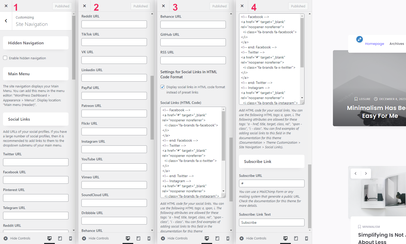
3. Site Navigation
Hidden Navigation
- Enable hidden navigation - Check this box if you want to enable additional navigation on your site. This navigation will appear when you scroll down the site pages. You can open this navigation by clicking on the navigation button in the button bar on the right side of the page.
Main Menu
The site navigation displays your Main Menu. You can add this menu in the Menu Editor: "WordPress Dashboard > Appearance > Menus". Display location: "Main menu (Header)".
Social Links
- Here you can add the URLs of your social profiles. The following social icons are available for your social links: Twitter, Facebook, Pinterest, Telegram, Reddit, TikTok, VK, LinkedIn, PayPal, Patreon, Flickr, Instagram, YouTube, Vimeo, SoundCloud, Dribbble, Behance, GitHub, and RSS.
- Display social links in HTML code format instead of preset links - Check this box if you want to display your own social links instead of the preset ones. In this case, you need to enter your own HTML code for your social links. This can be done in the field below: "Social Links (HTML Code)".
- Social Links (HTML Code) - Add HTML for your social links. For this you can use Font Awesome icons and the following HTML tags: <a>, <span>, <i>. The following attributes are allowed for these tags: <a> - href, title, target, class, rel; <span> - class; <i> - class. This is an example of HTML markup for creating social links:
<!-- Facebook -->
<a href="#your-facebook-url" target="_blank" rel="noopener noreferrer">
    <i class="fa-brands fa-facebook"></i>
</a>
<!-- end: Facebook -->

<!-- X / Twitter -->
<a href="#your-twitter-url" target="_blank" rel="noopener noreferrer">
    <i class="fa-brands fa-x-twitter"></i>
</a>
<!-- end: X / Twitter -->

<!-- Instagram -->
<a href="#your-instagram-url" target="_blank" rel="noopener noreferrer">
    <i class="fa-brands fa-instagram"></i>
</a>
<!-- end: Instagram -->

<!-- PayPal -->
<a href="#your-paypal-url" target="_blank" rel="noopener noreferrer">
    <i class="fa-brands fa-paypal"></i>
</a>
<!-- end: PayPal -->

<!-- ... -->

<!-- Link to my Twitter profile (example) -->
<a href="https://twitter.com/BirdwpThemes" target="_blank" rel="noopener noreferrer">
    <i class="fa-brands fa-x-twitter"></i>
</a>
<!-- end: X / Twitter -->
Subscribe Link
- Subscribe URL - Add a public URL to your subscription form page. You can use a MailChimp Form or any mailing system that generate a public URL.
- Subscribe: Link Text - Enter your text for the "Subscribe" link.
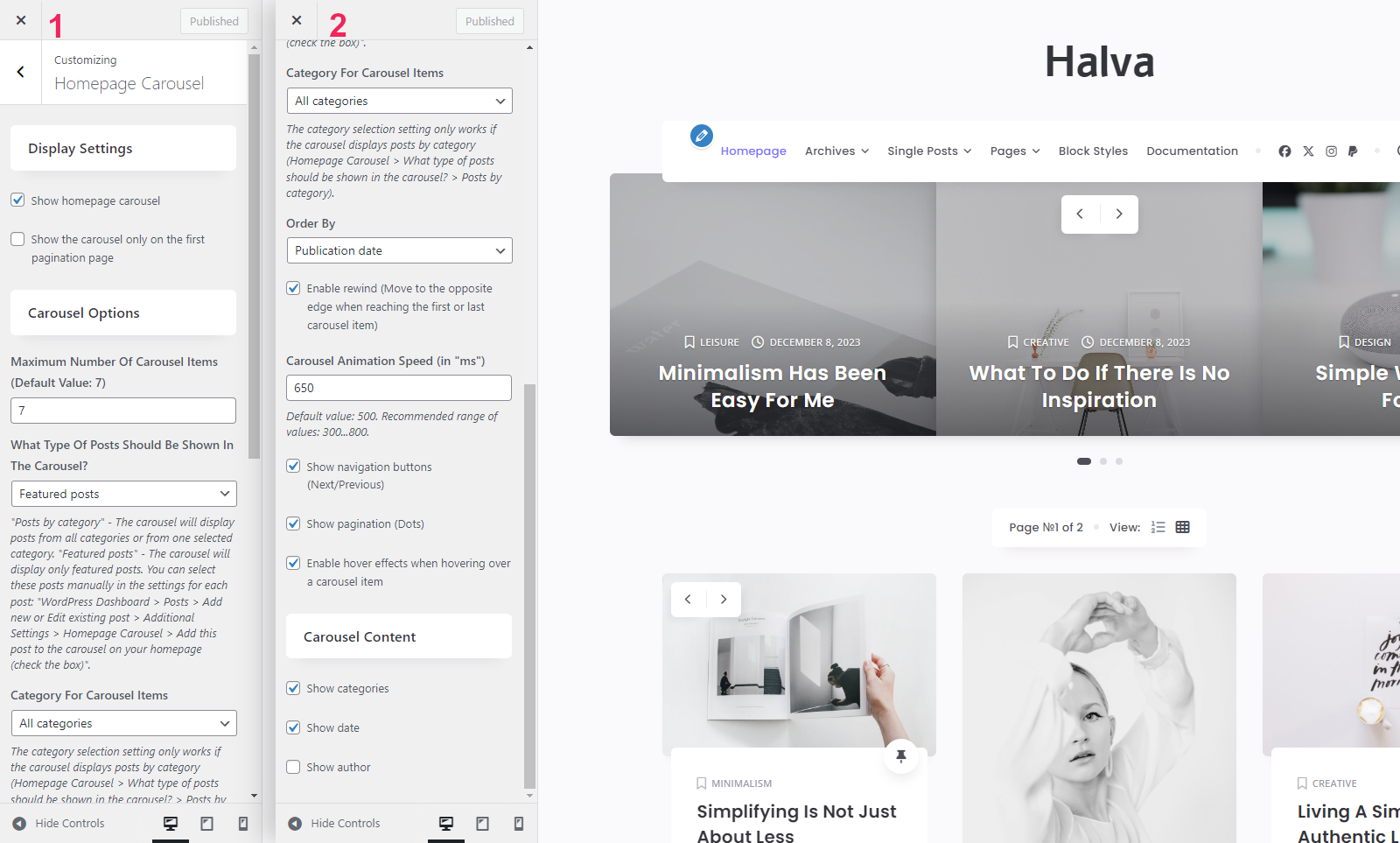
4. Homepage Carousel
Display Settings
- Show homepage carousel - Show or hide the carousel on your homepage. Important! The carousel is only available on the homepage with your latest posts (WordPress Dashboard > Settings > Reading > Your homepage displays > Your latest posts).
- Show the carousel only on the first pagination page - Check this box if you want the carousel to appear only on the first page of the pagination.
Carousel Options
- Maximum Number Of Carousel Items (Default Value: 7) - Enter the maximum number of carousel items. Only numeric values are allowed.
- What Type Of Posts Should Be Shown In The Carousel? - Select the type of posts you want to display in the carousel: Posts by category or Featured posts. "Posts by category" - The carousel will display posts from all categories or from one selected category. "Featured posts" - The carousel will display only featured posts. You can select these posts manually in the settings for each post: "WordPress Dashboard > Posts > Add new or Edit existing post > Additional Settings > Homepage Carousel > Add this post to the carousel on your homepage (check the box)".
- Category For Carousel Items - Category of posts for the carousel. Important! The category selection setting only works if the carousel displays posts by category.
- Order By - Select one of the order options for the carousel items: "Random order", "Publication date" or "Number of comments".
- Enable rewind (Move to the opposite edge when reaching the first or last carousel item) - Activate this checkbox to enable rewind.
- Carousel Animation Speed (in "ms") - Enter the duration of the carousel animation in milliseconds. Default value: 500. Recommended range of values: 300...800.
- Show navigation buttons (Next/Previous) - Show or hide navigation buttons (Next/Previous).
- Show pagination (Dots) - Show or hide carousel pagination (Dots).
- Enable hover effects when hovering over a carousel item - Activate this checkbox if you would like to see an animation of the carousel items when you hover over each item.
Carousel Content
- Show categories - Show or hide categories.
- Show date - Show or hide date.
- Show author - Show or hide author.
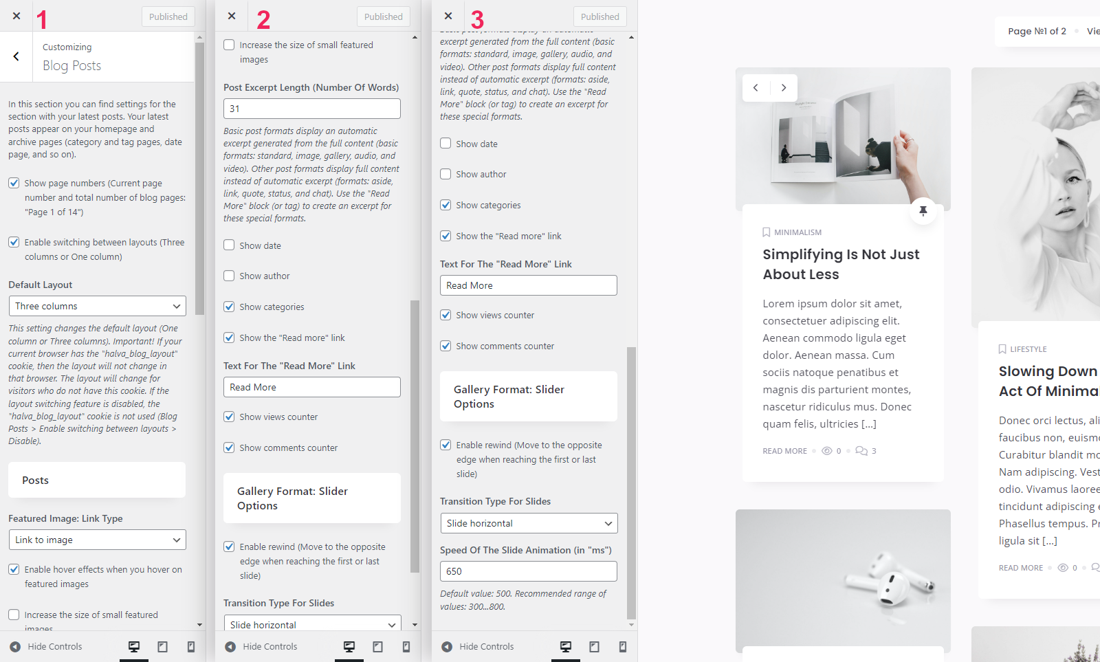
5. Blog Posts
In this section you can find settings for the section with your latest posts. Your latest posts appear on your homepage and archive pages (category and tag pages, date page, and so on).
- Show page numbers (Current page number and total number of blog pages: "Page 1 of 14") - Show or hide the current page number and the total number of pagination pages.
- Enable switching between layouts (Three columns or One column) - Enable or disable the ability to switch between two layout types: One column or Three columns.
- Default Layout - Select the default layout for your posts: One column or Three columns. Important! If your current browser has the "halva_blog_layout" cookie, then the layout will not change in that browser. The layout will change for visitors who do not have this cookie. If the layout switching feature is disabled, the "halva_blog_layout" cookie is not used ("Customize > Blog Posts > Enable switching between layouts > Disable").
Posts
- Featured Image: Link Type - Choose between "Link to post" and "Link to image" options.
- Enable hover effects when you hover on featured images - Show animation effects when hovering over featured images.
- Increase the size of small featured images - Enable this setting if you want to scale small featured images.
- Post Excerpt Length (Number Of Words) - The length of the automatically generated post excerpt (default value: 30 words).
- Show date - Show or hide date.
- Show author - Show or hide author.
- Show categories - Show or hide categories.
- Show the "Read more" link - Show or hide the "Read more" link.
- Text For The "Read More" Link - Enter your text for the "Read more" link.
- Show views counter - Show or hide views counter.
- Show comments counter - Show or hide comments counter.
Gallery Format: Slider Options
- Enable rewind (Move to the opposite edge when reaching the first or last slide) - Activate this checkbox to enable rewind.
- Transition Type For Slides - Select one of the available transition types: "Fade animation" or "Slide horizontal".
- Speed Of The Slide Animation (in "ms") - Enter the duration of the slide animation in milliseconds. Default value: 500. Recommended range of values: 300...800.
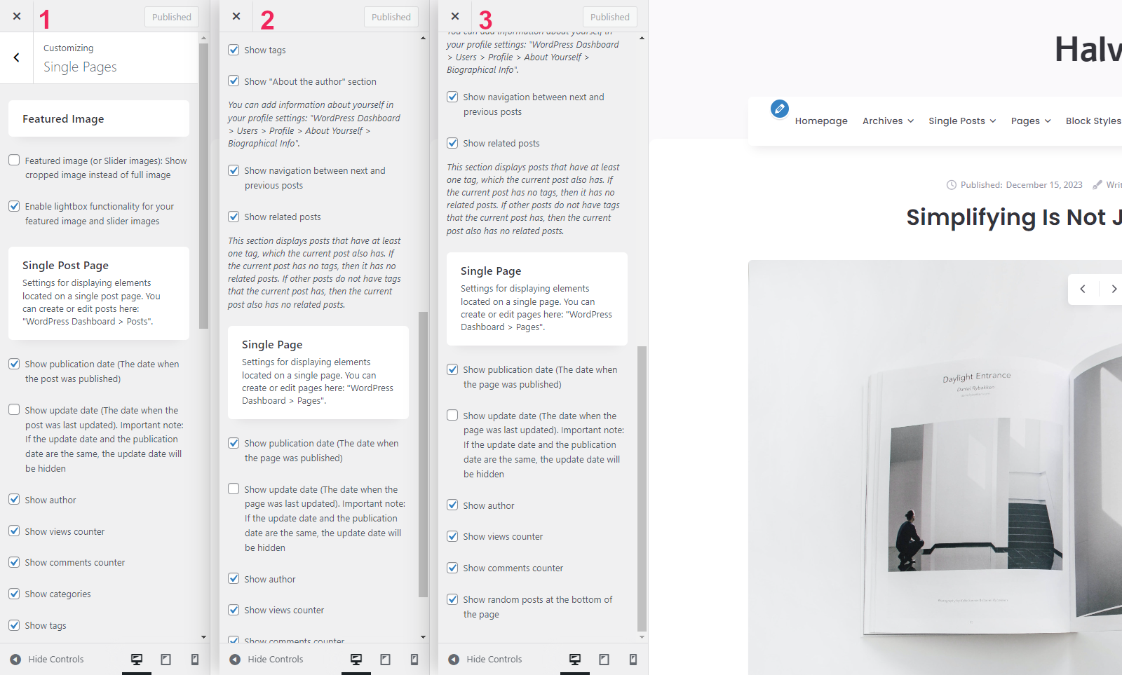
6. Single Pages
Featured Image
- Featured image (or Slider images): Show cropped image instead of full image - Show cropped image instead of full image on post page and standard page. This setting can be useful if you are using large vertical images (portrait orientation). If this setting is enabled, large vertical images will be cropped on all single pages.
- Enable lightbox functionality for your featured image and slider images - Activate this checkbox if you want to enable lightbox functionality for your featured images and sliders on single pages.
Single Post Page
Settings for displaying elements located on a single post page. You can create or edit posts here: "WordPress Dashboard > Posts".
- Show publication date - Show or hide the publication date.
- Show update date - Show or hide the update date. Important note: If the update date and the publication date are the same, the update date will be hidden.
- Show author - Show or hide author.
- Show views counter - Show or hide views counter.
- Show comments counter - Show or hide comments counter.
- Show categories - Show or hide categories.
- Show tags - Show or hide tags.
- Show "About the author" section - Show or hide author information. Note: You can add information about yourself in your profile settings: "WordPress Dashboard > Users > Profile > About Yourself > Biographical Info".
- Show navigation between next and previous posts - Show or hide navigation between posts.
- Show related posts - Show or hide related posts. This section displays posts that have at least one tag, which the current post also has. If the current post has no tags, then it has no related posts. If other posts do not have tags that the current post has, then the current post also has no related posts.
Single Page
Settings for displaying elements located on a single page. You can create or edit pages here: "WordPress Dashboard > Pages".
- Show publication date - Show or hide the publication date.
- Show update date - Show or hide the update date. Important note: If the update date and the publication date are the same, the update date will be hidden.
- Show author - Show or hide author.
- Show views counter - Show or hide views counter.
- Show comments counter - Show or hide comments counter.
- Show random posts at the bottom of the page - Show or hide random posts at the bottom of the page.
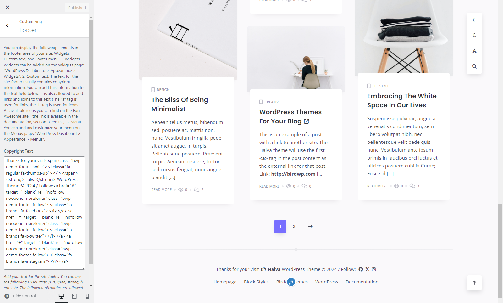
7. Footer
You can display the following elements in the footer area of your site: Widgets, Custom text, and Footer menu.
1. Widgets. Widgets can be added on the Widgets page: "WordPress Dashboard > Appearance > Widgets".
2. Custom text. The text for the site footer usually contains copyright information. You can add this information to the following text field: "Customize > Footer > Copyright Text". It is also allowed to add links and icons to this text (The <a> tag is used for links, the <i> tag is used for icons. All available icons you can find on the Font Awesome site). For example, you can add several links to your social profiles (example: <a href="https://twitter.com/BirdwpThemes" target="_blank" rel="noopener noreferrer"><i class="fa-brands fa-x-twitter"></i></a>).
3. Menu. You can add and customize your menu on the Menus page: "WordPress Dashboard > Appearance > Menus".
- Copyright Text - Enter your copyright information (or other text). You can use the following HTML tags: <p>, <a>, <span>, <strong>, <b>, <em>, <i>, <br>. The following attributes are allowed for these tags: <p> - class; <a> - href, title, target, class, rel; <span> - class; <i> - class.
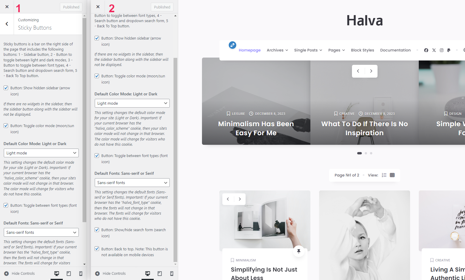
8. Sticky Buttons
Sticky buttons is a bar on the right side of the page that includes the following buttons:
- Sidebar button;
- Button to toggle between light and dark modes;
- Button to toggle between font types;
- Search button;
- Back To Top button.
- Button: Show hidden sidebar (arrow icon) - Show or hide the sidebar button. If your sidebar doesn't have widgets, this button will be hidden.
- Button: Toggle color mode (moon/sun icon) - Show or hide the button for switching color modes. Check the box if you want to enable the function of switching between two color modes: dark and light.
- Default Color Mode: Light or Dark - Select one of the color modes that will be used by default on your site: light or dark. Important note. If your current browser has the "halva_color_scheme" cookie, then your site's color mode will not change in that browser. The color mode will change for visitors who do not have this cookie.
- Button: Toggle between font types (font icon) - Show or hide the font button. Check this box if you want to enable the function of switching between two types of fonts: serif and sans-serif.
- Default Fonts: Sans-serif or Serif - Select one of the two types of fonts that will be used by default on your site: sans-serif or serif. Important note. If your current browser has the "halva_font_type" cookie, then the fonts will not change in that browser. The fonts will change for visitors who do not have this cookie.
- Button: Show/hide search form (search icon) - Show or hide the search button.
- Button: Back to top - Show or hide the "Back to Top" button. Note: This button is not available on mobile devices.
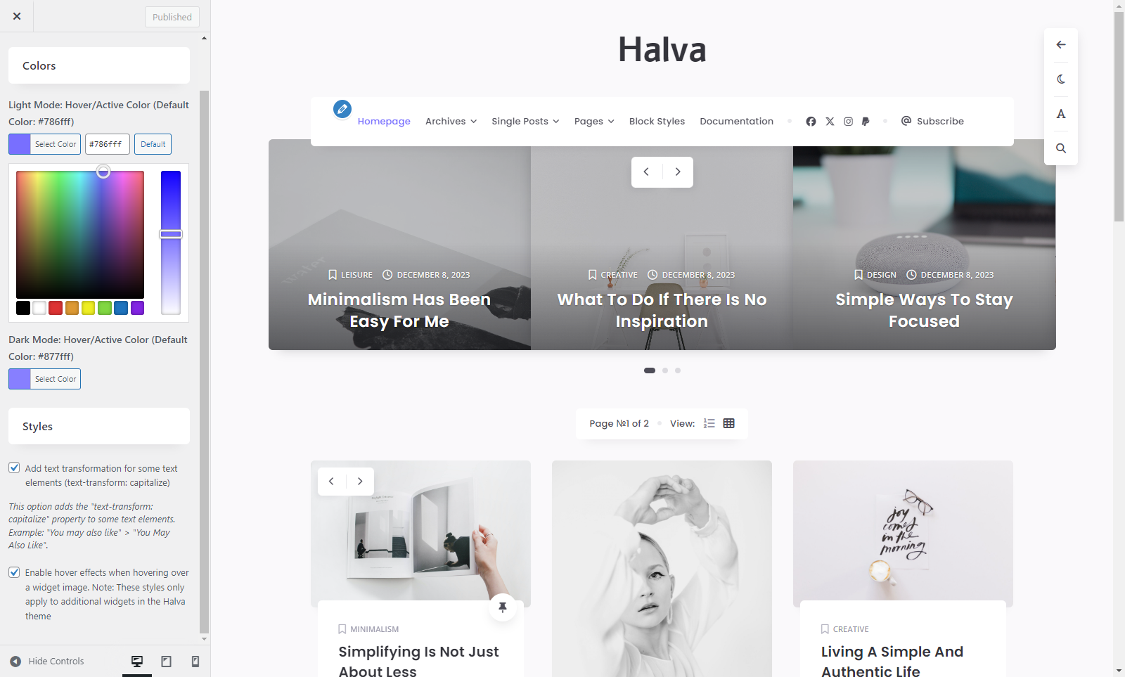
9. Colors And Styles
Colors
- Light Mode: Hover/Active Color (Default Color: #786fff) - Choose a color for links and other elements of your site when you hover over them.
- Dark Mode: Hover/Active Color (Default Color: #877fff) - Choose a color for links and other elements of the dark version of your site when you hover over them.
Styles
- Add text transformation for some text elements (text-transform: capitalize) - This option adds the "text-transform: capitalize" property to some text elements. Example: "You may also like" > "You May Also Like".
- Enable hover effects when hovering over a widget image - Check this box if you want to enable hover effects on widget images. Note: These styles only apply to additional widgets in the Halva theme.
10. Cookies
Cookies: Enable/Disable
- Use a cookie to save the selected layout (one column or three columns)? - Activate this checkbox if you want to use a cookie file to save the selected blog layout.
- Use a cookie to save the selected color mode (light or dark)? - Activate this checkbox if you want to use a cookie file to save the selected color mode.
- Use a cookie to save the selected type of fonts (sans-serif fonts or serif fonts)? - Activate this checkbox if you want to use a cookie file to save the selected type of fonts.
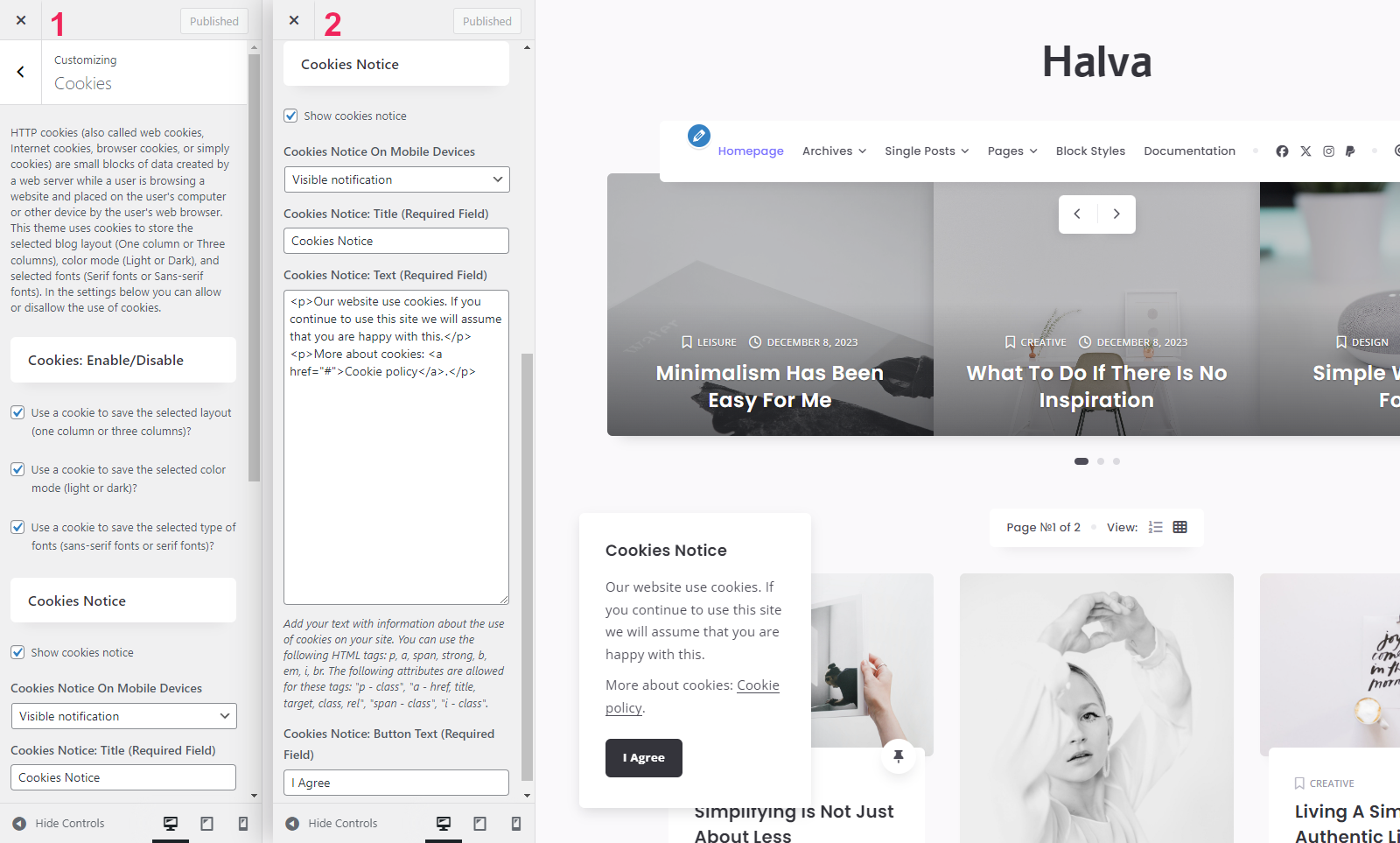
Cookies Notice
- Show cookies notice - Show or hide cookies notice. It is strongly recommended that you inform your visitors about the cookies on your site.
- Cookies Notice On Mobile Devices - Choose between two types of notification: Hidden notification or Visible notification.
- Cookies Notice: Title (Required Field) - Enter your title for the notification.
- Cookies Notice: Text (Required Field) - Enter your text with information about cookies. You can use the following HTML tags: <p>, <a>, <span>, <strong>, <b>, <em>, <i>, <br>. The following attributes are allowed for these tags: <p> - class; <a> - href, title, target, class, rel; <span> - class; <i> - class.
- Cookies Notice: Button Text (Required Field) - Enter your text for the "Accept and Close" button.
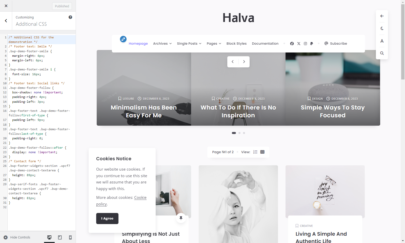
11. Additional CSS
- Here you can add your own CSS code. This setting is necessary if you want to change something on your site that is not available in the theme settings, for example: font size, font style, color, margin, or some other customization.
Translation
To translate this theme, I recommend using the .mo and .po files. These files work in pairs, so for each language you need to have 2 files with the same name but a different extension. For example, if you want to translate the theme into Turkish, you need to create 2 files called tr_TR.mo and tr_TR.po.
As you already understood, first you need to create these 2 files. For this you need to use Poedit software which is very easy to use. You can download it here. After installation Poedit software, you need to run it. In Poedit go to File > New from POT/PO file..., select and open the .pot file from the "languages" folder: "/halva/languages/halva.pot". After that you just need to select your language, add translation, and save your changes.
Now you have .mo and .po files with your translation, and all you need to do is upload these both files into the "languages" folder on your server: "/wp-content/themes/halva/languages/". Also do not forget to change the language of your site in the WordPress settings: Settings > General > Site Language.
Importing Demo Data
After unpacking the main archive that you downloaded from ThemeForest to your computer, you need to open the "Halva Theme with Documentation" folder. There you can see a folder called "Demo Content". This folder contains the halva-demo-data.xml file with demo data. You can use it to import demo data to your site. To do this, you need to perform a few simple steps:
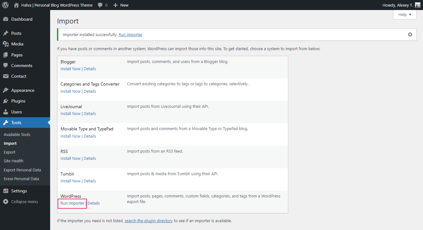
Step 1. Navigate to Tools > Import.
Step 2. Now you need to install the "WordPress Importer" plugin. To do this, click the "Install Now" link.
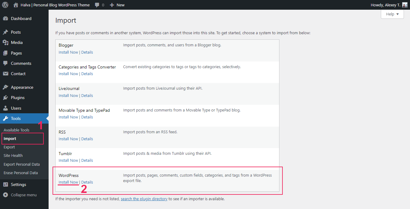
Step 3. After the installation is complete, click the "Run Importer" link.
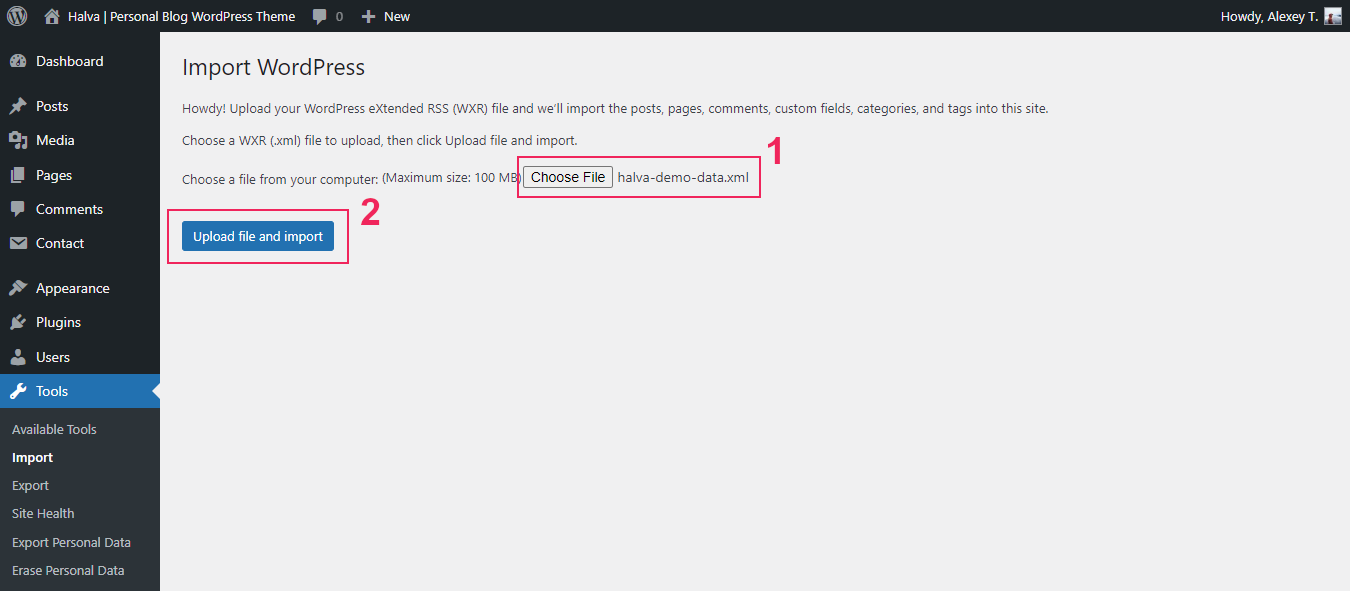
Step 4. Next, click on the "Choose file" button and select the halva-demo-data.xml file from the "Demo Content" folder (/Halva Theme with Documentation/Demo Content/halva-demo-data.xml).
Step 5. Click the "Upload file and import" button.
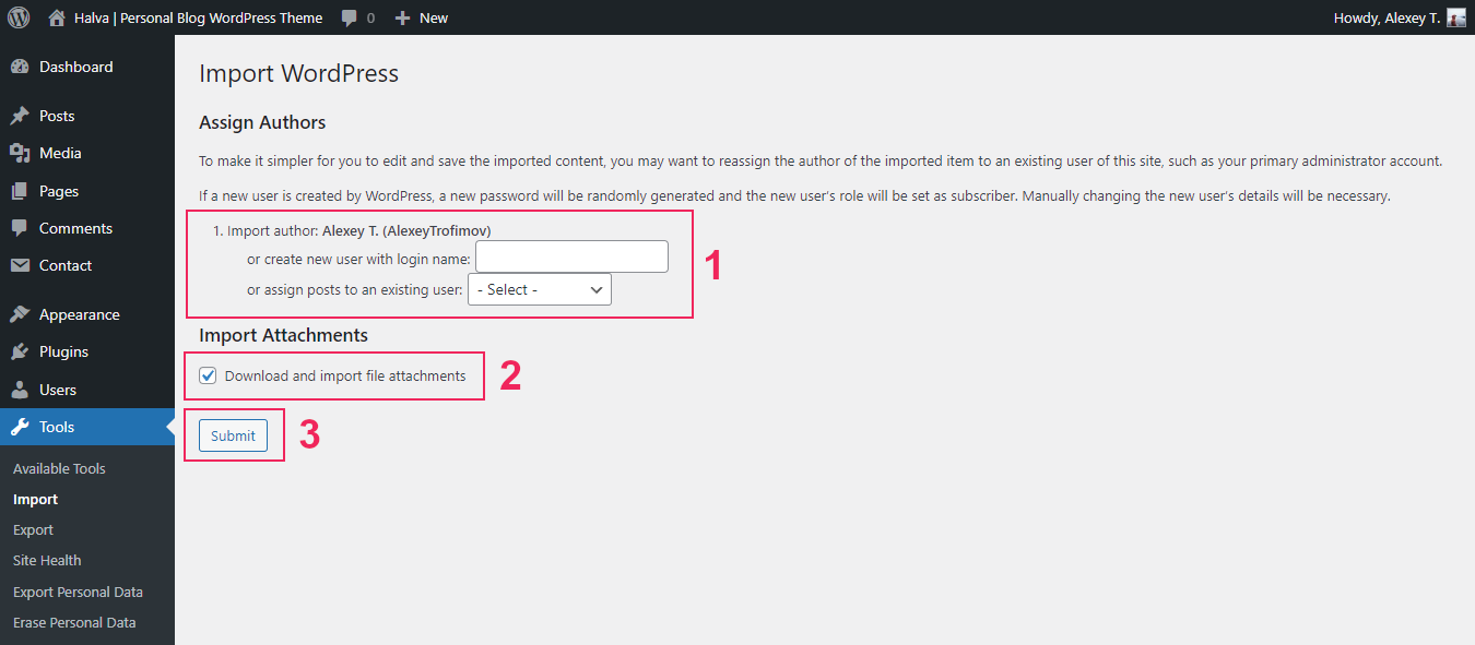
Step 6. After you will then be offered to Assign Authors. You can read the description at the top as this explains everything.
Step 7. Check the box "Download and import file attachments". This will download attachments for images included in the live preview demo.
Step 8. Click the "Submit" button.
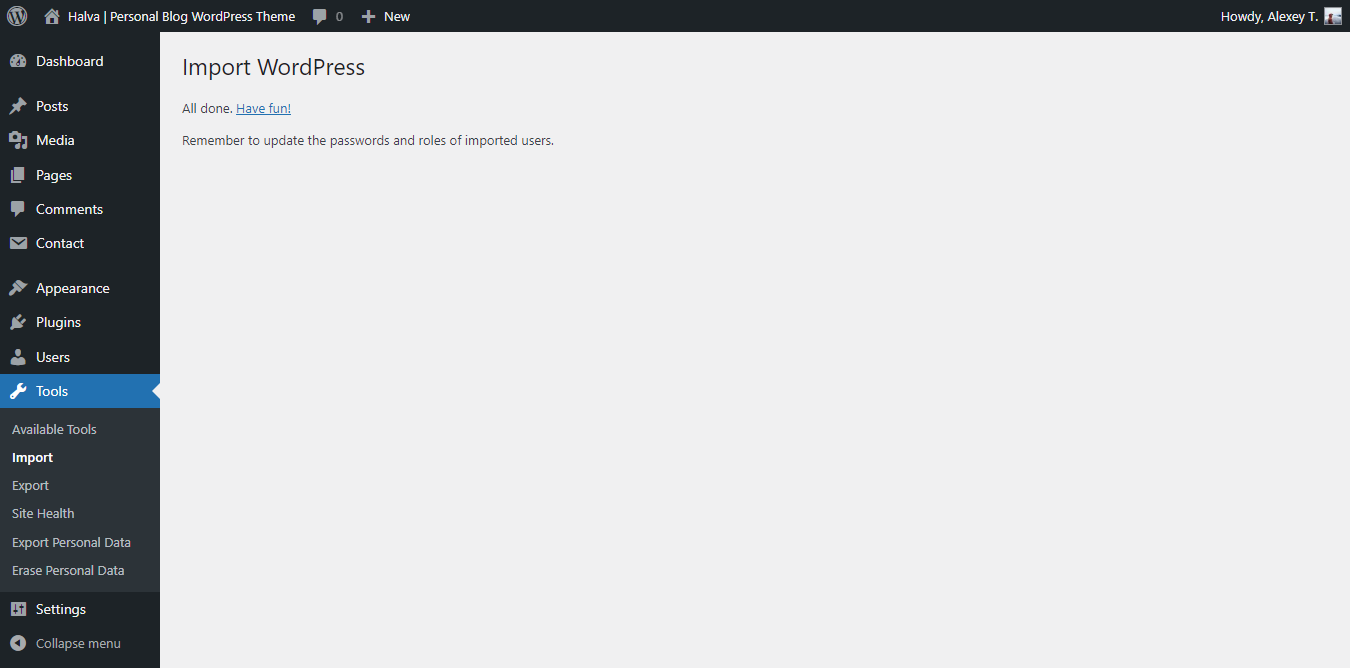
Now you need to wait for the importer to finish. This might take a few minutes depending on your hosting server speed.
Popular Questions
Question 1. When installing the theme, I see this error message: "The package could not be installed. The theme is missing the style.css stylesheet". How to fix it?
A common issue that can occur with users new to installing WordPress themes is a "Broken theme and/or stylesheets missing" error message being displayed when trying to upload or activate the theme. This error message does not mean that the theme you have purchased is broken, it simply means it has been uploaded incorrectly. Luckily, there is a very easy fix: https://help.market.envato.com/hc/en-us/articles/202821510.
Question 2. Does the theme support RTL?
Unfortunately not. The theme does not support RTL.
Question 3. Is this theme compatible with WooCommerce?
Unfortunately not. This is a simple blog theme.
Question 4. My posts do not appear on my homepage. What could be the problem?
You just need to activate the following option in your WordPress settings: WordPress Dashboard > Settings > Reading > Your homepage displays > select "Your latest posts". After that, do not forget to save the settings.
Question 5. How to change the number of displayed posts on the homepage (and on all other archive pages)?
You can easily change the number of displayed posts in your WordPress settings: WordPress Dashboard > Settings > Reading > Blog pages show at most ... posts.
Question 6. Can I change the default color mode from light to dark?
You can change the default color mode in the theme settings: WordPress Dashboard > Appearance > Customize > Sticky Buttons > Default Color Mode: Light or Dark. Important note: If your current browser has the "halva_color_scheme" cookie, then your site's color mode will not change in that browser. The color mode will change for visitors who do not have this cookie.
Question 7. Is it possible to change the default fonts from sans serif fonts to serif fonts?
You can change the default fonts in the theme settings: WordPress Dashboard > Appearance > Customize > Sticky Buttons > Default Fonts: Sans-serif or Serif. Important note: If your current browser has the "halva_font_type" cookie, then the fonts will not change in that browser. The fonts will change for visitors who do not have this cookie.
Question 8. Can I change the default blog layout from three columns to one column?
You can change the default blog layout in the theme settings: WordPress Dashboard > Appearance > Customize > Blog Posts > Default Layout. Important note: If your current browser has the "halva_blog_layout" cookie, then the layout will not change in that browser. The layout will change for visitors who do not have this cookie.
Question 9. Can I change the fonts in this theme to my own?
Unfortunately this is not possible. According to the new requirements for all WordPress themes on the market, the theme should not simply include a drop-down list of all Google Fonts in the options, as this can be confusing for users. Link: "WordPress Theme Requirements Part 4 - Coding" > "Font Loading". For this reason, there are no settings in this theme that allow you to change fonts. Instead, this theme has the ability to choose between sans-serif and serif fonts.
If you really need to change the fonts to your own, then this requires changes in the code. Unfortunately, I cannot help you with this, because help with changing the theme code is not included in the support. I also do not help with changes for a fee.
P.S. This theme uses the following set of Google fonts:
- Sans-serif fonts: Open Sans, Poppins, and Alef;
- Serif fonts: Noto Serif, Lora, and PT Serif.
Question 10. Icons are not displayed on my site. What is the problem?
This theme uses Font Awesome Icons v6. Link: https://fontawesome.com/search?m=free&o=r. However, most third-party plugins still use an older version (usually version 4.7.0) of the same icons. Link: https://fontawesome.com/v4/icons/. Unfortunately, these two icon libraries are not compatible with each other. Therefore, if your site does not display icons (or you see squares instead of icons), it means that you are using two different icon libraries at the same time (version 6 from this theme and an older version from one of your plugins, usually version 4). There are only two reasons why this happened:
- One of your plugins added an older version of the icons to your site. This is usually Font Awesome 4.7.0 (or older version). The probability of this is 99%.
- You yourself made changes to the theme code by adding an older version of the icons to your site. This is unlikely, but possible (1%).
The solution to the problem is simple:
If you added an older version of the icons, then simply remove your changes. However, it is more likely that one of your plugins is causing the problem. In this case, you just need to deactivate the plugin that uses the older version of Font Awesome icons. If you really need this plugin, then you can contact its author and ask to update the icons to the sixth version. However, some plugins that use old icons from Font Awesome may have settings to disable the old version of the icons. Therefore, you can first contact the author of the problematic plugin and find out about it.
Question 11. Can you help with changing the theme?
Unfortunately, I cannot help with this, because the customization service is not included in the support. What is item customization? Item customization includes the following: changing theme styles, adding new features just for you, changing existing features, changing the theme code to suit your needs. Also, I do not provide help for errors that arise due to changes in the theme code (You will receive a response from me that you should remove all third-party code).
Item Support Policy (Item Support Policy > What's not included in item support): https://themeforest.net/page/item_support_policy#whats-not-included-item-support
Support and Feedback
All questions you can send via the contact form HERE.
I respond to all emails from Monday to Friday within 24-48 hours in the order in which they were received. My time zone is GMT+3.
Please don't panic if I don't reply for a long time - I really love everyone who uses my WordPress themes, and I will definitely answer all your questions! ;)
What's included in item support:
- Answering questions about how to use the item;
- Answering technical questions about the item (and included third party assets);
- Help with defects in the item or included third party assets;
- Item updates to ensure ongoing compatibility and to resolve security vulnerabilities.
What's not included in item support:
- Item customization;
- Installation of the item;
- Hosting, server environment, or software;
- Support for third party plugins;
- Plugins integration;
- WordPress general support (use WordPress forums for this);
- Support for issues caused by user modifications in the theme's code, styling, and general functionality.
Credits
Thanks so much:
- Bootstrap v5.1.3 - Bootstrap is the most popular HTML, CSS, and JS framework for developing responsive, mobile first projects on the web.
- jQuery - jQuery is a fast, small, and feature-rich JavaScript library. It makes things like HTML document traversal and manipulation, event handling, animation, and Ajax much simpler with an easy-to-use API that works across a multitude of browsers.
- jQuery Superfish Menu Plugin by Joel Birch - Superfish is a jQuery plugin that adds usability enhancements to existing multi-level drop-down menus.
- Masonry by David DeSandro - Masonry is a JavaScript grid layout library. It works by placing elements in optimal position based on available vertical space, sort of like a mason fitting stones in a wall.
- imagesLoaded - Detect when images have been loaded. Development on imagesLoaded is sponsored by Metafizzy.
- Tiny Slider 2 by William Lin - Vanilla javascript slider for all purposes.
- Magnific Popup by Dmitry Semenov - Magnific Popup is a responsive lightbox and dialog script with focus on performance and providing best experience for user with any device.
- Font Awesome Free v6.x - Get vector icons and social logos on your website with the web's most popular icon set and toolkit.
- WordPress Meta Box Plugin - Meta Box is a powerful, professional, and lightweight toolkit for developers to create unlimited custom meta boxes and WordPress custom fields.
- TGM Plugin Activation - TGM Plugin Activation is a PHP library that allows you to easily require or recommend plugins for your WordPress themes (and plugins).
- Blank WordPress Pot by Fx Bénard - Blank WordPress Pot allows developers to have a great starting point for their translations' pot files and translators an explanation how to use the file.
- Contact Form 7 - Contact Form 7 can manage multiple contact forms, plus you can customize the form and the mail contents flexibly with simple markup. The form supports Ajax-powered submitting, CAPTCHA, Akismet spam filtering and so on.
- Google Fonts - Open Sans, Poppins, Alef, Noto Serif, Lora, and PT Serif.
- Minimalism Life - Special thanks for the inspiration while creating the demo. Minimalism Life is a collaborative publication focused on the nuances of minimalism and simple living.
- Documentation template by Alexey Trofimov - This is my documentation template that was used to create this documentation. Feel free to use it in your projects ;)
Images in the demo:
- Unsplash - Beautiful, free photos. Gifted by the world's most generous community of photographers.